- From: Phil Evans <pae9@star.le.ac.uk>
- Date: Wed, 15 Jun 2011 13:35:44 +0100
- To: Jonathan Avila <jon.avila@ssbbartgroup.com>
- Cc: Charles McCathieNevile <chaals@opera.com>, w3c-wai-ig@w3.org
- Message-ID: <4DF8A720.2080106@star.le.ac.uk>
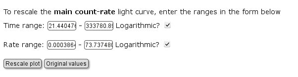
Forgive the continued questions on this issue but:

> Having labels on the right for radio buttons and checkboxes is very
> important to users of screen magnification software.  Screen magnification
> will align the left edge of the magnified area before the checkmark and the
> text of the checkmark and radio button will often go past the edge of the
> magnified area on the right.  When the label is on the left the checkmark
> would likely be out of view.

Surely this would also be an issue for other form controls as well,
rather than just radio/checkboxes?

In the specific case that triggered this issue for me, I actually have
multiple form controls on one line (as makes logical sense for the
specific use of this form) -- see the attached snapshot. In other places
(e.g. http://www.swift.ac.uk/user_objects/ -- currently being revised),
the form follows a consistent layout, and would certainly look rather
odd and be clumsy to use if the checkboxes preceded their labels,
whereas the text boxes suceeded theirs. Is your suggestion that these
examples would be difficult for users with screen magnifiers to use?

Phil


>
> This positioning is mentioned as an advisory technique under 1.3.1 and
> mentioned under G162
> http://www.w3.org/TR/2010/NOTE-WCAG20-TECHS-20101014/G162  So while it's not
> required it strongly benefits users with low vision.  Sometimes it seems
> like the standards and their implementation focus primarily on certain
> disability groups and other user groups needs are not fully met.
>
> For example, guidance on not using color to convey meaning indicated that
> provide an off-screen alternative such as a title attribute or text
> positioned off-screen would meet the requirement although this information
> would be NOT obtainable for someone not using a screen reader who was
> colorblind.  It similar to the old skip navigation idea where skip
> navigation links were just hidden for screen reader users but not available
> to other keyboard users who do not use screen readers.
>
> Jonathan
>
> -----Original Message-----
> From: w3c-wai-ig-request@w3.org [mailto:w3c-wai-ig-request@w3.org] On Behalf
> Of Charles McCathieNevile
> Sent: Wednesday, June 15, 2011 3:33 AM
> To: w3c-wai-ig@w3.org; Phil Evans
> Subject: Re: Question re: WCAG2.0, Requirement 3.3.2
>
> Hi Phil,
>
> On Wed, 15 Jun 2011 09:01:11 +0200, Phil Evans<pae9@star.le.ac.uk>  wrote:
> ...
>> "3.3.2 Labels or Instructions: Labels or instructions are provided when
>> content requires user input. (Level A) "
>>
>> This seems straightforward enough. However, following via the link "How
>> to meet 3.3.2" leads to the page:
>> http://www.w3.org/TR/2010/NOTE-WCAG20-TECHS-20101014/H44
>>
>> which includes the line, 'Note that the label is positioned after input
>> elements of type="checkbox" and type="radio".'
>>
>> It is not clear to me whether this is a *requirement* or not (although
>> the validator I am using assumes it is). That is, is the following part
>> of a form OK or not?
>
> The text is part of an old requirement (written when implementation of
> <label>  wasn't very good) which called for *consistent* placement of
> labels in relation to controls, and suggested that the *common* pattern
> for checkboxes was to place text after them.
>
> While you should certainly ensure that you layout is consistent, I don't
> think you need to worry so much whether your labels are typically before
> or after the thing they are labeling (so long as they have proper markup
> they are likely to be useful in most modern software).
>
> IMHO, of course
>
> cheers
>
> Chaals
>

--
-------------------------

Phil Evans,
Swift Development Scientist
X-ray and Observational Astronomy Group,
University of Leicester

Tel: +44 (0)116 252 5059
Mobile: +44 (0)7780 980240
pae9@star.le.ac.uk
http://www.star.le.ac.uk/~pae9
http://www.swift.ac.uk

Follow me as a Swift scientist on Twitter: @swift_phil
http://www.star.le.ac.uk/~pae9/twitter
Attachments
- image/png attachment: checkbox_label.png
Received on Wednesday, 15 June 2011 12:36:19 UTC