- From: Alastair Campbell <acampbell@nomensa.com>
- Date: Fri, 18 Feb 2022 11:57:40 +0000
- To: Wilco Fiers <wilco.fiers@deque.com>
- CC: GLWAI Guidelines WG org <w3c-wai-gl@w3.org>
- Message-ID: <D15B9F0F-AEA5-4AC5-918D-3CF2C9532C98@nomensa.com>
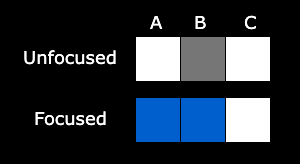
Hi Wilco,

> A is outside the text input, B is its border, C is inside…

My interpretation was: The border doesn’t contribute to the contrasting area, which is determined by the change of contrast from non-focused to focused.

“Where the contrasting area is adjacent to the component…”
If it was a visible part of the component before, and it isn’t part of the contrasting area, it is still part of the component.

On Windows (my version of Chrome at least) the B pixel starts black (or dark grey) and A is black when focused. B doesn’t change colour. Given that we are working with contrast, the result of the SC should be the same in both cases.

We can include that as an example in the understanding, and I think it overlaps a bit with the (relatively) recent additions to the non-text contrast understanding, so that needs cross-referencing.


> So how do we decide whether or not the text label is part of the component then?

I think this comes down to UIC, i.e. what is perceived as the control, including when you interact with it. There are things that have to visually change in order for the control to work for anyone, so we can work up from the visuals and platform defaults. I sense a need for more examples being added to the understanding doc…

I don’t see that as a problem for a bounding box approach to determining size. This is an issue for what you put the bounding box (or perimeter) around in the first place, which affects all sizing methods.

Also, something that I don’t think has been explicit in WCAG before is whether items in a select, or cells in an interactive grid are considered UIC themselves. I know in browser terms select-options and grid cells don’t have focus per-se, but from comments from other people I don’t think that matches their interpretation of UICs.
I.e. items in a menu, options in a select, and grid cells would be considered their own UIC that should have a focus indicator in scope.

Cheers,

-Alastair


From: Wilco Fiers

Hey Alastair,

> So the change of contrast would pass because there is blue to white change outside the component, but that contrasting area is not contrasting with the adjacent area of the component (which is now also blue?), and it’s only 1px thick. I don’t think that would pass?

[cid:ii_kzsas4o20]
Can you explain how that works? I've drawn a little diagram of what happens. For simplicity, it's just three pixels here. A is outside the text input, B is its border, C is inside. The focus indicator appears in pixel A and B, however only pixel A is part of the area of the focus indicator with sufficient contrast. A is adjacent to B, but because B is part of the focus indicator, I don't think we can say anymore that B is part of the component. Ergo, A is not adjacent to the component, so the "adjacent contrast" condition doesn't apply.

The only sort of logic I can see here is that maybe "adjacent contrast" should apply to the unfocused state of the component;
Adjacent contrast: Where the area is adjacent to the onfocused component, it has a contrast ratio of at least 3:1 against the unfocused component or a thickness of at least 2 CSS pixels.

I don't really know what the implications of such a change are. But just checking contrast while the component is focused leaves this edge case I think. Or at the very least, it leaves that as a possible interpretation.


> I’d rather not, Scott & Adrian provided quite a few realistic examples which show that the actual element (regardless of role) can be wildly different from what you think it is.
> For example, hidden inputs: https://cdpn.io/pen/debug/mdByQJm<https://eur01.safelinks.protection.outlook.com/?url=https%3A%2F%2Fcdpn.io%2Fpen%2Fdebug%2FmdByQJm&data=04%7C01%7Cacampbell%40nomensa.com%7C9a56804e297549787b5e08d9f2cddcc6%7Cebea4ad6fbbf43bd8449c56e26692c35%7C0%7C0%7C637807788269014832%7CUnknown%7CTWFpbGZsb3d8eyJWIjoiMC4wLjAwMDAiLCJQIjoiV2luMzIiLCJBTiI6Ik1haWwiLCJXVCI6Mn0%3D%7C3000&sdata=eeUVeuQ%2BpNPjQR0JBZFtpVCwNVwuxDqBd6gEJPngRQE%3D&reserved=0>,
> https://codepen.io/scottohara/pen/ZEaXjQw<https://eur01.safelinks.protection.outlook.com/?url=https%3A%2F%2Fcodepen.io%2Fscottohara%2Fpen%2FZEaXjQw&data=04%7C01%7Cacampbell%40nomensa.com%7C9a56804e297549787b5e08d9f2cddcc6%7Cebea4ad6fbbf43bd8449c56e26692c35%7C0%7C0%7C637807788269014832%7CUnknown%7CTWFpbGZsb3d8eyJWIjoiMC4wLjAwMDAiLCJQIjoiV2luMzIiLCJBTiI6Ik1haWwiLCJXVCI6Mn0%3D%7C3000&sdata=eGrXXl34Xb189NBvNveUCnB5USlAmxamJS49O8ccpJI%3D&reserved=0>
>
> That’s what really turned me off the approach of using the underlying element.

I hadn't seen that case before. Yikes, that's a difficult one. That does indeed sort of seem like a nail in the coffin of using bounding boxes... So how do we decide whether or not the text label is part of the component then? I assume we don't want it to for things that look like checkboxes. I'm particularly struck by the listbox there. Programmatically, that fieldset-looking thing should have focus, not the option inside it. Those are active elements.

I don't know what to do with that, other than to restate that going off content would mean we'd have to define content. That looks like a dead end to me, but since I don't have anything else to suggest, maybe we explore that for a while?


On Thu, Feb 17, 2022 at 4:22 PM Alastair Campbell <acampbell@nomensa.com<mailto:acampbell@nomensa.com>> wrote:
Hi Wilco,

>  the Chrome text input default example passes the current wording too. Because of that offset -1, the contrasting area is the outer 1px of that 2px focus indicator, which is only adjacent to the inner pixels, and the background around the component. So yeah, I guess that loophole exists regardless.

So the change of contrast would pass because there is blue to white change outside the component, but that contrasting area is not contrasting with the adjacent area of the component (which is now also blue?), and it’s only 1px thick. I don’t think that would pass?


> I think the UIC of a card component is whatever element has the link role. 4.1.2 requires all components to have an appropriate role. So unless there's a 4.1.2 violation, a UIC is just any component with a widget role.

That works for me in most cases. I think where a component is visually ambiguous such as a card, there need to be fall-back indicators such as role, but perhaps also what the focus indicator is associated with. I know that seems circular, but if something passes 2.4.7 it must have an indicator, therefore that can be a signal of what the interactive thing is. Also target area could be a signal.

It’s probably a useful example to add to the understanding – if the link is the thing with a role of link, just because the card’s whole area is clickable doesn’t make that the component.

> I suppose we could change this to "all elements with the role of a user interface component".

I’d rather not, Scott & Adrian provided quite a few realistic examples which show that the actual element (regardless of role) can be wildly different from what you think it is.
For example, hidden inputs: https://cdpn.io/pen/debug/mdByQJm<https://eur01.safelinks.protection.outlook.com/?url=https%3A%2F%2Fcdpn.io%2Fpen%2Fdebug%2FmdByQJm&data=04%7C01%7Cacampbell%40nomensa.com%7C9a56804e297549787b5e08d9f2cddcc6%7Cebea4ad6fbbf43bd8449c56e26692c35%7C0%7C0%7C637807788269014832%7CUnknown%7CTWFpbGZsb3d8eyJWIjoiMC4wLjAwMDAiLCJQIjoiV2luMzIiLCJBTiI6Ik1haWwiLCJXVCI6Mn0%3D%7C3000&sdata=eeUVeuQ%2BpNPjQR0JBZFtpVCwNVwuxDqBd6gEJPngRQE%3D&reserved=0>,
https://codepen.io/scottohara/pen/ZEaXjQw<https://eur01.safelinks.protection.outlook.com/?url=https%3A%2F%2Fcodepen.io%2Fscottohara%2Fpen%2FZEaXjQw&data=04%7C01%7Cacampbell%40nomensa.com%7C9a56804e297549787b5e08d9f2cddcc6%7Cebea4ad6fbbf43bd8449c56e26692c35%7C0%7C0%7C637807788269014832%7CUnknown%7CTWFpbGZsb3d8eyJWIjoiMC4wLjAwMDAiLCJQIjoiV2luMzIiLCJBTiI6Ik1haWwiLCJXVCI6Mn0%3D%7C3000&sdata=eGrXXl34Xb189NBvNveUCnB5USlAmxamJS49O8ccpJI%3D&reserved=0>

That’s what really turned me off the approach of using the underlying element.

-Alastair


--
Wilco Fiers
Axe-core & Axe-linter product owner - WCAG 3 Project Manager - Facilitator ACT Task Force
[cid:BCBD7D4B-677E-4B95-AE3F-60005DBD9EE4]
Attachments
- image/png attachment: chrome-input-focus.png
Received on Friday, 18 February 2022 11:58:00 UTC