- From: Wilco Fiers <wilco.fiers@deque.com>
- Date: Fri, 18 Feb 2022 12:00:11 +0100
- To: Alastair Campbell <acampbell@nomensa.com>
- Cc: GLWAI Guidelines WG org <w3c-wai-gl@w3.org>
- Message-ID: <CAHVyjGP=Hf5r6VRV8au3a9S4_u2k5+K1fqa0EhbfPL4iyJd6rQ@mail.gmail.com>
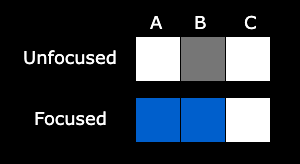
Hey Alastair,

> So the change of contrast would pass because there is blue to white
change outside the component, but that contrasting area is not contrasting
with the adjacent area of the component (which is now also blue?), and it’s
only 1px thick. I don’t think that would pass?

[image: chrome-input-focus.png]

Can you explain how that works? I've drawn a little diagram of what
happens. For simplicity, it's just three pixels here. A is outside the text
input, B is its border, C is inside. The focus indicator appears in pixel A
and B, however only pixel A is part of the area of the focus indicator with
sufficient contrast. A is adjacent to B, but because B is part of the focus
indicator, I don't think we can say anymore that B is part of the
component. Ergo, A is not adjacent to the component, so the "adjacent
contrast" condition doesn't apply.

The only sort of logic I can see here is that maybe "adjacent contrast"
should apply to the unfocused state of the component;

*Adjacent contrast*: Where the area is adjacent to the onfocused component,
it has a contrast ratio of at least 3:1 against the unfocused component or
a thickness of at least 2 CSS pixels.


I don't really know what the implications of such a change are. But just
checking contrast while the component is focused leaves this edge case I
think. Or at the very least, it leaves that as a possible interpretation.


> I’d rather not, Scott & Adrian provided quite a few realistic examples
which show that the actual element (regardless of role) can be wildly
different from what you think it is.
> For example, hidden inputs: https://cdpn.io/pen/debug/mdByQJm,
> https://codepen.io/scottohara/pen/ZEaXjQw
>
> That’s what really turned me off the approach of using the underlying
element.

I hadn't seen that case before. Yikes, that's a difficult one. That does
indeed sort of seem like a nail in the coffin of using bounding boxes... So
how do we decide whether or not the text label is part of the component
then? I assume we don't want it to for things that look like checkboxes.
I'm particularly struck by the listbox there. Programmatically, that
fieldset-looking thing should have focus, not the option inside it. Those
are active elements.

I don't know what to do with that, other than to restate that going off
content would mean we'd have to define content. That looks like a dead end
to me, but since I don't have anything else to suggest, maybe we explore
that for a while?


On Thu, Feb 17, 2022 at 4:22 PM Alastair Campbell <acampbell@nomensa.com>
wrote:

> Hi Wilco,
>
>
>
> >  the Chrome text input default example passes the current wording too.
> Because of that offset -1, the contrasting area is the outer 1px of that
> 2px focus indicator, which is only adjacent to the inner pixels, and the
> background around the component. So yeah, I guess that loophole exists
> regardless.
>
>
>
> So the change of contrast would pass because there is blue to white change
> outside the component, but that contrasting area is not contrasting with
> the adjacent area of the component (which is now also blue?), and it’s only
> 1px thick. I don’t think that would pass?
>
>
>
>
>
> > I think the UIC of a card component is whatever element has the link
> role. 4.1.2 requires all components to have an appropriate role. So unless
> there's a 4.1.2 violation, a UIC is just any component with a widget role.
>
>
>
> That works for me in most cases. I think where a component is visually
> ambiguous such as a card, there need to be fall-back indicators such as
> role, but perhaps also what the focus indicator is associated with. I know
> that seems circular, but if something passes 2.4.7 it must have an
> indicator, therefore that can be a signal of what the interactive thing is.
> Also target area could be a signal.
>
>
>
> It’s probably a useful example to add to the understanding – if the link
> is the thing with a role of link, just because the card’s whole area is
> clickable doesn’t make that the component.
>
>
>
> > I suppose we could change this to "all elements with the role of a user
> interface component".
>
>
>
> I’d rather not, Scott & Adrian provided quite a few realistic examples
> which show that the actual element (regardless of role) can be wildly
> different from what you think it is.
>
> For example, hidden inputs: https://cdpn.io/pen/debug/mdByQJm,
>
> https://codepen.io/scottohara/pen/ZEaXjQw
>
>
>
> That’s what really turned me off the approach of using the underlying
> element.
>
>
>
> -Alastair
>
>
>


--
*Wilco Fiers*
Axe-core & Axe-linter product owner - WCAG 3 Project Manager - Facilitator
ACT Task Force
Attachments
- image/png attachment: chrome-input-focus.png
- image/gif attachment: deque_logo_180p.gif

Received on Friday, 18 February 2022 11:01:37 UTC