- From: Storr, Francis <francis.storr@intel.com>
- Date: Fri, 15 Oct 2021 19:40:24 +0000
- To: John Foliot <john@foliot.ca>, Hidde de Vries <hidde@w3.org>
- CC: "Patrick H. Lauke" <redux@splintered.co.uk>, WCAG <w3c-wai-gl@w3.org>
- Message-ID: <4430A217-BBED-409D-90ED-1864502265D0@intel.com>
+1 to Wilco, Patrick, and John.

The example pages are 404ing today, so I can’t double check what I remember seeing yesterday, but:


  1.  There seemed to be an issue with focus management when the toggle buttons were “clicked” with a keyboard – focus didn’t stay on the button and Tab had to be pressed to get back to it.
  2.  Crossing out the text of a button to indicate – I think – it was unselected, was a little confusing.
  3.  If we do keep a toggle button, could it be one button instead of two?

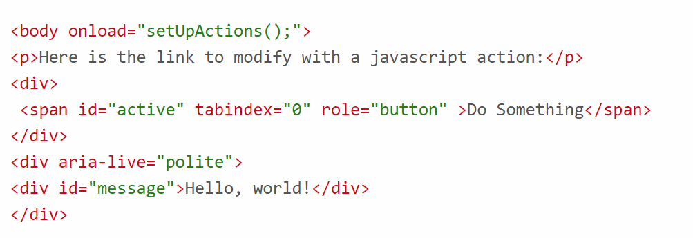
Regarding red and green color choice: I checked some other sites (ACT Rules<https://act-rules.github.io/rules/ff89c9#passed-example-1>, ARIA 1.2 Authoring Practices<https://www.w3.org/TR/wai-aria-practices-1.2/#no_aria_better_bad_aria>, ePub 3.3<https://www.w3.org/TR/epub-33/>) and they use red-ish and green colors for syntax highlighting (although the ePub spec has non-conforming contrast), so is there a conversation about color choice vs. internal consistency of design?

Francis

From: John Foliot <john@foliot.ca>
Date: Thursday, October 14, 2021 at 09:12
To: Hidde de Vries <hidde@w3.org>
Cc: "Patrick H. Lauke" <redux@splintered.co.uk>, WCAG <w3c-wai-gl@w3.org>
Subject: Re: Updating 2.x support materials redesign release
Resent-From: <w3c-wai-gl@w3.org>
Resent-Date: Thursday, October 14, 2021 at 06:12

+1 to Wilco and Patrick's comments.

I'll also note that while the colors being used on those resource appear to be passing the WCAG Color contrast requirements, I'll pose a slightly higher-level question: given that we know that red/green color-blindness is the most prevalent form of color blindness, do we really want to be using red/green 'contrast' like this?
[cid:image001.png@01D7C1C1.D2904C80]

Not a hill to die on, but I just find it curious, is all...

JF

On Thu, Oct 14, 2021 at 8:45 AM Hidde de Vries <hidde@w3.org<mailto:hidde@w3.org>> wrote:

On 14 Oct 2021, at 14:21, Patrick H. Lauke <redux@splintered.co.uk<mailto:redux@splintered.co.uk>> wrote:

One probably very subjective comment: really not a fan of the animated/transitioning focus styles. I find them unnecessarily distracting. At a stretch, could they at least be wrapped in a prefers-reduced-motion media query (as otherwise they may potentially/probably fail 2.3.3 Animation from Interactions ?)

Hi Patrick,

Thanks, I like the idea of wrapping these in prefers-reduced motion. As these are part of the WAI website stylesheet, I have added an issue<https://github.com/w3c/wai-website/issues/271> in the WAI website repository.

Best,
Hidde


—

Web Accessibility Specialist ・ https://w3.org/people/hidde ・ Web Accessibility Initiative (WAI) at World Wide Web Consortium (W3C)


--
John Foliot |
Senior Industry Specialist, Digital Accessibility |
W3C Accessibility Standards Contributor |
"I made this so long because I did not have time to make it shorter." - Pascal "links go places, buttons do things"
Attachments
- image/png attachment: image001.png

Received on Friday, 15 October 2021 19:40:56 UTC