- From: Jonathan Avila <jon.avila@levelaccess.com>
- Date: Mon, 23 Aug 2021 12:33:14 +0000
- To: "WCAG list (w3c-wai-gl@w3.org)" <w3c-wai-gl@w3.org>
- Message-ID: <BL1PR03MB6120189D94C5A0E246F1CA8FF1C49@BL1PR03MB6120.namprd03.prod.outlook.com>
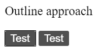
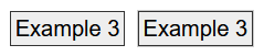
Alastair,

  *   There isn't a requirement for a button to have a contrasting border, the question at hand is what the (state) the focus indicator should contrast with.
Sorry I was not clear - I am referring to the situations where the border is used as the focus indicator.  It sounds like since the border is considered part of the element - if the border color change is the focus indicator then it has to contrast with the inner adjacent pixels and not the pixels on the outside of the border (with this proposal).

For an inset indicator it seems like there is still discussion whether it has to contrast with both adjacent colors inside or outside the ring (or only one) but only within the component.

In regards to my 2 examples that are hard to see the focus indicator - the only solution is to require adjacent contrast on both sides unless there is a substantial size difference.  But I acknowledge that this is potentially better solved with the proposed SC 2.4.11.

Best Regards,

Jonathan

From: Alastair Campbell <acampbell@nomensa.com>
Sent: Monday, August 23, 2021 4:18 AM
To: Jonathan Avila <jon.avila@levelaccess.com>
Cc: WCAG list (w3c-wai-gl@w3.org) <w3c-wai-gl@w3.org>
Subject: RE: Non-text contrast - focus indicators

CAUTION: This email originated from outside of the organization. Do not click links or open attachments unless you recognize the sender and know the content is safe.

> I'd like to come to an agreement on what is considered inside the component vs. outside.  For example, is the outline property that is not offset considered outside of the component (it's within the component's margin area)?

My assumption so far is that it has been the visual boundary (if it has one, it doesn't really matter if it doesn't have one).

So by default the outline would go around the component, on the outside. You can use a negative value on outline-offset to bring it within the component.

Overall I'd rather avoid the CSS box-model terms as what matter to the user is how it looks. You can manipulate that quite easily by having borders that match the background etc, so focusing on the visuals seems to be a better approach.


> And thus if the outline property was used a the focus indicator it would need to contrast with only the page background around the component.

Yep. (I think this is also the current interpretation by most people? That didn't seem controversial.)


> I assume the border is considered inside the component.

In CSS terms, it could be the edge (therefore inside/part-of) the component, BUT, if you have a white background, dark component background, and white border, that border shouldn't really count. In any case, adding a dark outline would then work well.


> I'm not sold that making a button's border contrast with the inside background but the button's outline contrast with the outside - is materially any different contrast wise.

There isn't a requirement for a button to have a contrasting border, the question at hand is what the (state) the focus indicator should contrast with.


> The primary difference is that when outline is used it makes the element larger as well.

For an outer outline, yes, and that's the requirement now: Contrast with the outside of the component.
For an inner outline, there are lots of possible things to contrast with with variable actual effects. I think it's a case of having some (testable) logic for non-text-contrast and using focus-appearance to plug the inevitable gap.

Your example 1:
[Two buttons with a dark grey background, the first has a black border, the second has a dark-grey border matching the button background.]

So the thick border gets darker, contrasting externally but not internally. (I thought there was a blue outline as well, but that was FF adding something.)

Example 2:
[Two dark grey buttons, the first has a thin black outline outside the button.]

I agree both are problematic, and both are good examples of why we've been working on focus-appearance.
However, what non-text-contrast metric would you suggest for these? They would both pass your earlier suggestion of contrasting with either the component or the background.

Patrick's metric of "contrast which whatever is needed to see it" would be effective if we could agree on that, but I don't think there's enough in the SC text to support that.

-Alastair


From: Alastair Campbell <acampbell@nomensa.com<mailto:acampbell@nomensa.com>>
Sent: Friday, August 20, 2021 9:55 AM
To: Jonathan Avila <jon.avila@levelaccess.com<mailto:jon.avila@levelaccess.com>>
Cc: WCAG list (w3c-wai-gl@w3.org<mailto:w3c-wai-gl@w3.org>) <w3c-wai-gl@w3.org<mailto:w3c-wai-gl@w3.org>>
Subject: RE: Non-text contrast - focus indicators

CAUTION: This email originated from outside of the organization. Do not click links or open attachments unless you recognize the sender and know the content is safe.

Hi Jon,

(Chair hat off)

You wrote:

> I'd like to propose that in this case of the border changing that the color needs to have sufficient contrast with either the adjacent control background or page background but not both.  This would allow for more flexibility than the proposal above which requires contrast with the page background when contrast with the component itself might be sufficient.

I don't think that will achieve what you are aiming for.

When I looked at various examples with an either or both scenario [1], for buttons with no (contrasting) border or background it doesn't matter.

For buttons which contrast against the background with a background and/or border, it is generally more noticeable to contrast with the outer background (assuming it's an outline that goes over the outer background).

If an outline contrasts with the component, that's when you allow the light-outline on a light background scenario:
[cid:image005.png@01D797F7.6C569990]
(The second one has a thin light-grey outline.)

For the typical case, outline, contrasting with the background of the component (rather than to the component) works better.

That's also the scenario where I'm fairly confident most people are failing it now, so it seems odd to change it in that way.


Secondly, we should try to keep a clear (as possible) line with the SC text (paraphrasing):
Visual information required to identify user interface components and states have a contrast ratio of at least 3:1 against adjacent color(s).

The SC text implies all adjacent colours, and I think that is hard to square with Patrick's suggestion of "whatever is needed to distinguish it", and for your suggestion of "contrast with either".

The logic I'm trying to apply in the proposal [2] is:

  *   If the state indicator is outside the component, test against the outer adjacency;
  *   If the state indicator is inside the component, test against the inside adjacency.
  *   If it is both inside and outside (e.g. the very odd example in the proposal where the indicator is a different shape), then at least one part of it must have contrast with adjacent colours (remembering there is no size requirement in this SC).

So that should work (and align with current understanding doc examples) for:

  *   Links /buttons with no background/border.
  *   Buttons with a contrasting background / border.
  *   Toggle buttons (and other things) with the state indicator (not just focus) inside the component.


> If there was an inset indicator that touched both the border that is black and inner control background that is blue - which one would we require comparison with?

So similar to the first example but in-between the border and background of the component?  I think there are three possible variations:

  *   If the outer border and inner background are both dark (like the example), it would have to be both.
  *   If the outer border didn't contrast with the outside background, it wouldn't really figure into the calculation. As the understanding document describes, you would consider that invisible. So the indicator would have to contrast with the outside. (And it would look odd, I can't recall seeing such an example.)
  *   If the inner background was light then I guess it could be either. A dark indicator would work better (change of contrast), but I don't see a basis for it to be required.

-Alastair


1] https://alastairc.uk/tests/wcag22-examples/focus-more-visible-2.html
2] https://docs.google.com/document/d/1xYriil533EW5DfOTDedG1g25JiVNqt0FJcQECys5n0o/edit#<https://docs.google.com/document/d/1xYriil533EW5DfOTDedG1g25JiVNqt0FJcQECys5n0o/edit>
Attachments
- image/png attachment: image003.png

- image/png attachment: image004.png
- image/png attachment: image005.png
Received on Monday, 23 August 2021 12:33:37 UTC