- From: Abma, J.D. (Jake) <Jake.Abma@ing.com>
- Date: Tue, 14 Jan 2020 07:23:04 +0000
- To: "Hall, Charles (DET-MRM)" <Charles.Hall@mrm-mccann.com>, Alastair Campbell <acampbell@nomensa.com>, WCAG list <w3c-wai-gl@w3.org>
- CC: David MacDonald <david100@sympatico.ca>
- Message-ID: <AM0PR03MB3571EE1BED63CB039E756DDAF1340@AM0PR03MB3571.eurprd03.prod.outlook.com>
"While extremely context-sensitive, there could also be a global toggle to display the visual text equivalent for each icon in each instance."

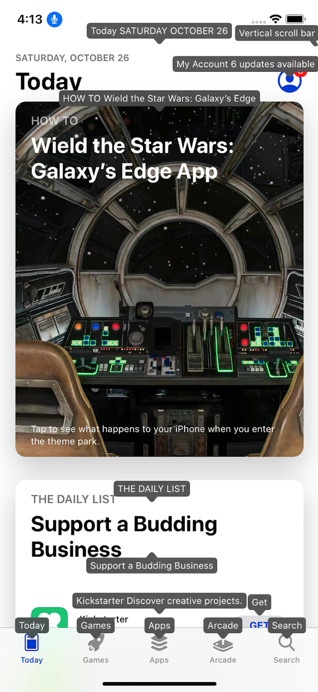
For everyones information: See the following picture of Voice Control for iOS 13, showing all accessible names, but more options available, like numbers etc.


[cid:51f5351d-a56d-4271-83ce-100ec3c4c5fc]

picture of apps showing accessible names, borrowed from a blog by Chris McMeeking
________________________________
From: Hall, Charles (DET-MRM) <Charles.Hall@mrm-mccann.com>
Sent: Saturday, January 11, 2020 6:11 PM
To: Abma, J.D. (Jake) <Jake.Abma@ing.com>; Alastair Campbell <acampbell@nomensa.com>; WCAG list <w3c-wai-gl@w3.org>
Cc: David MacDonald <david100@sympatico.ca>
Subject: Re: WCAG 2.2 status - Icon Description


Sorry, the survey questions do not seem like the best venue for my comments. And apologies if this should not go to the entire list.


I would prefer a more strict SC.

“on or before the first occurrence of an icon on the page” can still be a challenge or barrier for people (including those interpreting the SC without specific examples). This also assumes the “page” is the user’s context. There is a UX / psychology principle that helps all, but is particularly important to people with cognitive issues, of “coherence over consistency” also known as “recognition over recall”. Meaning, to recall how something works from a previous context is more difficult than recognizing how it works in the current context with no ambiguity.


But, to extend the point I understood from Jake’s comment, this could include example methods for mobile and devices with touch input, of: long touch; force touch; and on focus via AT. While extremely context-sensitive, there could also be a global toggle to display the visual text equivalent for each icon in each instance.


In my opinion, experience and preference, the icon itself should also never be hidden, covered or replaced by the visual text equivalent. So, if it is displayed on any of these events, it should be displayed adjacent to and not instead of the icon.


Thanks,


Charles Hall // Senior UX Architect

Invited Expert, W3C Accessibility Guidelines Working Group


(he//him)

charles.hall@mrm-mccann.com<mailto:charles.hall@mrm-mccann.com>

W +1.248.203.8723

M +1.248.225.8179

360 W Maple, Birmingham MI 48009

mrm-mccann.com<https://www.mrm-mccann.com/>


[MRM//McCann]

Cannes Network of the Year

Effie’s Most Creatively Effective Global Network 2018, 2019

Adweek 2019 Global Agency of the Year

IPG Agency Inclusion Vanguard – Agency of the Year 2019


From: "Abma, J.D. (Jake)" <Jake.Abma@ing.com>
Date: Saturday, January 11, 2020 at 8:29 AM
To: Alastair Campbell <acampbell@nomensa.com>, WCAG list <w3c-wai-gl@w3.org>
Cc: David MacDonald <david100@sympatico.ca>
Subject: [EXTERNAL] Re: WCAG 2.2 status - Icon Description
Resent-From: <w3c-wai-gl@w3.org>
Resent-Date: Saturday, January 11, 2020 at 8:28 AM


For me, on hover and focus seem fine, on click/tap and enter key not as this is a bit of odd behavior (activate a UIC and then show a tooltip? or clicking on NON interactive elements?)


Previous example was (as I remember) also a modal dialog and the tooltip was hidden under the overlay. At the moment this one still doesn't work on Android phone.


--------------


Also decorative / additional / supportive icons (part of label like content) NOT used as interactive label icons should not per se have tooltips.


--------------


Only the first of an icon, somewhere on the page (not necessary in the same landmark) also doesn't seem to fix the repetitiveness of icons in contrary to how it might work for abbreviations and alike.


________________________________

From: Alastair Campbell <acampbell@nomensa.com>
Sent: Wednesday, January 8, 2020 11:36 AM
To: WCAG list <w3c-wai-gl@w3.org>
Cc: David MacDonald <david100@sympatico.ca>
Subject: WCAG 2.2 status - Icon Description


Hi everyone,


Another SC-specific follow up, this one on Icon Description.


The issue it is trying to solve is how to understand icons that do not have visually associated text labels.


The main theme of the comments/discussion was around how well it works on touch platforms. For example, where an icon is a trigger for a menu, or a link, how would you present a text label? (Which is fine on desktop with a mouse or keyboard focus.)


David did include examples which appear to cover most people’s concerns, but I’m not sure if everyone has had time to consider those?

  *   Example A - A keyboard and mouse operable tooltip that shows on hover and keyboard focus
https://codepen.io/Moiety/pen/LaPvWy<https://urldefense.proofpoint.com/v2/url?u=https-3A__codepen.io_Moiety_pen_LaPvWy&d=DwMF-g&c=Ftw_YSVcGmqQBvrGwAZugGylNRkk-uER0-5bY94tjsc&r=FbsK8fvOGBHiAasJukQr6i2dv-WpJzmR-w48cl75l3c&m=7px9FRiSHdztgKz_ETtURlXNCp5UWKjZTLjdE_lsZaU&s=5FG83rGXw7AIg8qPfluKT-gp5YYKRmq31tZ16r51fIw&e=>
  *   Example B - A keyboard and mouse operable tooltip that shows on click/tap and Enter key
https://codepen.io/dmacd100/pen/eYYBWNK<https://urldefense.proofpoint.com/v2/url?u=https-3A__codepen.io_dmacd100_pen_eYYBWNK&d=DwMF-g&c=Ftw_YSVcGmqQBvrGwAZugGylNRkk-uER0-5bY94tjsc&r=FbsK8fvOGBHiAasJukQr6i2dv-WpJzmR-w48cl75l3c&m=7px9FRiSHdztgKz_ETtURlXNCp5UWKjZTLjdE_lsZaU&s=dEgEhsUvIZBMlSVAQRCAWIKbdS_m4U6kDbIJMBG4u_o&e=>

There are some text-edits/suggestions in the comments, but the main thing is: Do people agree that it would improve the situation for people with disabilities, and that it applies to all content across all websites & technologies?


If you could consider that and please update the Survey: https://www.w3.org/2002/09/wbs/35422/icon-desc-acceptance/<https://urldefense.proofpoint.com/v2/url?u=https-3A__www.w3.org_2002_09_wbs_35422_icon-2Ddesc-2Dacceptance_&d=DwMF-g&c=Ftw_YSVcGmqQBvrGwAZugGylNRkk-uER0-5bY94tjsc&r=FbsK8fvOGBHiAasJukQr6i2dv-WpJzmR-w48cl75l3c&m=7px9FRiSHdztgKz_ETtURlXNCp5UWKjZTLjdE_lsZaU&s=C5Ar5UzuHKQbaXPNq50HLSjE5l6w5XDLWIrG5sVjj9Q&e=>


Then we’ll know whether to progress.


Kind regards,


-Alastair


Doc: https://docs.google.com/document/d/1HzSsCGelWfz_Z-M7NyUzJOvl1A1kAStyl8epYdpZhoA/edit#heading=h.u26dvsexm72w<https://urldefense.proofpoint.com/v2/url?u=https-3A__docs.google.com_document_d_1HzSsCGelWfz-5FZ-2DM7NyUzJOvl1A1kAStyl8epYdpZhoA_edit-23heading-3Dh.u26dvsexm72w&d=DwMF-g&c=Ftw_YSVcGmqQBvrGwAZugGylNRkk-uER0-5bY94tjsc&r=FbsK8fvOGBHiAasJukQr6i2dv-WpJzmR-w48cl75l3c&m=7px9FRiSHdztgKz_ETtURlXNCp5UWKjZTLjdE_lsZaU&s=ibFtYxRRGuwsrtOjxi3h37jDRNR22-RWB8qQMp1tA8M&e=>

Minutes: https://www.w3.org/2020/01/07-ag-minutes.html#item06<https://urldefense.proofpoint.com/v2/url?u=https-3A__www.w3.org_2020_01_07-2Dag-2Dminutes.html-23item06&d=DwMF-g&c=Ftw_YSVcGmqQBvrGwAZugGylNRkk-uER0-5bY94tjsc&r=FbsK8fvOGBHiAasJukQr6i2dv-WpJzmR-w48cl75l3c&m=7px9FRiSHdztgKz_ETtURlXNCp5UWKjZTLjdE_lsZaU&s=hMCqlBABOFCtyMDEvvMddZycCJ3xGcX16NrEYECsv_0&e=>


-----------------------------------------------------------------

ATTENTION:

The information in this e-mail is confidential and only meant for the intended recipient. If you are not the intended recipient, don't use or disclose it in any way. Please let the sender know and delete the message immediately.

-----------------------------------------------------------------

This message contains information which may be confidential and privileged. Unless you are the intended recipient (or authorized to receive this message for the intended recipient), you may not use, copy, disseminate or disclose to anyone the message or any information contained in the message. If you have received the message in error, please advise the sender by reply e-mail, and delete the message. Thank you very much.

-----------------------------------------------------------------
ATTENTION:
The information in this e-mail is confidential and only meant for the intended recipient. If you are not the intended recipient, don't use or disclose it in any way. Please let the sender know and delete the message immediately.
-----------------------------------------------------------------
Attachments
- image/jpeg attachment: image001.jpg

- image/png attachment: image.png

Received on Tuesday, 14 January 2020 07:27:02 UTC