- From: Jonathan Avila <jon.avila@levelaccess.com>
- Date: Fri, 3 Jan 2020 19:44:56 +0000
- To: "Newton, Brooks (TR Product)" <Brooks.Newton@thomsonreuters.com>, "w3c-wai-gl@w3.org" <w3c-wai-gl@w3.org>
- Message-ID: <BN6PR03MB313913C03EDEF84C7B82CBA7F1230@BN6PR03MB3139.namprd03.prod.outlook.com>
Hi Brooks, I totally agree. An example from Slack is the Description text label in the Channel details pane - when hovered over with the mouse or focused an edit link appears - otherwise you'd have no idea it was editable.
[cid:image001.png@01D5C244.5126A730]
Jonathan
From: Newton, Brooks (TR Product) <Brooks.Newton@thomsonreuters.com>
Sent: Friday, January 3, 2020 12:37 PM
To: w3c-wai-gl@w3.org
Subject: Examples of interactive elements with what I consider missing or inadequate affordances
CAUTION: This email originated from outside of the organization. Do not click links or open attachments unless you recognize the sender and know the content is safe.
Hi All,
In a previous working group meeting, someone suggested that interactive elements without adequate affordances are "edge case scenarios" that users wouldn't frequently encounter online. In advance of our discussion of the proposed Visual Indicators Success Criterion, I wanted to send out some examples of interactive components that could cause confusion to sighted users based on the lack of visual affordances, or use of non-traditional visual affordances that connote interactivity.
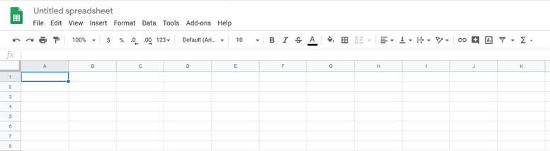
This Google Sheets editable document title ("Untitled spreadsheet") doesn't look interactive to me upon page load.
[The phrase "Untitled spreadsheet" is presented at the top left of the online document, but is missing traditional affordances, such as a rectangle around the pre-populated text and a proper input label to indicate that the title is in fact an interactive page element.]
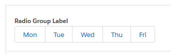
This Lightning Design System radio button group doesn't look like a group of mutually exclusive radio button choices to me.
[Lightning Design System radio group comprised of five adjacent squares with Mon, Tue, Wed, Thu and Fri listed inside of the squares.]
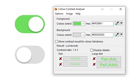
Unidentified set of toggle switches, where the lack of a darkened nub makes it tricky to determine which switch is in the "on" position.
[On and off toggle switch inputs where the switch backgrounds for on and off don't meet the color contrast ratio requirement for non-text content, and where the nubs for both switches are white]
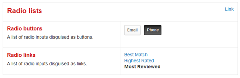
Radio lists from the Yelp Style Guide, including what I consider a misleading affordance for Radio links that makes the group look like linked and unlinked text and not a list of mutually exclusive choices.
[Yelp Style Guide examples of radio lists where radio buttons that are styled to look like push buttons and where radio links are styled to look like linked and unlinked text.]
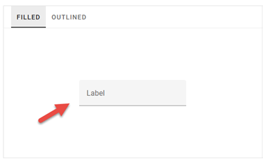
Material Design filled text input with placeholder text looks to me like a non-interactive text phrase positioned above a horizontal rule. Low color contrast between the filled input background and page background (1.1:1) make it indistinguishable to some sighted users.
[Material Design filled input with low contrast textbox input background and a single horizontal line at the bottom of the input area.]
These are not edge case scenarios. All but one of the examples I've provided above are from design systems that are marketed to be used over and over by the masses. There are more examples of ambiguous and misleading interactive element affordances out there in the wild. If anyone from the group has more examples to share, please do.
Thanks!
Brooks
* * * * * * * * * * * * * * * * * * * * * * * * * * * * * * * * * * * * * * *
Brooks Newton
Sr. Accessibility Specialist
Thomson Reuters
the answer company
This e-mail is for the sole use of the intended recipient and contains information that may be privileged and/or confidential. If you are not an intended recipient, please notify the sender by return e-mail and delete this e-mail and any attachments. Certain required legal entity disclosures can be accessed on our website: https://www.thomsonreuters.com/en/resources/disclosures.html
Attachments
- image/png attachment: image001.png

- image/png attachment: image004.png
- image/png attachment: image011.png
- image/png attachment: image012.png
- image/png attachment: image013.png
- image/png attachment: image014.png
Received on Friday, 3 January 2020 19:45:02 UTC