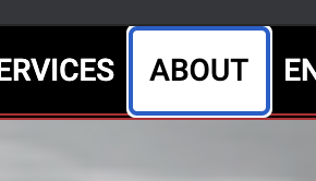
This is part of a set of accessibility improvements that Microsoft and Google are working on for Chromium—it rolled out a few weeks ago. The new focus states are covered in this Updates To Form Controls And Focus<https://blog.chromium.org/2020/03/updates-to-form-controls-and-focus.html> blog post, and this joint HTML Isn’t Done! presentation<https://www.youtube.com/watch?v=ZFvPLrKZywA> from November last year is worth watching to see how the two companies are working together.

—
Francis

From: David MacDonald <david@can-adapt.com>
Date: Wednesday, June 17, 2020 at 14:37
To: WCAG Editors <team-wcag-editors@w3.org>, WCAG <w3c-wai-gl@w3.org>, Alastair Campbell <acampbell@nomensa.com>
Subject: Chrome seems to have a 2 colour focus indicator by default on Mac
Resent-From: <w3c-wai-gl@w3.org>
Resent-Date: Wednesday, June 17, 2020 at 14:35

[cid:image001.png@01D644B5.C67B7F80]


[cid:image002.png@01D644B5.C67B7F80]
[cid:image003.png@01D644B5.C67B7F80]


Cheers,
David MacDonald


CanAdapt Solutions Inc.
Mobile:  613.806.9005

LinkedIn
<http://www.linkedin.com/in/davidmacdonald100>

twitter.com/davidmacd<http://twitter.com/davidmacd>

GitHub<https://github.com/DavidMacDonald>

www.Can-Adapt.com<http://www.can-adapt.com/>


  Adapting the web to all users
            Including those with disabilities

If you are not the intended recipient, please review our privacy policy<http://www.davidmacd.com/disclaimer.html>


