- From: Steve Lee <stevelee@w3.org>
- Date: Tue, 12 May 2020 09:43:27 +0100
- To: w3c-wai-gl@w3.org
- Message-ID: <217dcd79-11d6-75f5-887a-f6c33054c14a@w3.org>
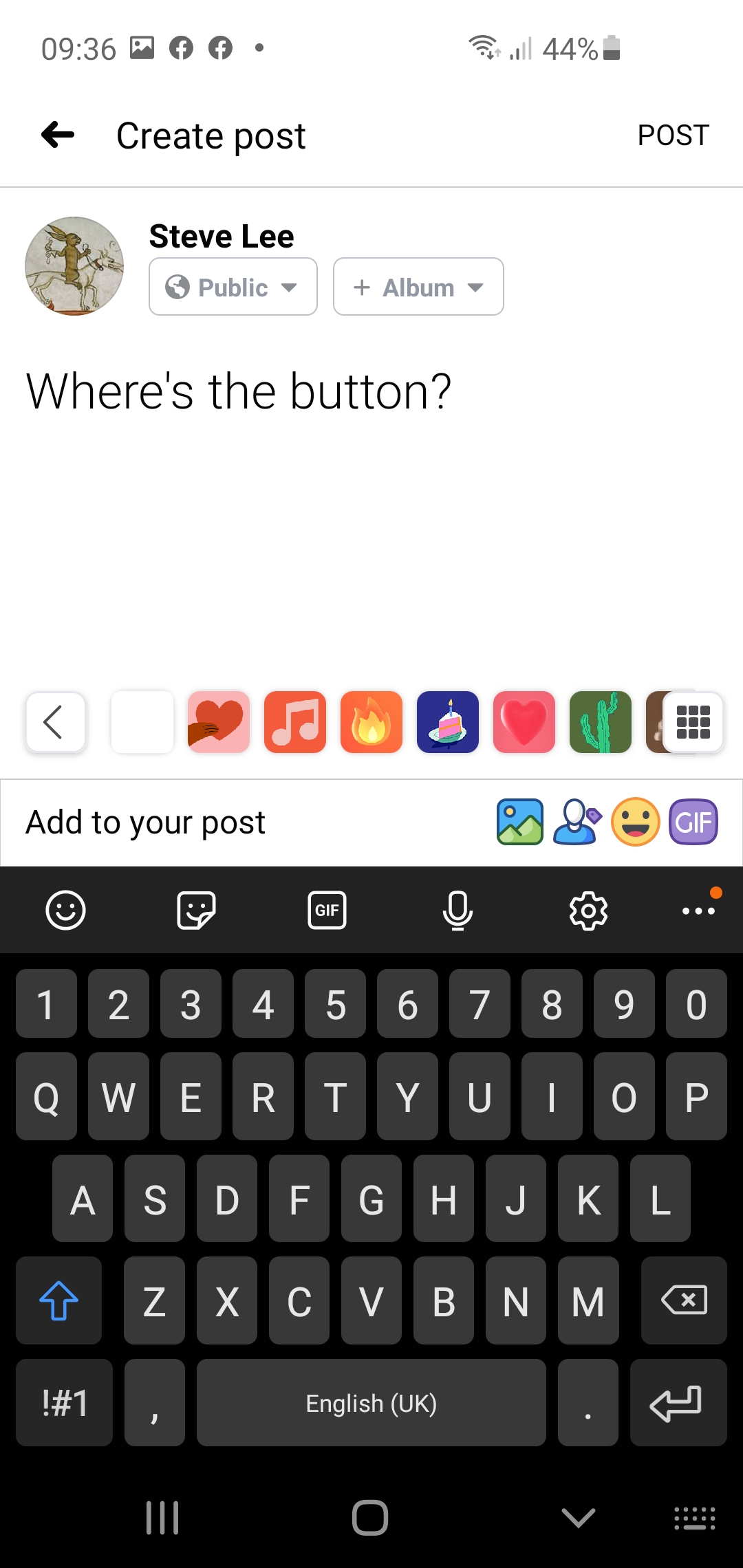
Thanks Rachael

I've attached a screen shot of the Facebook Android App (not web) where
the 'POST' text is top right and easily confused with the title text
just to it's left. It's slightly grey, in caps and raised above the
baseline but otherwise has no affordance at all.

Steve


On 08/05/2020 22:10, Rachael Bradley Montgomery wrote:
> Hello,
>
> I've spent some time working through a few examples with the proposed
> new language for visual indicators. I've also pulled together some
> definitions for Font styling and Spacing. The link is Visual Indicators
> Examples (New)
> <https://docs.google.com/document/d/1SgwInDzCzJXJ9RZ9q5ktr3GxWYCTKkrmCInIdO4Qc10/edit> and is
> on the SC Document as well.
>
> If you have time before Tuesday, I recommend you check out the front
> page of two sites and consider what would pass and fail on each based on
> the SC language you prefer:
>
>   * CNN.com <http://CNN.com>
>   * Fitbit.com <http://Fitbit.com>
>
> I've included questions that were still outstanding for me at the bottom
> of my document.
>
> Best regards,
>
> Rachael
> --
> Rachael Montgomery, PhD
> Director, Accessible Community
> rachael@accessiblecommunity.org <mailto:rachael@accessiblecommunity.org>
>
> "I will paint this day with laughter;
> I will frame this night in song."
>   - Og Mandino
>
Attachments
- image/jpeg attachment: Facebook_Post.jpg
Received on Tuesday, 12 May 2020 08:43:31 UTC