- From: Abma, J.D. (Jake) <Jake.Abma@ing.com>
- Date: Tue, 10 Dec 2019 07:27:11 +0000
- To: "Patrick H. Lauke" <redux@splintered.co.uk>, "w3c-wai-gl@w3.org" <w3c-wai-gl@w3.org>
- Message-ID: <VI1PR03MB44626F9B10CC50E547D30156F15B0@VI1PR03MB4462.eurprd03.prod.outlook.com>
+/- 1

Next to Wilco's examples I'm also still a bit concerned for bigger click area's / touch targets to make UICs more usable.


  1.  AREA

If we take the following two examples from the Understanding doc there's a maximum of creating bigger touch area's before you get "punished" for making it bigger. The rational for a pass is the indicator related to the size of the button.
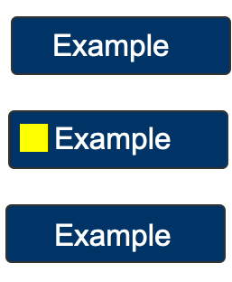
[Three dark blue buttons on a white background. The middle button has a thick yellow line under the text.]The thick (3px) yellow underline is almost as long as the longest edge therefore meets the requirment.[Three dark blue buttons on a white background. The middle button has a yellow square to the left of the text.]The 14px by 14px yellow square is 196px therefore meets the requirment.
In these two cases the focus indicator passes the SC / the yellow indicators are big enough.
BUT, from a visual perspective, IF the indicators stay the same but you 'enlarge' the touch target area and make that also focusable, suddenly you fail this same SC. I guess that is not what we want.

example wider buttons, still same indicator BUT a fail now:

[cid:8f87d0c6-9eae-408a-a68c-33fcf86c7fdc]
example bigger touch area, same indicator, BUT a fail now:

[cid:0aa031eb-ada7-4fa7-a81d-b36683c19bc7]
Think this is hard to explain, and mobile Vs. desktop this happen a lot in slightly different scenarios / visual examples.

2. MULTIPLE FOCUS

Not covered yet is the fact that we can have more than 1 focus are.
Like with a combobox, where the browser focus and AT focus can be the same (roving tabindex) OR can be in two different places (aria activedescendant) where the browser focus stays in the input / text field (so you can type when you like) BUT the AT focus is at a parent element 'watching' where the arrow keys place the focus to (ID) and this option like element receives the visible focus ALSO.

Cheers!


________________________________
From: Patrick H. Lauke <redux@splintered.co.uk>
Sent: Tuesday, December 10, 2019 12:26 AM
To: w3c-wai-gl@w3.org <w3c-wai-gl@w3.org>
Subject: Re: CfC - Add Focus Visible (Enhanced) to WCAG 2.2 draft

On 06/12/2019 13:46, Alastair Campbell wrote:
> Call For Consensus — ends 11th Dec 2019 at 12:00 (midday) Boston time.
>
> The Working Group has discussed adding a new success criteria to the
> WCAG 2.2 editors draft, “focus visible (enhanced)”.
>
> The specific changes are detailed in this pull request:
>
> https://github.com/w3c/wcag/pull/936
>
> Call minutes: https://www.w3.org/2019/10/22-ag-minutes.html#item03
>
> Survey:
> https://www.w3.org/2002/09/wbs/35422/focus-vis-enh-acceptance/results
>
> If you have concerns about this proposed consensus position that have
> not been discussed already and feel that those concerns result in you
> “not being able to live with” this decision, please let the group know
> before the CfC deadline.

Coming in late on this, I am wondering about the third point:

"The focus indication area has a 3:1 contrast ratio against all adjacent
colors for the minimum area or greater, or has a thickness of at least 2
CSS Pixels."

doesn't the "or" clause then simply allow absolutely faint contrast
ratio to be used, as long as the thickness is 2 CSS pixels?

I'm assuming this is supposedly then covered by the following note

"A focus indicator that is larger than the minimum area may have parts
that do not meet the 3:1 contrast ratio, as long as an area equal to the
minimum does meet the contrast ratio."

But, if this is a hard requirement, shouldn't it be part of the third
bullet? Also, what about focus indicators that are *exactly* the minimum
area (so not "larger than"). Would they also escape this clause?

P
--
Patrick H. Lauke

www.splintered.co.uk<http://www.splintered.co.uk> | https://github.com/patrickhlauke
http://flickr.com/photos/redux/ | http://redux.deviantart.com
twitter: @patrick_h_lauke | skype: patrick_h_lauke


-----------------------------------------------------------------
ATTENTION:
The information in this e-mail is confidential and only meant for the intended recipient. If you are not the intended recipient, don't use or disclose it in any way. Please let the sender know and delete the message immediately.
-----------------------------------------------------------------
Attachments
- image/png attachment: focus-indicator-icon-stacked.png

- image/png attachment: focus-indicator-icon-bigger-touch.png

Received on Tuesday, 10 December 2019 07:27:19 UTC