- From: Glenda Sims <glenda.sims@deque.com>
- Date: Wed, 24 Jan 2018 10:44:59 -0600
- To: Alastair Campbell <acampbell@nomensa.com>
- Cc: WCAG <w3c-wai-gl@w3.org>
- Message-ID: <CAH2ngET5CAfBkYiZurrvCqUQiTdX4iWmgRQyWXvkQLWmyExodw@mail.gmail.com>
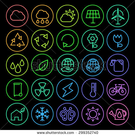
Alastair,

What about this group of flat gradient icons for social media:
https://orig00.deviantart.net/00c4/f/2014/048/7/7/flat_gradient_social_media_icons_by_limav-d76kj42.jpg

Or this library of gradient icons
https://www.vecteezy.com/free-vector/gradient-icon

Or this image of gradient icons on a black background
[image: Inline image 1]

G


glenda sims  |   team a11y lead   |    deque.com    |    512.963.3773
*web for everyone. web on everything.* -  w3 goals

[image: IAAP International Association of Accessibility Professionals:
Certified Professional in Accessibility Core Competencies (CPACC)]
<http://www.accessibilityassociation.org/certification>


On Tue, Jan 23, 2018 at 10:46 AM, Alastair Campbell <acampbell@nomensa.com>
wrote:

> Hi everyone,
>
>
>
> I’ve been continuing to find examples and test the SC (and understanding
> doc), you can see some here:
>
> https://docs.google.com/presentation/d/1bvukTWBNTuC0ABk40fH8i194B0Gmb
> -qoUZukE-W6_TU/edit?usp=sharing
>
>
>
> (I’m afraid it does need sight to understand. Hopefully not perfect sight,
> I zoom in a lot on small icons.)
>
>
>
> Taking some popular sites (e.g. Github, BBC) and even an app (Outlook),
> I’m struggling to find examples of icons which are difficult to test. In
> fact, most icons I’ve tested so far pass fairly easily, and obviously.
>
>
>
> I’ll look at more complex infographics next, but can anything think of a
> site which uses complex icons (e.g. with gradients, lots of colours), that
> aren’t supplementary to text?
>
>
>
> Kind regards,
>
>
>
> -Alastair
>
>
>
> --
>
>
>
> www.nomensa.com
> tel: +44 (0)117 929 7333 <+44%20117%20929%207333> / 07970 879 653
> follow us: @we_are_nomensa or me: @alastc
> Nomensa Ltd. King William House, 13 Queen Square, Bristol BS1 4NT
> <https://maps.google.com/?q=13+Queen+Square,+Bristol+BS1+4NT&entry=gmail&source=g>
>
>
>
> Company number: 4214477 | UK VAT registration: GB 771727411
>
Attachments
Received on Wednesday, 24 January 2018 16:45:24 UTC