- From: John Foliot <john.foliot@deque.com>
- Date: Fri, 22 Jun 2018 10:27:30 -0500
- To: David MacDonald <david100@sympatico.ca>
- Cc: Joshue O Connor - InterAccess <josh@interaccess.ie>, Jonathan Avila <jon.avila@levelaccess.com>, Eric Eggert <ee@w3.org>, GLWAI Guidelines WG org <w3c-wai-gl@w3.org>, "Patrick H. Lauke" <redux@splintered.co.uk>, Wilco Fiers <wilco.fiers@deque.com>
- Message-ID: <CAKdCpxwrFMEJ6A-ZyypyrWfoD46N==W9vEcLqxB5ki9pPmmTRg@mail.gmail.com>
Hi Alastair,
Thanks for taking the time to respond. Comments inline. (Question: where do
your images come from?)
Kinda missing the point, let me try again. If you have a button, it has a
foreground and background, e.g.
button {color: #000; background-color: #fff;}
Neither of those affects the default outline colour. That’s the techie CSS
part of the point.
Actually Alastair, I believe *you* are missing my point. Let's look at the
button you just declared. If your CSS was part of this:
body {background-color:#fff;}
button {color: #000; background-color: #fff;}
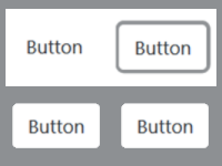
[image: Two buttons, the first with no visual indicator except text saying
'button'. The second is the same but with an added grey border.]
...then that button's active state indication will likely show up on that
page. But what happens when I change the background color to "gray"
(#8D9093)
body {background-color:#8D9093;}
button {color: #000; background-color: #fff;}
You've lost your visible tab focus. The argument for the permissive reading
would say this is OK, that it is exempt from the SC.
Thankfully it's fairly easy to remediate:
body {background-color:#8D9093;}
button {color: #000; background-color: #fff; padding: 1px; border: 1px
solid #8D9093;}
button:focus {color: #000; background-color: #fff; padding: 1px; border:
1px dashed #fff;}
Also, in some browsers the focus indicator is *inside* the component (for
buttons), in some it’s outside (for links, always I think).
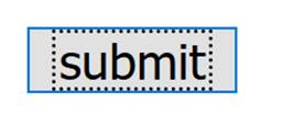
[image: Default FF submit button with dotted outline around the text within
the button.]
Yes, that appears to be the default in Firefox today, but instead, what if
it was this?
button {color: #fff; background-color: #000;}
Are you suggesting that because the author has not modified the focus state
indicator, that the dotted black lines around the text "submit" (they ARE
there, it's just, you know, black on black) that this should not fail?
> So you are agreeing then that state indications (aka focus indication) is
different than "component"
It can be, but not necessarily. It is more complex. The indicator could be:
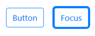
- Extra thickness added to the outer border, (like the default in most
browsers) e.g.
- [image: Two buttons on a white background. The first has a blue
border to indicate its boundary, white internal background and blue text.
The second adds a thick blue-grey outer border to show focus.]
- A link/button without a border gets one, e.g.
- [image: Two buttons, the first with no visual indicator except text
saying 'button'. The second is the same but with an added grey border.]
- A reversal of colour scheme, e.g:
- [image: Two buttons, the first has a blue outline and inner white
background with blue text. The second has a blue background with white
text, reversing the color scheme.]
- An additional (contrasting) graphic added inside or outside the
component boundary (e.g. a triangle, or a line like on the WAI site nav).
All of these examples share the same problem as the first example: you are
not taking into consideration the background color, which *directly*
impacts the 'native' visible focus indication:
Per your reading of the exception clause, the example directly above would
Pass. That is what you seem to be arguing.
If you have changed the focus style, then yes that should be good, and
there are many options. However, if you haven’t touched the focus style
then it should be the responsibility of the user-agent to display that
properly.
in other words... "If the developer is not attuned enough to ensure visible
tab focus is always present, then the browser should somehow be smart
enough to pick up the slack." That is the flippant (but not disrespectful)
way I am reading your response Alastair, sorry. I cannot buy that.
> "Setting the page background..." - developers and designers are already
doing this today - at scale and in fact a "norm"
Agreed. It just means (in your interpretation) that the exception is always
applied. Why have it? (That’s flippant, we have it, but it points to that
not being the intent.)
Good question: My read is for when nothing has been styled (then you are
dependent on ALL the browser defaults), or when a user-agent technically
cannot be modified by the content author (forced user-agent defaults). The
exception clause is supposed to cover the edge and corner cases, not leave
a gaping door wide open to abuse.
Also, the definition of state is tied to the component, so if you take the
view that any change to the component at all means the whole exception
doesn’t apply, then that applies to states as well. That seems extreme,
especially considering the next point.
I strongly disagree. Here is our normative definition of "state":
state
dynamic property expressing characteristics of a user interface component
that may change in response to user action or automated processes
States do not affect the nature of the component, but
*represent data associated with the component* or user interaction
possibilities. Examples include focus, hover, select, press, check,
visited/unvisited, and expand/collapse.
"...represent data *associated* with the component..."
says to me it is separate but related, which the visual rebuttals I've
offered illustrate.
> "...the size of a checkbox..." - unrelated to this Contrast SC: size has
nothing to do with color.
Not so, the SC text says when the ‘appearance’ is changed (for good reason
because we’re flexible about what the indicators are). That will happen
with a change of font (which inherits from the parent elements) or when the
size is changed, it isn’t just colour.
Then let me restate that: size has nothing to do with visible tab focus,
however visible tab focus requires a minimum contrast ratio to be
perceivable.
I’ll drop the point around changes over time, as you’re effectively arguing
for *always* setting focus colour.
Effectively, *yes*. At the risk of being a broken record: *if you modify
any of the browser default colors (including background), then the author
is responsible for all other color choices, as changing one aspect of the
browser's default "palette" means you are responsible for all of the
downstream impact(s) of that choice. *
I personally cannot envision designers or developers pushing back on that
statement, the sheer logic of it being (at least to me) more than obvious.
"If you change the background color to black, you MUST change the text to
something with sufficient contrast" is so simplistic as to be laughable, so
all we're saying is continue with the same logic, and know that visible tab
focus needs a minimum contrast ratio as well. What designer is not going to
get that quickly? We're not mandating a specific technique here, we're
simply ensuring the intent is understood: if you cannot perceive the
visible tab focus, it's really not there in practice (even if it is there
in principle).
JF
On Fri, Jun 22, 2018 at 8:56 AM, John Foliot <john.foliot@deque.com> wrote:
> > I'm not suggesting we soften it, I'm suggesting we don't widen it.
>
> ...and I'm not saying to widen it, I'm saying we use the precise reading
> of the exception clause, which both Wilco and Eric have agreed is in
> keeping with my proffered interpretation: that "components" may be exempt,
> "states" are not.
>
> It is the difference between:
>
> Visual information required to identify user interface components
> <https://www.w3.org/TR/WCAG21/#dfn-user-interface-components> and states
> <https://www.w3.org/TR/WCAG21/#dfn-states>, except for inactive
> components or where the appearance of the component is determined by the
> user agent and not modified by the author;
>
> and:
>
> Visual information required to identify user interface components
> <https://www.w3.org/TR/WCAG21/#dfn-user-interface-components> and states
> <https://www.w3.org/TR/WCAG21/#dfn-states>, except for inactive
> components or where the appearance of the component
>
> *OR STATE*
>
> is determined by the user agent and not modified by the author;
>
>
>
> ...which, BTW, even those on the LVTF have admitted was originally the
> intent of this SC (before it got merged and mangled).
>
> If I really had my way, we'd re-open this to instead say:
>
> Visual information required to identify user interface components
> <https://www.w3.org/TR/WCAG21/#dfn-user-interface-components> and states
> <https://www.w3.org/TR/WCAG21/#dfn-states>, except for inactive
> components or where the appearance of the component *or state* is
> determined by the user agent and *can *not *be *modified by the author;
>
>
> ...but, it's too late now to change the normative text, but not still too
> late from using the Understanding and Techniques documents to underscore
> this intent. I am at a loss as to why we don't want to pursue that approach.
>
> JF
>
> On Fri, Jun 22, 2018 at 8:47 AM, David MacDonald <david100@sympatico.ca>
> wrote:
>
>> > I fail to see how a primary target audience for any given SC should
>> somehow soften or weaken the SC.
>>
>> I'm not suggesting we soften it, I'm suggesting we don't widen it.
>>
>> Cheers,
>> David MacDonald
>>
>>
>>
>> *Can**Adapt* *Solutions Inc.*
>>
>> Tel: 613.235.4902
>>
>> LinkedIn
>> <http://www.linkedin.com/in/davidmacdonald100>
>>
>> twitter.com/davidmacd
>>
>> GitHub <https://github.com/DavidMacDonald>
>>
>> www.Can-Adapt.com <http://www.can-adapt.com/>
>>
>>
>>
>> * Adapting the web to all users*
>> * Including those with disabilities*
>>
>> If you are not the intended recipient, please review our privacy policy
>> <http://www.davidmacd.com/disclaimer.html>
>>
>> On Fri, Jun 22, 2018 at 9:34 AM, John Foliot <john.foliot@deque.com>
>> wrote:
>>
>>> > This SC is aimed at improving the experience for low vision users, the
>>> focus indicator is generally for keyboard users.
>>>
>>> And...?
>>>
>>> I fail to see how a primary target audience for any given SC should
>>> somehow soften or weaken the SC. I'll respond to that statement with:
>>>
>>> *This SC is aimed at improving the experience for users, and the focus
>>> indicator is generally for those users who require it. *
>>>
>>> https://www.w3.org/WAI/perspective-videos/contrast/ - "...essential for
>>> people with disabilities and useful for all."
>>>
>>> JF
>>>
>>>
>>>
>>> On Fri, Jun 22, 2018 at 4:24 AM, David MacDonald <david100@sympatico.ca>
>>> wrote:
>>>
>>>> > ... IMO within the twin cultures of MVP and minimum compliance
>>>> without the push of that 30% nothing more would be done.
>>>>
>>>> I hope that proves to be true. History will tell ... In the meantime,
>>>> I suggest we not get too strident in the interpretation of our new SCs,
>>>> until we see what happens with what we've put out there. We
>>>> say in our standard
>>>> "The Working Group considers that WCAG 2.1 incrementally advances web
>>>> content accessibility guidance for all these areas..."
>>>>
>>>> Let's keep it "incremental" ...
>>>>
>>>>
>>>> Cheers,
>>>> David MacDonald
>>>>
>>>>
>>>>
>>>> *Can**Adapt* *Solutions Inc.*
>>>>
>>>> Tel: 613.235.4902
>>>>
>>>> LinkedIn
>>>> <http://www.linkedin.com/in/davidmacdonald100>
>>>>
>>>> twitter.com/davidmacd
>>>>
>>>> GitHub <https://github.com/DavidMacDonald>
>>>>
>>>> www.Can-Adapt.com <http://www.can-adapt.com/>
>>>>
>>>>
>>>>
>>>> * Adapting the web to all users*
>>>> * Including those with disabilities*
>>>>
>>>> If you are not the intended recipient, please review our privacy policy
>>>> <http://www.davidmacd.com/disclaimer.html>
>>>>
>>>> On Fri, Jun 22, 2018 at 4:03 AM, Joshue O Connor - InterAccess <
>>>> josh@interaccess.ie> wrote:
>>>>
>>>>> David MacDonald wrote:
>>>>>
>>>>> These fast implementation cycles are based on the AGILE world... and
>>>>> in the AGILE world we also have Minimal Viable product (MVP) delivery which
>>>>> I'd say we've overstepped a bit with a 30% increase with this version.
>>>>> Let's not widen it further right now.
>>>>>
>>>>> While I hear your point, I don't think we have overstepped at all. IMO
>>>>> within the twin cultures of MVP and minimum compliance without the
>>>>> push of that 30% nothing more would be done.
>>>>>
>>>>> --
>>>>> Joshue O Connor
>>>>> Director | InterAccess.ie
>>>>>
>>>>
>>>>
>>>
>>>
>>> --
>>> John Foliot
>>> Principal Accessibility Strategist
>>> Deque Systems Inc.
>>> john.foliot@deque.com
>>>
>>> Advancing the mission of digital accessibility and inclusion
>>>
>>
>>
>
>
> --
> John Foliot
> Principal Accessibility Strategist
> Deque Systems Inc.
> john.foliot@deque.com
>
> Advancing the mission of digital accessibility and inclusion
>
--
John Foliot
Principal Accessibility Strategist
Deque Systems Inc.
john.foliot@deque.com
Advancing the mission of digital accessibility and inclusion
Attachments
- image/png attachment: buttons.png

- image/png attachment: image.png

- image/png attachment: image007.png

- image/png attachment: image006.png

- image/png attachment: 05-image.png

- image/jpeg attachment: image001.jpg

- image/png attachment: image003.png

Received on Friday, 22 June 2018 15:28:01 UTC