- From: Jonathan Avila <jon.avila@levelaccess.com>
- Date: Wed, 30 May 2018 23:14:03 +0000
- To: Michael Gower <michael.gower@ca.ibm.com>, David MacDonald <david100@sympatico.ca>
- CC: Andrew Kirkpatrick <akirkpat@adobe.com>, WCAG <w3c-wai-gl@w3.org>, Wilco Fiers <wilco.fiers@deque.com>
- Message-ID: <BY2PR03MB393B3C8985BAE9C21ED2A8BF16C0@BY2PR03MB393.namprd03.prod.outlook.com>
* Once we've dropped this as a measurement, I think we still get a readily testable scope if we only say we care about state indication for UI components. If the SC just read "Visual information used to indicate states of user interface components..."
I would not like to limit this SC to just state – If people use other markers to communicate a UI control those markers very much should have sufficient contrast. This change allows for other markers to be used other than boundary such as underline. Personally low contrast borders would help me more than no border at all. I agree where we arrived was not optimal and boundaries with better contrast would be good in some cases – but we don’t fully understand the problems that could also be introduced.
Jonathan
From: Michael Gower <michael.gower@ca.ibm.com>
Sent: Wednesday, May 30, 2018 5:11 PM
To: David MacDonald <david100@sympatico.ca>
Cc: Andrew Kirkpatrick <akirkpat@adobe.com>; WCAG <w3c-wai-gl@w3.org>; Wilco Fiers <wilco.fiers@deque.com>
Subject: Re: Resolving 1.4.11
This is what I was trying, not very clearly, to drive at on this last call. Yes, I'm sad we've decided we don't want to force designers to provide boundaries (if present) with sufficient contrast -- but I get the issues.
Once we've dropped this as a measurement, I think we still get a readily testable scope if we only say we care about state indication for UI components. If the SC just read "Visual information used to indicate states of user interface components..." that would mean that all UI components, be they buttons, tab items or inputs, would need to have a 3:1 focus indicator, and where appropriate would need to have a selected indicator. That would be relatively clear to all. I'm thinking that a clean retreat is giving up more ground, but leaves less wounded on the battle field.
Dropping "boundaries" and replacing with "required to identify" results in increased discretionary room for designers, but also results in an increase in the level of debate about which visual information is necessary to ID the component.
Like Wilco, I'm not voting this down, but I do feel that it not only muddies the water now, but may make it harder to rectify in 2.2.
Michael Gower
IBM Accessibility
Research
1803 Douglas Street, Victoria, BC V8T 5C3
gowerm@ca.ibm.com<mailto:gowerm@ca.ibm.com>
cellular: (250) 661-0098 * fax: (250) 220-8034
From: David MacDonald <david100@sympatico.ca<mailto:david100@sympatico.ca>>
To: Wilco Fiers <wilco.fiers@deque.com<mailto:wilco.fiers@deque.com>>
Cc: Michael Gower <michael.gower@ca.ibm.com<mailto:michael.gower@ca.ibm.com>>, Andrew Kirkpatrick <akirkpat@adobe.com<mailto:akirkpat@adobe.com>>, WCAG <w3c-wai-gl@w3.org<mailto:w3c-wai-gl@w3.org>>
Date: 2018-05-30 01:52 PM
Subject: Re: Resolving 1.4.11
________________________________
> This was the one SC in WCAG 2.1 that I think could have some significant parts of it automated.
It would be nice to automatically to check that all buttons and links etc have strong contrast on all four sides, but we're seeing that designers need to be respected, and if some line is not required to identify it as a component, it means we'll be telling organizations to compromise their design to meet an needs of an automated testing tool.
> Designers & developers using any sort of tooling could have known about this issue. Now we're down to just those that work for an organisation that can afford to have an expert look at it.
The easiest way to meet this is just put a border around everything or use passing background colours. Its what I'll tell my clients. I think the tools should throw a warning when its not met. If organizations want a supple UI with nuance etc, then they'll need to read the understanding document careful to get free advice on whether they've met this or not.
Cheers,
David MacDonald
CanAdapt Solutions Inc.
Tel: 613.235.4902
LinkedIn <http://www.linkedin.com/in/davidmacdonald100>
twitter.com/davidmacd<http://twitter.com/davidmacd>
GitHub<https://github.com/DavidMacDonald>
www.Can-Adapt.com<http://www.can-adapt.com/>
Adapting the web to all users
Including those with disabilities
If you are not the intended recipient, please review our privacy policy<http://www.davidmacd.com/disclaimer.html>
On Wed, May 30, 2018 at 4:06 PM, Wilco Fiers <wilco.fiers@deque.com<mailto:wilco.fiers@deque.com>> wrote:
> I admit the SC now has a lot of room for interpretation from evaluators, but that's better than forcing a border around everything.
I'm sorry but that's just heartbreaking to read. I find it hard to believe that everyone that +1'ed this change even agrees on what "required to identify" means, let alone the rest of the world who will have to work with it. This kind of "compromisy" language is why we tell developers not to read WCAG. Leave it to the experts. I was genuinely disappointed when I read this thread last night. This was the one SC in WCAG 2.1 that I think could have some significant parts of it automated. Designers & developers using any sort of tooling could have known about this issue. Now we're down to just those that work for an organisation that can afford to have an expert look at it.
I'm not going to downvote it - I know that you're all correct about this... but it did make me sad. And I do think it's worth taking more care to look at the "accessibility" of WCAG testing, in the other sense of the word the next time around.
W
On Wed, May 30, 2018 at 8:57 PM, David MacDonald <david100@sympatico.ca<mailto:david100@sympatico.ca>> wrote:
> Would people would fail it for lacking visual identifying characteristics on an input? Or does the lack of visual information for all users about the input mean this is a design issue, not an accessibility issue?
I don't think we can say visual cues are necessary to pass this SC, but if cues *are* used that are required to identify the component, then they need to be 3:1.
The Funka example ... the placement of the buttons is consistent with a menu and they are laid out as a nav menu would be, so under our discussion of interpretation yesterday I would not fail it...
I admit the SC now has a lot of room for interpretation from evaluators, but that's better than forcing a border around everything.
Cheers,
David MacDonald
CanAdapt Solutions Inc.
Tel: 613.235.4902
LinkedIn <http://www.linkedin.com/in/davidmacdonald100>
twitter.com/davidmacd<http://twitter.com/davidmacd>
GitHub<https://github.com/DavidMacDonald>
www.Can-Adapt.com<http://www.can-adapt.com/>
Adapting the web to all users
Including those with disabilities
If you are not the intended recipient, please review our privacy policy<http://www.davidmacd.com/disclaimer.html>
On Wed, May 30, 2018 at 2:20 PM, Michael Gower <michael.gower@ca.ibm.com<mailto:michael.gower@ca.ibm.com>> wrote:
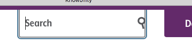
I wasn't sure whether to bring this up on the CFC or in this thread, but I would like to understand whether the first example you gave, the Knowbility<https://knowbility.org/>Search mechanism, would be considered to pass the rewording of 1.4.11.
To me, this lacks any visual indication that it is an input field. It is indistinguishable from the links immediately below it. The new SC wording states "Visual information required to identify user interface components" needs to meet a 3:1 ratio.
Would people would fail it for lacking visual identifying characteristics on an input? Or does the lack of visual information for all users about the input mean this is a design issue, not an accessibility issue?
I also want to understand whether folks think Funka's questions about their buttons have been resolved with this new change. Is each button's shape, defined by a flat colour, part of the visual information required to ID each as a button?
Is it up to the tester to make that call, and thus decide whether the button color needs to meet 3:1?
We just had specific questions on a call here at IBM about some new low-contrast UI components, and whether we had leeway to fail them with the new wording or had to find some other means of convincing the designers to rethink the components.
Michael Gower
IBM Accessibility
Research
1803 Douglas Street, Victoria, BC <https://maps.google.com/?q=1803+Douglas+Street,+Victoria,+BC++V8T+5C3&entry=gmail&source=g> V8T 5C3<https://maps.google.com/?q=1803+Douglas+Street,+Victoria,+BC++V8T+5C3&entry=gmail&source=g>
gowerm@ca.ibm.com<mailto:gowerm@ca.ibm.com>
cellular: (250) 661-0098 * <https://maps.google.com/?q=1803+Douglas+Street,+Victoria,+BC++%C2%A0+V8T+5C3&entry=gmail&source=g> fax: (250) 220-8034
From: <https://maps.google.com/?q=1803+Douglas+Street,+Victoria,+BC++%C2%A0+V8T+5C3&entry=gmail&source=g> Andrew Kirkpatrick <akirkpat@adobe.com<mailto:akirkpat@adobe.com>>
To: WCAG <w3c-wai-gl@w3.org<mailto:w3c-wai-gl@w3.org>>
Date: 2018-05-26 03:46 PM
Subject: Resolving 1.4.11
________________________________
AGWG’ers,
**WARNING – lengthy but important and time-critical email!**
We have a few concerns raised about 1.4.11 Non-text contrast:
1. Concern from Funka (see Word doc attachment at https://lists.w3.org/Archives/Public/public-comments-wcag20/2018May/0001.html) that the Color limitations for buttons with text on a colored background are too limiting. People either won’t be able to use yellow or will need to use an extra border and that will be unpopular for designers. This is the same issue as the concern about boundaries in Issue 914: https://github.com/w3c/wcag21/issues/914.
2. Does the hover state indicator need to have 3:1? (Issue 913: https://github.com/w3c/wcag21/issues/913)
So, what do we do? I think that it helps to look at a bunch of examples:
As a reminder, this is the SC text:
1.4.11
The visual presentation<https://www.w3.org/TR/WCAG21/#dfn-presentation>of the following have a contrast ratio<https://www.w3.org/TR/WCAG21/#dfn-contrast-ratio> of at least 3:1 against adjacent color(s):
User Interface Components
Visual information used to indicate states<https://www.w3.org/TR/WCAG21/#dfn-states>and boundaries of user interface components<https://www.w3.org/TR/WCAG21/#dfn-user-interface-components>, except for inactive components or where the appearance of the component is determined by the user agent and not modified by the author;
Graphical Objects
Parts of graphics required to understand the content, except when a particular presentation of graphics is essential<https://www.w3.org/TR/WCAG21/#dfn-essential>to the information being conveyed.
1. Knowbility’s search box. There is 4.5:1 text that indicates that there is something for the user to activate. It is a search box and when you click on it the placeholder text shifts to the left and exposes the full area of the input.
[cid:image001.png@01D3F849.0FE540E0]
[cid:image002.png@01D3F849.0FE540E0]
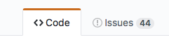
2. Github’s tab interface. It is pretty clear which tab has the selected state because of the red accent, but there is definitely not 3:1 contrast between the background colors of “code” and “issues”, nor is the line between these 3:1.
[cid:image003.png@01D3F849.0FE540E0]
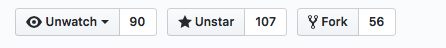
3. Github buttons. For the “unwatch” button, the contrast between the inside of the button and the outside is 1.08:1, and between the border line and the outside background is 1.62:1. The contrast between the unwatch text and the little triangle that indicates the drop down is 13.79:1.
[cid:image004.png@01D3F849.0FE540E0]
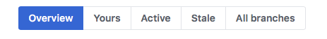
4. Github buttons #2. The contrast everywhere is sufficient except in the thin border line around the not-currently-selected items.
[cid:image005.png@01D3F849.0FE540E0]
5. New WAI site. The difference in contrast between a hovered item and a non-hovered item in the nav is 1:40:1, but there is a high-contrast underline that is also part of the hover.
[cid:image006.png@01D3F849.0FE540E0]
6. CNN. Contrast of hovered and non-hovered text is greater than 4.5:1. Contrast between the hovered and non-hovered text is 1.84:1.
[cid:image007.png@01D3F849.0FE540E0]
7. Adobe. The light gray background appears on hover and the tiny little triangle appears. The text has sufficient contrast in hover and non-hover states, but the hover background and triangle don’t.
[cid:image008.png@01D3F849.0FE540E0]
8. LevelAccess – high-contrast throughout.
[cid:image009.png@01D3F849.0FE540E0]
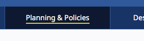
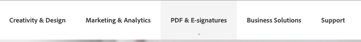
9. Funka. Active/selected tab shows sufficient contrast for state. The non-selected tabs don’t use color to indicate the boundaries.
[cid:image010.png@01D3F849.0FE540E0]
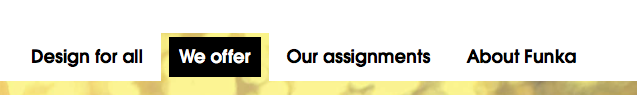
10. Funka Search. The three items in the top nav – the left two don’t use color to indicate the boundary. The right button does but the contrast isn’t 3:1.
[cid:image011.png@01D3F849.0FE540E0]
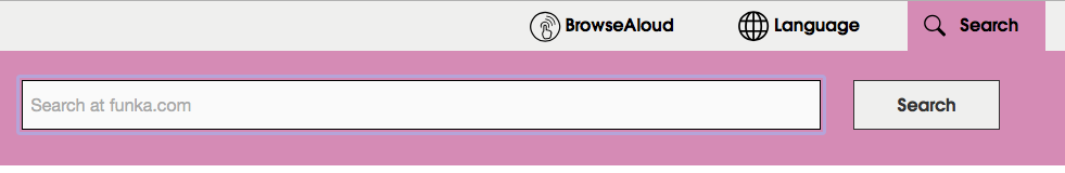
11. Funka search open. Once the search button is open, everything seems to have suffient 4.5/3:1 contrast.
[cid:image012.png@01D3F849.0FE540E0]
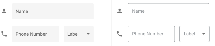
12. Material design. Text fields come in two forms. The example on the left has a field background that is less than 3:1 with the background, but the line marking the bottom boundary of the field is 3.28:1 on the background. For the triangle in the drop down the ratio is 3.02:1 relative to the field background. On the right, the border has a 3.64:1 ratio to the background, but it goes all the way around.
[cid:image013.png@01D3F849.0FE540E0]
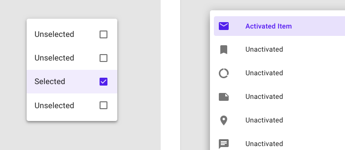
13. Material design selection. The selected item on the left has a greater than 3:1 ratio for the checked/unchecked box, but the purple background is not 3:1. On the right, the purple activated color has >6:1 contrast against the light purple and >7:1 against the white, but the purple background is less than 3:1 against the white.
[cid:image014.png@01D3F849.0FE540E0]
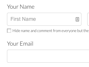
14. GoFundMe donate page: The “your name” label text (not properly labeled) is >4.5:1, but the field border and placeholder text are less than 3:1.
[cid:image015.png@01D3F849.0FE540E0]
15. Buttons with specific boundaries – contrast between states is 1.75:1, so to some people this just looks like one green area.
[cid:image016.png@01D3F849.0FE540E0]
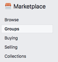
16. Facebook marketplace active area indicator. The greatest contrast is the whitish background of groups and the thin border between that and the light grey background. 1.22:1 contrast.
[cid:image017.png@01D3F849.0FE540E0]
17. Bootstrap checkbox. The checkbox is 1.30:1 contrast relative to the background.
[cid:image019.jpg@01D3F849.0FE540E0]
https://getbootstrap.com/docs/4.1/components/forms/#inlineFormCustomSelect<https://na01.safelinks.protection.outlook.com/?url=https%3A%2F%2Fgetbootstrap.com%2Fdocs%2F4.1%2Fcomponents%2Fforms%2F%23inlineFormCustomSelect&data=02%7C01%7Cakirkpat%40adobe.com%7C05736cdf6373468230e408d5c31ae33d%7Cfa7b1b5a7b34438794aed2c178decee1%7C0%7C0%7C636629442639781231&sdata=TMFTI316LNA3T8bUUPXyKIZFx7xFqdw5wbyvsbke4Tw%3D&reserved=0>
Interpretation:
My interpretation of the SC, and what I believe that the WG intended is that:
1. Visual information that is important to identifying the state or existence (boundary) needs to be at least 3:1.
2. All visual aspects of a UI Component at not required to meet 3:1, only if it is required to identity the state or existence of the control.
3. For some components, text that is 4.5:1 is entirely sufficient to meet the requirements of 1.4.11.
a. Are we requiring a full boundary around links (which are UI Components)? I don’t believe so.
b. Are we ok with a set of tabs like in example #9 above, or does each tab need a full boundary to indicate the click area? I believe so.
4. If a color is less than 3:1, you need to pretend that it doesn’t exist at all and assess whether the component passes based on other information.
a. Compare the same set of tabs in example #9 and consider whether it is less accessible if the non-active tabs have a pale color background.
5. Hover is covered, but not relative to the component’s own non-hover state. What is covered is that the hover state needs to meet the 3:1 ratio for any non-text content. This means that if there is an icon in a button that fades out when hovered, it would fail (just like is the case for 1.4.3 if text in a hovered button fades on hover).
With my interpretation the examples above are rated:
1. Pass
2. Borderline fail – perhaps an uncomfortable pass?
3. Pass
4. Pass
5. Pass
6. Pass
7. Pass
8. Pass
9. Pass
10. Pass
11. Pass
12. Pass – the right side example passes easily. The left side, with the underline border is, I think, an uncomfortable pass. Like a lined paper form, people can figure out the rough size of the fields by proximity and spacing, so one line is minimally sufficient.
13. Pass
14. Is interesting – this example clearly fails, but if the control was properly associated with the label would that help since that creates a clickable region that has sufficient contrast and then the control becomes more visible when focused because of the focus rectangle or input carat?
15. Fail – the contrast for the boundary is particularly significant in this situation.
16. Fail – the contrast for the selected state. This is an example of communicating information by color alone and the contrast doesn’t make up for the color.
17. Fail - Similar to #14. Some might argue that if the label is properly associated that this makes the text label and image part of one control and therefore ok, and we should be clear about that in a technique or failure.
If you find that you are agreeing that my interpretation reflects the intent of the Working Group, or that you are disagreeing that it reflects the intent of the Working Group, please say so.
I have a pull request that implements changes in the Understanding document in line with this: https://github.com/w3c/wcag21/pull/943/files?utf8=•&diff=split
Is there a downside?
One of the comments we received requested that we implement a requirement for a thicker boundary around components. This would unquestionably help people, but also creates problems in that we are specifying UI Components, including links and other interactive controls. Are we requiring that individual items within a select/drop down show clear boundaries since each is a separate clickable region? Both of these come into play if the strict interpretation of this SC is the intent of the group.
I believe that we need to be unified and clear about this SC’s interpretation, and soon!
AWK
--
Wilco Fiers
Senior Accessibility Engineer - Co-facilitator WCAG-ACT - Chair Auto-WCAG
[cid:image020.gif@01D3F849.0FE540E0]
Attachments
- image/png attachment: image001.png

- image/png attachment: image002.png
- image/png attachment: image003.png
- image/png attachment: image004.png
- image/png attachment: image005.png
- image/png attachment: image006.png
- image/png attachment: image007.png

- image/png attachment: image008.png
- image/png attachment: image009.png

- image/png attachment: image010.png
- image/png attachment: image011.png

- image/png attachment: image012.png
- image/png attachment: image013.png
- image/png attachment: image014.png
- image/png attachment: image015.png
- image/png attachment: image016.png
- image/png attachment: image017.png
- image/jpeg attachment: image019.jpg
- image/gif attachment: image020.gif

Received on Wednesday, 30 May 2018 23:14:41 UTC