- From: Dirks, Kim (Legal) <kimberlee.dirks@thomsonreuters.com>
- Date: Tue, 29 May 2018 14:17:51 +0000
- To: Katie Haritos-Shea <ryladog@gmail.com>, public-low-vision-a11y-tf <public-low-vision-a11y-tf@w3.org>, WCAG <w3c-wai-gl@w3.org>
- CC: Detlev Fischer <detlev.fischer@testkreis.de>, Andrew Kirkpatrick <akirkpat@adobe.com>, David MacDonald <david100@sympatico.ca>
- Message-ID: <BN7PR03MB3428E4742A2DBF9CA67986FC946D0@BN7PR03MB3428.namprd03.prod.outlook.com>
I was just thinking the same thing as Katie. The contrast for both (image or text within the button plus contrast between the edge of the button and the background) may be essential and may have been the intent of this SC. Or not. I’d like to hear from that group as to both intent and what’s needed.
Kim
From: Katie Haritos-Shea [mailto:ryladog@gmail.com]
Sent: Sunday, May 27, 2018 7:56 PM
To: public-low-vision-a11y-tf <public-low-vision-a11y-tf@w3.org>; WCAG <w3c-wai-gl@w3.org>
Cc: Detlev Fischer <detlev.fischer@testkreis.de>; Andrew Kirkpatrick <akirkpat@adobe.com>; David MacDonald <david100@sympatico.ca>
Subject: Re: Resolving 1.4.11
I'd like to hear a consensus from the Low Vision Task Force on this issue before a decision is made.
* katie *
Katie Haritos-Shea
Principal ICT Accessibility Architect,
W3C Advisory Committee Rep for Knowbility
WCAG/Section 508/ADA/AODA/QA/FinServ/FinTech/Privacy, IAAP CPACC+WAS = CPWA<https://urldefense.proofpoint.com/v2/url?u=http-3A__www.accessibilityassociation.org_cpwacertificants&d=DwMFaQ&c=4ZIZThykDLcoWk-GVjSLmy8-1Cr1I4FWIvbLFebwKgY&r=TNPSf5_s1C7GQN2fKXOGh6t05xN18F4fA5Kt3Nyy0IU&m=tIb7o5JRf3nKszDQpehMDl4s9Ke5jvrMsq0-Z7gp6ck&s=FpgApQLzQ9tmuBNVjOXGGRm0Yp4Dlt91gyc8tUpvzpk&e=>
Cell: 703-371-5545<tel:703-371-5545> | ryladog@gmail.com<mailto:ryladog@gmail.com> | Oakton, VA | LinkedIn Profile<https://urldefense.proofpoint.com/v2/url?u=http-3A__www.linkedin.com_in_katieharitosshea_&d=DwMFaQ&c=4ZIZThykDLcoWk-GVjSLmy8-1Cr1I4FWIvbLFebwKgY&r=TNPSf5_s1C7GQN2fKXOGh6t05xN18F4fA5Kt3Nyy0IU&m=tIb7o5JRf3nKszDQpehMDl4s9Ke5jvrMsq0-Z7gp6ck&s=KrVZpvhXqlHZE_WTjny1jOy19hFUSN6UBWOUPMrgrOY&e=>
People may forget exactly what it was that you said or did,
but people will never forget how you made them feel.......
Our scars remind us of where we have been........they do not have to dictate where we are going.
On Sun, May 27, 2018 at 5:51 AM, David MacDonald <david100@sympatico.ca<mailto:david100@sympatico.ca>> wrote:
I think we should explore Andrew and Detlev's ideas further, and come up with some language in the understanding ... it's the final hour and I'm afraid designers will reject a strict interpretation of the SC that forces them to put dark borders around everything...
So I support the Gestalt type of approach even though its a bit messier and may make for more variability in testing results between expert evaluators.
Cheers,
David MacDonald
CanAdapt Solutions Inc.
Tel: 613.235.4902
LinkedIn
<https://urldefense.proofpoint.com/v2/url?u=http-3A__www.linkedin.com_in_davidmacdonald100&d=DwMFaQ&c=4ZIZThykDLcoWk-GVjSLmy8-1Cr1I4FWIvbLFebwKgY&r=TNPSf5_s1C7GQN2fKXOGh6t05xN18F4fA5Kt3Nyy0IU&m=tIb7o5JRf3nKszDQpehMDl4s9Ke5jvrMsq0-Z7gp6ck&s=s1wBZBOICSnvRYc8gGlB3xk6ZSYrQxE8WzlrMDKX-1c&e=>
twitter.com/davidmacd<https://urldefense.proofpoint.com/v2/url?u=http-3A__twitter.com_davidmacd&d=DwMFaQ&c=4ZIZThykDLcoWk-GVjSLmy8-1Cr1I4FWIvbLFebwKgY&r=TNPSf5_s1C7GQN2fKXOGh6t05xN18F4fA5Kt3Nyy0IU&m=tIb7o5JRf3nKszDQpehMDl4s9Ke5jvrMsq0-Z7gp6ck&s=lwUt1snnEDfy3Wz373B6nY184f-a90n851EHSTgIj7g&e=>
GitHub<https://urldefense.proofpoint.com/v2/url?u=https-3A__github.com_DavidMacDonald&d=DwMFaQ&c=4ZIZThykDLcoWk-GVjSLmy8-1Cr1I4FWIvbLFebwKgY&r=TNPSf5_s1C7GQN2fKXOGh6t05xN18F4fA5Kt3Nyy0IU&m=tIb7o5JRf3nKszDQpehMDl4s9Ke5jvrMsq0-Z7gp6ck&s=FHbY17-q6uerASDvmZ4hsdnFHofFeHE2BSSgiTlhylA&e=>
www.Can-Adapt.com<https://urldefense.proofpoint.com/v2/url?u=http-3A__www.can-2Dadapt.com_&d=DwMFaQ&c=4ZIZThykDLcoWk-GVjSLmy8-1Cr1I4FWIvbLFebwKgY&r=TNPSf5_s1C7GQN2fKXOGh6t05xN18F4fA5Kt3Nyy0IU&m=tIb7o5JRf3nKszDQpehMDl4s9Ke5jvrMsq0-Z7gp6ck&s=wGcU-mT5htpWx-nTglVRl5ViztZ2GEJbt3J-bXZVdNk&e=>
Adapting the web to all users
Including those with disabilities
If you are not the intended recipient, please review our privacy policy<https://urldefense.proofpoint.com/v2/url?u=http-3A__www.davidmacd.com_disclaimer.html&d=DwMFaQ&c=4ZIZThykDLcoWk-GVjSLmy8-1Cr1I4FWIvbLFebwKgY&r=TNPSf5_s1C7GQN2fKXOGh6t05xN18F4fA5Kt3Nyy0IU&m=tIb7o5JRf3nKszDQpehMDl4s9Ke5jvrMsq0-Z7gp6ck&s=h4am1pbXqgSs68GnWrqquX1ohHmSyyVUR7nDDWh2-Cs&e=>
On Sun, May 27, 2018 at 5:32 AM, Detlev Fischer <detlev.fischer@testkreis.de<mailto:detlev.fischer@testkreis.de>> wrote:
I think what is missing in the assessment of contrast is the implied information users gain from the grouping of items (menus, select options). We need to acknowledge that Gestalt features and visual context help communicating the fact that elements are user interface controls. So a vertically aligned horizontal menu with evenly spaced items communicates by its arrangements (and often, its top-of the page, or top-of-a-segment position) that these are links (or certainly contributes to that interpretation), especially if one item in a row of menu links is discernibly focused. This suggests that others on the same row can equally be selected (and focus be highlighted the same way).
I recognise that going beyond the atomic assessment of one individual component creates difficulties for testing because it suggests some grey areas that the understanding text may largely illuminate (turn to b&w).
In recognition of the obvious practical problems for designers to implement this, I lean towards the most liberal interpretation of this SC possible. I think the focus indication (keyboard op) should only need to meet 3:1 against background OR default state (author’s pick) with no requirements for hover if any affordances such as a menu type arrangement (alignment, styling, additional icon) allow a recognition that something is a control AND, for graphics-only controls, that the salient part of the control has 3:1.
Not sure if this helps...
Detlev
Sent from phone
Am 27.05.2018 um 10:04 schrieb David MacDonald <david100@sympatico.ca<mailto:david100@sympatico.ca>>:
> Part of what I’m thinking is that what is required is that enough information exists in aggregate that the user can know that there is something to interact with. This may mean that one boundary is ok, or more, or fewer – it is context dependent.
ohhh... that's interesting, I though the requirement was to know where the clickable area is, i.e., if I click on the inside of the border its part of the interface and outside of the border does nothing... so knowing where the actual boundary line is was part of the thing...
Cheers,
David MacDonald
CanAdapt Solutions Inc.
Tel: 613.235.4902
LinkedIn
<https://urldefense.proofpoint.com/v2/url?u=http-3A__www.linkedin.com_in_davidmacdonald100&d=DwMFaQ&c=4ZIZThykDLcoWk-GVjSLmy8-1Cr1I4FWIvbLFebwKgY&r=TNPSf5_s1C7GQN2fKXOGh6t05xN18F4fA5Kt3Nyy0IU&m=tIb7o5JRf3nKszDQpehMDl4s9Ke5jvrMsq0-Z7gp6ck&s=s1wBZBOICSnvRYc8gGlB3xk6ZSYrQxE8WzlrMDKX-1c&e=>
twitter.com/davidmacd<https://urldefense.proofpoint.com/v2/url?u=http-3A__twitter.com_davidmacd&d=DwMFaQ&c=4ZIZThykDLcoWk-GVjSLmy8-1Cr1I4FWIvbLFebwKgY&r=TNPSf5_s1C7GQN2fKXOGh6t05xN18F4fA5Kt3Nyy0IU&m=tIb7o5JRf3nKszDQpehMDl4s9Ke5jvrMsq0-Z7gp6ck&s=lwUt1snnEDfy3Wz373B6nY184f-a90n851EHSTgIj7g&e=>
GitHub<https://urldefense.proofpoint.com/v2/url?u=https-3A__github.com_DavidMacDonald&d=DwMFaQ&c=4ZIZThykDLcoWk-GVjSLmy8-1Cr1I4FWIvbLFebwKgY&r=TNPSf5_s1C7GQN2fKXOGh6t05xN18F4fA5Kt3Nyy0IU&m=tIb7o5JRf3nKszDQpehMDl4s9Ke5jvrMsq0-Z7gp6ck&s=FHbY17-q6uerASDvmZ4hsdnFHofFeHE2BSSgiTlhylA&e=>
www.Can-Adapt.com<https://urldefense.proofpoint.com/v2/url?u=http-3A__www.can-2Dadapt.com_&d=DwMFaQ&c=4ZIZThykDLcoWk-GVjSLmy8-1Cr1I4FWIvbLFebwKgY&r=TNPSf5_s1C7GQN2fKXOGh6t05xN18F4fA5Kt3Nyy0IU&m=tIb7o5JRf3nKszDQpehMDl4s9Ke5jvrMsq0-Z7gp6ck&s=wGcU-mT5htpWx-nTglVRl5ViztZ2GEJbt3J-bXZVdNk&e=>
Adapting the web to all users
Including those with disabilities
If you are not the intended recipient, please review our privacy policy<https://urldefense.proofpoint.com/v2/url?u=http-3A__www.davidmacd.com_disclaimer.html&d=DwMFaQ&c=4ZIZThykDLcoWk-GVjSLmy8-1Cr1I4FWIvbLFebwKgY&r=TNPSf5_s1C7GQN2fKXOGh6t05xN18F4fA5Kt3Nyy0IU&m=tIb7o5JRf3nKszDQpehMDl4s9Ke5jvrMsq0-Z7gp6ck&s=h4am1pbXqgSs68GnWrqquX1ohHmSyyVUR7nDDWh2-Cs&e=>
On Sat, May 26, 2018 at 11:27 PM, Andrew Kirkpatrick <akirkpat@adobe.com<mailto:akirkpat@adobe.com>> wrote:
Comments within:
Given the limited implementation experience, I think we should take the most liberal interpretation possible in the understanding doc without sending us back the CR. A future version can strengthen requirements but with backward compatibility future versions can't be loosened until Silver.
> ... Visual information used to indicate states<https://urldefense.proofpoint.com/v2/url?u=https-3A__na01.safelinks.protection.outlook.com_-3Furl-3Dhttps-253A-252F-252Fwww.w3.org-252FTR-252FWCAG21-252F-2523dfn-2Dstates-26data-3D02-257C01-257Cakirkpat-2540adobe.com-257C988a6db6044a40d402fb08d5c373e9f4-257Cfa7b1b5a7b34438794aed2c178decee1-257C0-257C0-257C636629824974117373-26sdata-3DER2gpeFXaM0sZ14wgm-252Fm577McigioTbK8mYcmXAmvgs-253D-26reserved-3D0&d=DwMFaQ&c=4ZIZThykDLcoWk-GVjSLmy8-1Cr1I4FWIvbLFebwKgY&r=TNPSf5_s1C7GQN2fKXOGh6t05xN18F4fA5Kt3Nyy0IU&m=tIb7o5JRf3nKszDQpehMDl4s9Ke5jvrMsq0-Z7gp6ck&s=EPBlYpj4TxpW9bqJNyB2zfoGv_7NX6euYgeJVoin7eA&e=> and boundaries of user interface components<https://urldefense.proofpoint.com/v2/url?u=https-3A__na01.safelinks.protection.outlook.com_-3Furl-3Dhttps-253A-252F-252Fwww.w3.org-252FTR-252FWCAG21-252F-2523dfn-2Duser-2Dinterface-2Dcomponents-26data-3D02-257C01-257Cakirkpat-2540adobe.com-257C988a6db6044a40d402fb08d5c373e9f4-257Cfa7b1b5a7b34438794aed2c178decee1-257C0-257C0-257C636629824974117373-26sdata-3DKTzZ9-252BM2CMEhB5ueIIbfk6av70ILjFoB78BzvIkfHF4-253D-26reserved-3D0&d=DwMFaQ&c=4ZIZThykDLcoWk-GVjSLmy8-1Cr1I4FWIvbLFebwKgY&r=TNPSf5_s1C7GQN2fKXOGh6t05xN18F4fA5Kt3Nyy0IU&m=tIb7o5JRf3nKszDQpehMDl4s9Ke5jvrMsq0-Z7gp6ck&s=O1mddAphYoVgFaOGpfdZ6BMwBvRUB2YWh_32U_TYctI&e=>,...
I think having just one boundary (i.e, underline in #12, overline in #2) with the proper ratio should be ok... if so we need to interpret the plural of "boundaries" as:
Part of what I’m thinking is that what is required is that enough information exists in aggregate that the user can know that there is something to interact with. This may mean that one boundary is ok, or more, or fewer – it is context dependent.
"All of your component*(s)* have boundary*(s). There are are more than one components on the page therefore boundaries is plural"
I don’t think that is going to be a very strong argument.
My questions about the pass/fail determinations
* Not sure why #3 passes. The button and the border are less than 3:1
This has to do with my statement that “If a color is less than 3:1, you need to pretend that it doesn’t exist at all and assess whether the component passes based on other information.”
Would the same control fail if the button background color was the same as the adjacent color of the page background and there was no light colored border at all? (you’ll need to pretend that I am competent at Photoshop here…). For this example, I might say that because the “90” is associated with the button a border that makes the grouping clear is needed, and in that case the border would need to be 3:1.
<image001.png>
I think that the big question is why a button with no color used to indicate the boundaries passes, but a button with a too-light background (but darker than nothing) would fail.
This is why I don’t think that the background is needed in this example and why I think that it passes (although I might fail it because of the “90” part which I wasn’t thinking about originally).
* Not sure why #4 passes for the non selected items, is that because they are (inactive). I wouldn't call them that because they are clickable.
Again for this one – what if there was no light grey line at all? Would you fail that? (If so, on what basis?)
[cid:image001.png@01D3F72D.E7CC6F00]
* Not sure why 7 passes. The arrow dropdown doesn't have sufficient contrast
This is the same as the previous one, except thinking about hover when the gray appears. The hover state is apparent because the mouse cursor changes, and the gray and the little triangle are not important information. I’m sure some might say that the triangle is needed because it indicates the menu will drop down, but if it wasn’t there (as it isn’t for many menus) you wouldn’t miss it. I wouldn’t feel the same way for a select box because there are additional keyboard expectations for a select box that come with the indication of the role.
* Not sure why 10 passes. The boundaries for the clickable region (Search) is less than 3:1
This is very similar to #4. Do the language and browsealoud buttons on that page pass? Is the solution to make this pass for the author to remove the white box and reduce the contrast?
* Not sure why 13 passes. The boundaries for the clickable region (light purple) is less than 3:1
If the light purple wasn’t there, would you fail it? Do you think that the items below the light purple item also trigger a failure? I’d say that a reasonable person can pretty accurately identify the region for each item with no color at all, in this example.
So, for me, if the light purple background was gone, then the active or selected state is the dark purple on the icon and text, and that meets 3:1.
Thanks for looking at this – will be interested to hear your responses!
AWK
On Sat, May 26, 2018 at 6:42 PM, Andrew Kirkpatrick <akirkpat@adobe.com<mailto:akirkpat@adobe.com>> wrote:
AGWG’ers,
**WARNING – lengthy but important and time-critical email!**
We have a few concerns raised about 1.4.11 Non-text contrast:
1. Concern from Funka (see Word doc attachment at https://lists.w3.org/Archives/Public/public-comments-wcag20/2018May/0001.html<https://urldefense.proofpoint.com/v2/url?u=https-3A__na01.safelinks.protection.outlook.com_-3Furl-3Dhttps-253A-252F-252Flists.w3.org-252FArchives-252FPublic-252Fpublic-2Dcomments-2Dwcag20-252F2018May-252F0001.html-26data-3D02-257C01-257Cakirkpat-2540adobe.com-257C988a6db6044a40d402fb08d5c373e9f4-257Cfa7b1b5a7b34438794aed2c178decee1-257C0-257C0-257C636629824974117373-26sdata-3DuNFWFw98MaqRcnZMaCFLv27Uls2pm8rkX-252BrADaMiFhs-253D-26reserved-3D0&d=DwMFaQ&c=4ZIZThykDLcoWk-GVjSLmy8-1Cr1I4FWIvbLFebwKgY&r=TNPSf5_s1C7GQN2fKXOGh6t05xN18F4fA5Kt3Nyy0IU&m=tIb7o5JRf3nKszDQpehMDl4s9Ke5jvrMsq0-Z7gp6ck&s=Ti81BP-LUFVE8XfJ5sMD6IKYcHxoboaXB0tygMipq30&e=>) that the Color limitations for buttons with text on a colored background are too limiting. People either won’t be able to use yellow or will need to use an extra border and that will be unpopular for designers. This is the same issue as the concern about boundaries in Issue 914: https://github.com/w3c/wcag21/issues/914<https://urldefense.proofpoint.com/v2/url?u=https-3A__na01.safelinks.protection.outlook.com_-3Furl-3Dhttps-253A-252F-252Fgithub.com-252Fw3c-252Fwcag21-252Fissues-252F914-26data-3D02-257C01-257Cakirkpat-2540adobe.com-257C988a6db6044a40d402fb08d5c373e9f4-257Cfa7b1b5a7b34438794aed2c178decee1-257C0-257C0-257C636629824974273627-26sdata-3D9sc7ZNJX4l5pd0banawcAEmubxiCFwYF-252B4ThdbNHI1Q-253D-26reserved-3D0&d=DwMFaQ&c=4ZIZThykDLcoWk-GVjSLmy8-1Cr1I4FWIvbLFebwKgY&r=TNPSf5_s1C7GQN2fKXOGh6t05xN18F4fA5Kt3Nyy0IU&m=tIb7o5JRf3nKszDQpehMDl4s9Ke5jvrMsq0-Z7gp6ck&s=PAK-PafxY4nDZ_nhG9toJFZj7yPOpir4SRMEqRc98m4&e=>.
2. Does the hover state indicator need to have 3:1? (Issue 913: https://github.com/w3c/wcag21/issues/913<https://urldefense.proofpoint.com/v2/url?u=https-3A__na01.safelinks.protection.outlook.com_-3Furl-3Dhttps-253A-252F-252Fgithub.com-252Fw3c-252Fwcag21-252Fissues-252F913-26data-3D02-257C01-257Cakirkpat-2540adobe.com-257C988a6db6044a40d402fb08d5c373e9f4-257Cfa7b1b5a7b34438794aed2c178decee1-257C0-257C0-257C636629824974273627-26sdata-3Dk6321BO-252BKHwS3xy2zSlGswai2mRWrDllEumGwJ15Ehs-253D-26reserved-3D0&d=DwMFaQ&c=4ZIZThykDLcoWk-GVjSLmy8-1Cr1I4FWIvbLFebwKgY&r=TNPSf5_s1C7GQN2fKXOGh6t05xN18F4fA5Kt3Nyy0IU&m=tIb7o5JRf3nKszDQpehMDl4s9Ke5jvrMsq0-Z7gp6ck&s=HYsDmu9mxWSR7obier7r1Y0HEvkQ3Y3DAqQQeOsmc6g&e=>)
So, what do we do? I think that it helps to look at a bunch of examples:
As a reminder, this is the SC text:
1.4.11
The visual presentation<https://urldefense.proofpoint.com/v2/url?u=https-3A__na01.safelinks.protection.outlook.com_-3Furl-3Dhttps-253A-252F-252Fwww.w3.org-252FTR-252FWCAG21-252F-2523dfn-2Dpresentation-26data-3D02-257C01-257Cakirkpat-2540adobe.com-257C988a6db6044a40d402fb08d5c373e9f4-257Cfa7b1b5a7b34438794aed2c178decee1-257C0-257C0-257C636629824974273627-26sdata-3DZXUUyw8vEAy-252Flg3vF1VkOwV-252FfYUej-252FCcAN4aI-252Bbvg6g-253D-26reserved-3D0&d=DwMFaQ&c=4ZIZThykDLcoWk-GVjSLmy8-1Cr1I4FWIvbLFebwKgY&r=TNPSf5_s1C7GQN2fKXOGh6t05xN18F4fA5Kt3Nyy0IU&m=tIb7o5JRf3nKszDQpehMDl4s9Ke5jvrMsq0-Z7gp6ck&s=b9nKBTTCMrLkOgdR7gbSnoABhLgd8GXeX2A-axnvkqI&e=> of the following have a contrast ratio<https://urldefense.proofpoint.com/v2/url?u=https-3A__na01.safelinks.protection.outlook.com_-3Furl-3Dhttps-253A-252F-252Fwww.w3.org-252FTR-252FWCAG21-252F-2523dfn-2Dcontrast-2Dratio-26data-3D02-257C01-257Cakirkpat-2540adobe.com-257C988a6db6044a40d402fb08d5c373e9f4-257Cfa7b1b5a7b34438794aed2c178decee1-257C0-257C0-257C636629824974273627-26sdata-3DZLQpGnryihkz8RUu8vcKZlWSxIi37XMIzRU4b4aB3qQ-253D-26reserved-3D0&d=DwMFaQ&c=4ZIZThykDLcoWk-GVjSLmy8-1Cr1I4FWIvbLFebwKgY&r=TNPSf5_s1C7GQN2fKXOGh6t05xN18F4fA5Kt3Nyy0IU&m=tIb7o5JRf3nKszDQpehMDl4s9Ke5jvrMsq0-Z7gp6ck&s=GgZH5tpE1mnLxDU5dFAVAKT4x1oJR3KHtLF1AYn3rzU&e=> of at least 3:1 against adjacent color(s):
User Interface Components
Visual information used to indicate states<https://urldefense.proofpoint.com/v2/url?u=https-3A__na01.safelinks.protection.outlook.com_-3Furl-3Dhttps-253A-252F-252Fwww.w3.org-252FTR-252FWCAG21-252F-2523dfn-2Dstates-26data-3D02-257C01-257Cakirkpat-2540adobe.com-257C988a6db6044a40d402fb08d5c373e9f4-257Cfa7b1b5a7b34438794aed2c178decee1-257C0-257C0-257C636629824974273627-26sdata-3DAWl1X9v6Vpfw6y1jgiAYrF-252B-252FpRHcpFlQDq1CJcSEvHI-253D-26reserved-3D0&d=DwMFaQ&c=4ZIZThykDLcoWk-GVjSLmy8-1Cr1I4FWIvbLFebwKgY&r=TNPSf5_s1C7GQN2fKXOGh6t05xN18F4fA5Kt3Nyy0IU&m=tIb7o5JRf3nKszDQpehMDl4s9Ke5jvrMsq0-Z7gp6ck&s=MvvHAsS_oAtH-KKarLtuzgDnkCUWpd7JX66hchKgMs8&e=> and boundaries of user interface components<https://urldefense.proofpoint.com/v2/url?u=https-3A__na01.safelinks.protection.outlook.com_-3Furl-3Dhttps-253A-252F-252Fwww.w3.org-252FTR-252FWCAG21-252F-2523dfn-2Duser-2Dinterface-2Dcomponents-26data-3D02-257C01-257Cakirkpat-2540adobe.com-257C988a6db6044a40d402fb08d5c373e9f4-257Cfa7b1b5a7b34438794aed2c178decee1-257C0-257C0-257C636629824974273627-26sdata-3DAShcj7ZJknS46iqQTLL9pXZJbMCfBT66jn6-252BhfeUcM4-253D-26reserved-3D0&d=DwMFaQ&c=4ZIZThykDLcoWk-GVjSLmy8-1Cr1I4FWIvbLFebwKgY&r=TNPSf5_s1C7GQN2fKXOGh6t05xN18F4fA5Kt3Nyy0IU&m=tIb7o5JRf3nKszDQpehMDl4s9Ke5jvrMsq0-Z7gp6ck&s=TcYxxsrd9Xw3MekH9LSbj6D-iDJg2i0twnhJ0IyGjLQ&e=>, except for inactive components or where the appearance of the component is determined by the user agent and not modified by the author;
Graphical Objects
Parts of graphics required to understand the content, except when a particular presentation of graphics is essential<https://urldefense.proofpoint.com/v2/url?u=https-3A__na01.safelinks.protection.outlook.com_-3Furl-3Dhttps-253A-252F-252Fwww.w3.org-252FTR-252FWCAG21-252F-2523dfn-2Dessential-26data-3D02-257C01-257Cakirkpat-2540adobe.com-257C988a6db6044a40d402fb08d5c373e9f4-257Cfa7b1b5a7b34438794aed2c178decee1-257C0-257C0-257C636629824974273627-26sdata-3DAkUWzGxZzavTTGaptQtOHa1KlOpDlJOwHLjP5eUxDYA-253D-26reserved-3D0&d=DwMFaQ&c=4ZIZThykDLcoWk-GVjSLmy8-1Cr1I4FWIvbLFebwKgY&r=TNPSf5_s1C7GQN2fKXOGh6t05xN18F4fA5Kt3Nyy0IU&m=tIb7o5JRf3nKszDQpehMDl4s9Ke5jvrMsq0-Z7gp6ck&s=hpz9z65ZaoJCd7a1XJx4YwEJkf58QO1SeQ8xJ60BiCg&e=> to the information being conveyed.
1. Knowbility’s search box. There is 4.5:1 text that indicates that there is something for the user to activate. It is a search box and when you click on it the placeholder text shifts to the left and exposes the full area of the input.
[cid:image001.png@01D3F520.E2DCDC00]
<image004.png>
1. Github’s tab interface. It is pretty clear which tab has the selected state because of the red accent, but there is definitely not 3:1 contrast between the background colors of “code” and “issues”, nor is the line between these 3:1.
<image005.png>
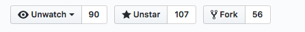
1. Github buttons. For the “unwatch” button, the contrast between the inside of the button and the outside is 1.08:1, and between the border line and the outside background is 1.62:1. The contrast between the unwatch text and the little triangle that indicates the drop down is 13.79:1.
[cid:image004.png@01D3F520.E2DCDC00]
1. Github buttons #2. The contrast everywhere is sufficient except in the thin border line around the not-currently-selected items.
<image007.png>
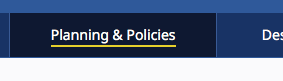
1. New WAI site. The difference in contrast between a hovered item and a non-hovered item in the nav is 1:40:1, but there is a high-contrast underline that is also part of the hover.
[cid:image006.png@01D3F520.E2DCDC00]
1. CNN. Contrast of hovered and non-hovered text is greater than 4.5:1. Contrast between the hovered and non-hovered text is 1.84:1.
[cid:image007.png@01D3F520.E2DCDC00]
1. Adobe. The light gray background appears on hover and the tiny little triangle appears. The text has sufficient contrast in hover and non-hover states, but the hover background and triangle don’t.
[cid:image008.png@01D3F520.E2DCDC00]
1. LevelAccess – high-contrast throughout.
<image011.png>
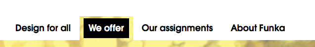
1. Funka. Active/selected tab shows sufficient contrast for state. The non-selected tabs don’t use color to indicate the boundaries.
[cid:image010.png@01D3F520.E2DCDC00]
1. Funka Search. The three items in the top nav – the left two don’t use color to indicate the boundary. The right button does but the contrast isn’t 3:1.
[cid:image011.png@01D3F520.E2DCDC00]
1. Funka search open. Once the search button is open, everything seems to have suffient 4.5/3:1 contrast.
<image014.png>
1. Material design. Text fields come in two forms. The example on the left has a field background that is less than 3:1 with the background, but the line marking the bottom boundary of the field is 3.28:1 on the background. For the triangle in the drop down the ratio is 3.02:1 relative to the field background. On the right, the border has a 3.64:1 ratio to the background, but it goes all the way around.
<image015.png>
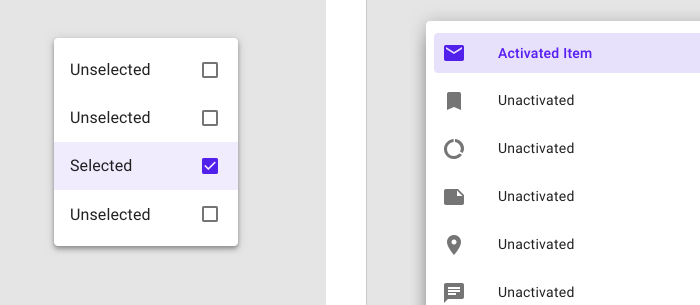
1. Material design selection. The selected item on the left has a greater than 3:1 ratio for the checked/unchecked box, but the purple background is not 3:1. On the right, the purple activated color has >6:1 contrast against the light purple and >7:1 against the white, but the purple background is less than 3:1 against the white.
[cid:image014.png@01D3F520.E2DCDC00]
1. GoFundMe donate page: The “your name” label text (not properly labeled) is >4.5:1, but the field border and placeholder text are less than 3:1.
<image017.png>
1. Buttons with specific boundaries – contrast between states is 1.75:1, so to some people this just looks like one green area.
<image018.png>
1. Facebook marketplace active area indicator. The greatest contrast is the whitish background of groups and the thin border between that and the light grey background. 1.22:1 contrast.
<image019.png>
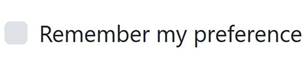
1. Bootstrap checkbox. The checkbox is 1.30:1 contrast relative to the background.
[cid:image018.jpg@01D3F520.E2DCDC00]
https://getbootstrap.com/docs/4.1/components/forms/#inlineFormCustomSelect<https://urldefense.proofpoint.com/v2/url?u=https-3A__na01.safelinks.protection.outlook.com_-3Furl-3Dhttps-253A-252F-252Fgetbootstrap.com-252Fdocs-252F4.1-252Fcomponents-252Fforms-252F-2523inlineFormCustomSelect-26data-3D02-257C01-257Cakirkpat-2540adobe.com-257C05736cdf6373468230e408d5c31ae33d-257Cfa7b1b5a7b34438794aed2c178decee1-257C0-257C0-257C636629442639781231-26sdata-3DTMFTI316LNA3T8bUUPXyKIZFx7xFqdw5wbyvsbke4Tw-253D-26reserved-3D0&d=DwMFaQ&c=4ZIZThykDLcoWk-GVjSLmy8-1Cr1I4FWIvbLFebwKgY&r=TNPSf5_s1C7GQN2fKXOGh6t05xN18F4fA5Kt3Nyy0IU&m=tIb7o5JRf3nKszDQpehMDl4s9Ke5jvrMsq0-Z7gp6ck&s=h-khG9y6b1lohvyHhbo9B2tFxQBWGqMDJ6_AEuGDY_8&e=>
Interpretation:
My interpretation of the SC, and what I believe that the WG intended is that:
1. Visual information that is important to identifying the state or existence (boundary) needs to be at least 3:1.
2. All visual aspects of a UI Component at not required to meet 3:1, only if it is required to identity the state or existence of the control.
3. For some components, text that is 4.5:1 is entirely sufficient to meet the requirements of 1.4.11.
* Are we requiring a full boundary around links (which are UI Components)? I don’t believe so.
* Are we ok with a set of tabs like in example #9 above, or does each tab need a full boundary to indicate the click area? I believe so.
1. If a color is less than 3:1, you need to pretend that it doesn’t exist at all and assess whether the component passes based on other information.
* Compare the same set of tabs in example #9 and consider whether it is less accessible if the non-active tabs have a pale color background.
1. Hover is covered, but not relative to the component’s own non-hover state. What is covered is that the hover state needs to meet the 3:1 ratio for any non-text content. This means that if there is an icon in a button that fades out when hovered, it would fail (just like is the case for 1.4.3 if text in a hovered button fades on hover).
With my interpretation the examples above are rated:
1. Pass
2. Borderline fail – perhaps an uncomfortable pass?
3. Pass
4. Pass
5. Pass
6. Pass
7. Pass
8. Pass
9. Pass
10. Pass
11. Pass
12. Pass – the right side example passes easily. The left side, with the underline border is, I think, an uncomfortable pass. Like a lined paper form, people can figure out the rough size of the fields by proximity and spacing, so one line is minimally sufficient.
13. Pass
14. Is interesting – this example clearly fails, but if the control was properly associated with the label would that help since that creates a clickable region that has sufficient contrast and then the control becomes more visible when focused because of the focus rectangle or input carat?
15. Fail – the contrast for the boundary is particularly significant in this situation.
16. Fail – the contrast for the selected state. This is an example of communicating information by color alone and the contrast doesn’t make up for the color.
17. Fail - Similar to #14. Some might argue that if the label is properly associated that this makes the text label and image part of one control and therefore ok, and we should be clear about that in a technique or failure.
If you find that you are agreeing that my interpretation reflects the intent of the Working Group, or that you are disagreeing that it reflects the intent of the Working Group, please say so.
I have a pull request that implements changes in the Understanding document in line with this: https://github.com/w3c/wcag21/pull/943/files?utf8=<https://urldefense.proofpoint.com/v2/url?u=https-3A__na01.safelinks.protection.outlook.com_-3Furl-3Dhttps-253A-252F-252Fgithub.com-252Fw3c-252Fwcag21-252Fpull-252F943-252Ffiles-253Futf8-253D-26data-3D02-257C01-257Cakirkpat-2540adobe.com-257C988a6db6044a40d402fb08d5c373e9f4-257Cfa7b1b5a7b34438794aed2c178decee1-257C0-257C0-257C636629824974273627-26sdata-3D-252BLBflG2avB07JulzIlFWOOgT1dro61YV9BFq59BRtBo-253D-26reserved-3D0&d=DwMFaQ&c=4ZIZThykDLcoWk-GVjSLmy8-1Cr1I4FWIvbLFebwKgY&r=TNPSf5_s1C7GQN2fKXOGh6t05xN18F4fA5Kt3Nyy0IU&m=tIb7o5JRf3nKszDQpehMDl4s9Ke5jvrMsq0-Z7gp6ck&s=vbDch6gNHwqBiWHsHwUJurCay3mdMjVk40KieaKLbLA&e=>✓&diff=split
Is there a downside?
One of the comments we received requested that we implement a requirement for a thicker boundary around components. This would unquestionably help people, but also creates problems in that we are specifying UI Components, including links and other interactive controls. Are we requiring that individual items within a select/drop down show clear boundaries since each is a separate clickable region? Both of these come into play if the strict interpretation of this SC is the intent of the group.
I believe that we need to be unified and clear about this SC’s interpretation, and soon!
AWK
Attachments
- image/png attachment: image001.png

- image/png attachment: image002.png

- image/png attachment: image003.png
- image/png attachment: image004.png
- image/png attachment: image005.png

- image/png attachment: image006.png

- image/png attachment: image007.png
- image/png attachment: image008.png

- image/png attachment: image009.png
- image/jpeg attachment: image011.jpg
Received on Tuesday, 29 May 2018 14:20:10 UTC