- From: Andrew Kirkpatrick <akirkpat@adobe.com>
- Date: Tue, 29 May 2018 12:58:00 +0000
- To: "Abma, J.D. (Jake)" <Jake.Abma@ing.com>, WCAG <w3c-wai-gl@w3.org>
- Message-ID: <DDBE5FAD-ECC9-44BF-BFD0-6DC1BCAF37B1@adobe.com>
3b. Are we ok with a set of tabs like in example #9 above, or does each tab need a full boundary to indicate the click area? I believe so.
=> Not if it's text, just like a link I would suggest to make it required that that the hover/focus state will make it clear what and where the boundary is.
How precisely are you thinking the boundary needs to be defined? For example, on the W3C nav bar you can tell that the item is clickable in a couple of ways, but the full boundary is not precisely defined by the focus/hover.
4. If a color is less than 3:1, you need to pretend that it doesn’t exist at all and assess whether the component passes based on other information.
=> The subjectiveness kicks in here and makes it harder to get mutual understanding, what is 'other information' here?
Again, the W3C WAI site is a good example – the hover makes the background of the nav button change to a darker color, but it doesn’t have enough contrast relative to the different backgrounds. However, there is a bright underline that makes it quite clear.
Another example is the material selection example – the selected item is a deep purple and there is greater than 3:1 contrast relative to other items that aren’t selected.
Interpretation of the examples
2. The difficult thing here is that the visual appearance on the page, the position, the icons before and the way they sit next to each other falls a bit under the "other information as you've suggested at nr. 4 above. Maybe not even an 'uncomfortable pass?' although this information will/may be lost when zoomed in a lot.
14. looked briefly around but don't see that form, URL?
It is used once you get into a donation process: https://www.gofundme.com/holistic-learning-sanctuary/donate
16. It fails 1.4.1 for sure, but this one is about 1.4.10 and the text has sufficient contrast, the extra on top for the hover makes it 'for me' more clear that it's a clickable area than the Github 'do nothing' on hover from number 2. There 'other information' is therefore interesting if that one (2) 'passes'
I’m not sure I’m following you “extra on top” comment? It was pointed out that the active item is also bolded, so it could pass as it is I think.
AWK
________________________________
From: Andrew Kirkpatrick <akirkpat@adobe.com>
Sent: Sunday, May 27, 2018 12:42 AM
To: WCAG
Subject: Resolving 1.4.11
AGWG’ers,
**WARNING – lengthy but important and time-critical email!**
We have a few concerns raised about 1.4.11 Non-text contrast:
1. Concern from Funka (see Word doc attachment at https://lists.w3.org/Archives/Public/public-comments-wcag20/2018May/0001.html) that the Color limitations for buttons with text on a colored background are too limiting. People either won’t be able to use yellow or will need to use an extra border and that will be unpopular for designers. This is the same issue as the concern about boundaries in Issue 914: https://github.com/w3c/wcag21/issues/914<https://na01.safelinks.protection.outlook.com/?url=https%3A%2F%2Fgithub.com%2Fw3c%2Fwcag21%2Fissues%2F914&data=02%7C01%7Cakirkpat%40adobe.com%7C84cef182f2834bb9832108d5c53cf1ea%7Cfa7b1b5a7b34438794aed2c178decee1%7C0%7C0%7C636631787945909433&sdata=3KVPp00HPgpn8iYUZhJ7wUvUxLgctjFpWsbCHQg396M%3D&reserved=0>.
2. Does the hover state indicator need to have 3:1? (Issue 913: https://github.com/w3c/wcag21/issues/913)
So, what do we do? I think that it helps to look at a bunch of examples:
As a reminder, this is the SC text:
1.4.11
The visual presentation<https://na01.safelinks.protection.outlook.com/?url=https%3A%2F%2Fwww.w3.org%2FTR%2FWCAG21%2F%23dfn-presentation&data=02%7C01%7Cakirkpat%40adobe.com%7C84cef182f2834bb9832108d5c53cf1ea%7Cfa7b1b5a7b34438794aed2c178decee1%7C0%7C0%7C636631787945909433&sdata=WhBySbf3scR21f8%2FTUr6soItD0PCYvO8HERIPhFiTjA%3D&reserved=0> of the following have a contrast ratio<https://na01.safelinks.protection.outlook.com/?url=https%3A%2F%2Fwww.w3.org%2FTR%2FWCAG21%2F%23dfn-contrast-ratio&data=02%7C01%7Cakirkpat%40adobe.com%7C84cef182f2834bb9832108d5c53cf1ea%7Cfa7b1b5a7b34438794aed2c178decee1%7C0%7C0%7C636631787945909433&sdata=XR6CbMRKAA1gn5cFZVaZZZvDtuOZakRLow3kD%2BnvhAk%3D&reserved=0> of at least 3:1 against adjacent color(s):
User Interface Components
Visual information used to indicate states<https://na01.safelinks.protection.outlook.com/?url=https%3A%2F%2Fwww.w3.org%2FTR%2FWCAG21%2F%23dfn-states&data=02%7C01%7Cakirkpat%40adobe.com%7C84cef182f2834bb9832108d5c53cf1ea%7Cfa7b1b5a7b34438794aed2c178decee1%7C0%7C0%7C636631787945909433&sdata=Nz2LCkKDMxR5sRIXB1DwNK6mQ%2Fb4GhiP7r9IhoiaVQ8%3D&reserved=0> and boundaries of user interface components<https://na01.safelinks.protection.outlook.com/?url=https%3A%2F%2Fwww.w3.org%2FTR%2FWCAG21%2F%23dfn-user-interface-components&data=02%7C01%7Cakirkpat%40adobe.com%7C84cef182f2834bb9832108d5c53cf1ea%7Cfa7b1b5a7b34438794aed2c178decee1%7C0%7C0%7C636631787945909433&sdata=qDd9ihY1nRcHfgZu1wOFK6gCPr94NhqssRtQpwVj2uk%3D&reserved=0>, except for inactive components or where the appearance of the component is determined by the user agent and not modified by the author;
Graphical Objects
Parts of graphics required to understand the content, except when a particular presentation of graphics is essential<https://na01.safelinks.protection.outlook.com/?url=https%3A%2F%2Fwww.w3.org%2FTR%2FWCAG21%2F%23dfn-essential&data=02%7C01%7Cakirkpat%40adobe.com%7C84cef182f2834bb9832108d5c53cf1ea%7Cfa7b1b5a7b34438794aed2c178decee1%7C0%7C0%7C636631787945909433&sdata=y2m%2FrworGGrw%2FDY8tvgMhfzoOlB9Jct3c9jWT5nVeg0%3D&reserved=0> to the information being conveyed.
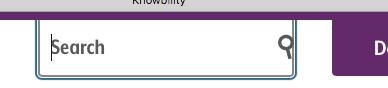
1. Knowbility’s search box. There is 4.5:1 text that indicates that there is something for the user to activate. It is a search box and when you click on it the placeholder text shifts to the left and exposes the full area of the input.
[cid:image001.png@01D3F520.E2DCDC00]
[cid:image002.png@01D3F520.E2DCDC00]
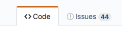
1. Github’s tab interface. It is pretty clear which tab has the selected state because of the red accent, but there is definitely not 3:1 contrast between the background colors of “code” and “issues”, nor is the line between these 3:1.
[cid:image003.png@01D3F520.E2DCDC00]
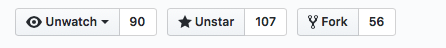
1. Github buttons. For the “unwatch” button, the contrast between the inside of the button and the outside is 1.08:1, and between the border line and the outside background is 1.62:1. The contrast between the unwatch text and the little triangle that indicates the drop down is 13.79:1.
[cid:image004.png@01D3F520.E2DCDC00]
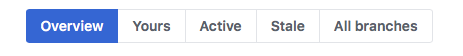
1. Github buttons #2. The contrast everywhere is sufficient except in the thin border line around the not-currently-selected items.
[cid:image005.png@01D3F520.E2DCDC00]
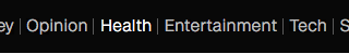
1. New WAI site. The difference in contrast between a hovered item and a non-hovered item in the nav is 1:40:1, but there is a high-contrast underline that is also part of the hover.
[cid:image006.png@01D3F520.E2DCDC00]
1. CNN. Contrast of hovered and non-hovered text is greater than 4.5:1. Contrast between the hovered and non-hovered text is 1.84:1.
[cid:image007.png@01D3F520.E2DCDC00]
1. Adobe. The light gray background appears on hover and the tiny little triangle appears. The text has sufficient contrast in hover and non-hover states, but the hover background and triangle don’t.
[cid:image008.png@01D3F520.E2DCDC00]
1. LevelAccess – high-contrast throughout.
[cid:image009.png@01D3F520.E2DCDC00]
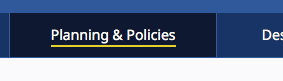
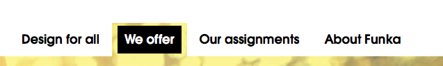
1. Funka. Active/selected tab shows sufficient contrast for state. The non-selected tabs don’t use color to indicate the boundaries.
[cid:image010.png@01D3F520.E2DCDC00]
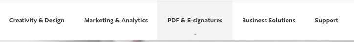
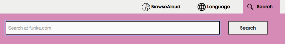
1. Funka Search. The three items in the top nav – the left two don’t use color to indicate the boundary. The right button does but the contrast isn’t 3:1.
[cid:image011.png@01D3F520.E2DCDC00]
1. Funka search open. Once the search button is open, everything seems to have suffient 4.5/3:1 contrast.
[cid:image012.png@01D3F520.E2DCDC00]
1. Material design. Text fields come in two forms. The example on the left has a field background that is less than 3:1 with the background, but the line marking the bottom boundary of the field is 3.28:1 on the background. For the triangle in the drop down the ratio is 3.02:1 relative to the field background. On the right, the border has a 3.64:1 ratio to the background, but it goes all the way around.
[cid:image013.png@01D3F520.E2DCDC00]
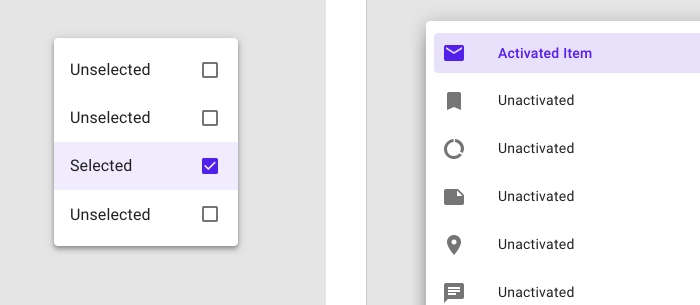
1. Material design selection. The selected item on the left has a greater than 3:1 ratio for the checked/unchecked box, but the purple background is not 3:1. On the right, the purple activated color has >6:1 contrast against the light purple and >7:1 against the white, but the purple background is less than 3:1 against the white.
[cid:image014.png@01D3F520.E2DCDC00]
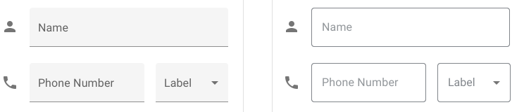
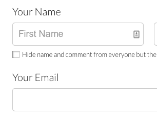
1. GoFundMe donate page: The “your name” label text (not properly labeled) is >4.5:1, but the field border and placeholder text are less than 3:1.
[cid:image015.png@01D3F520.E2DCDC00]
1. Buttons with specific boundaries – contrast between states is 1.75:1, so to some people this just looks like one green area.
[cid:image016.png@01D3F520.E2DCDC00]
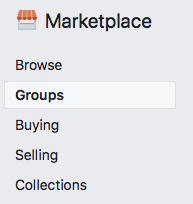
1. Facebook marketplace active area indicator. The greatest contrast is the whitish background of groups and the thin border between that and the light grey background. 1.22:1 contrast.
[cid:image017.png@01D3F520.E2DCDC00]
1. Bootstrap checkbox. The checkbox is 1.30:1 contrast relative to the background.
[cid:image018.jpg@01D3F520.E2DCDC00]
https://getbootstrap.com/docs/4.1/components/forms/#inlineFormCustomSelect<https://na01.safelinks.protection.outlook.com/?url=https%3A%2F%2Fgetbootstrap.com%2Fdocs%2F4.1%2Fcomponents%2Fforms%2F%23inlineFormCustomSelect&data=02%7C01%7Cakirkpat%40adobe.com%7C05736cdf6373468230e408d5c31ae33d%7Cfa7b1b5a7b34438794aed2c178decee1%7C0%7C0%7C636629442639781231&sdata=TMFTI316LNA3T8bUUPXyKIZFx7xFqdw5wbyvsbke4Tw%3D&reserved=0>
Interpretation:
My interpretation of the SC, and what I believe that the WG intended is that:
1. Visual information that is important to identifying the state or existence (boundary) needs to be at least 3:1.
2. All visual aspects of a UI Component at not required to meet 3:1, only if it is required to identity the state or existence of the control.
3. For some components, text that is 4.5:1 is entirely sufficient to meet the requirements of 1.4.11.
* Are we requiring a full boundary around links (which are UI Components)? I don’t believe so.
* Are we ok with a set of tabs like in example #9 above, or does each tab need a full boundary to indicate the click area? I believe so.
1. If a color is less than 3:1, you need to pretend that it doesn’t exist at all and assess whether the component passes based on other information.
* Compare the same set of tabs in example #9 and consider whether it is less accessible if the non-active tabs have a pale color background.
1. Hover is covered, but not relative to the component’s own non-hover state. What is covered is that the hover state needs to meet the 3:1 ratio for any non-text content. This means that if there is an icon in a button that fades out when hovered, it would fail (just like is the case for 1.4.3 if text in a hovered button fades on hover).
With my interpretation the examples above are rated:
1. Pass
2. Borderline fail – perhaps an uncomfortable pass?
3. Pass
4. Pass
5. Pass
6. Pass
7. Pass
8. Pass
9. Pass
10. Pass
11. Pass
12. Pass – the right side example passes easily. The left side, with the underline border is, I think, an uncomfortable pass. Like a lined paper form, people can figure out the rough size of the fields by proximity and spacing, so one line is minimally sufficient.
13. Pass
14. Is interesting – this example clearly fails, but if the control was properly associated with the label would that help since that creates a clickable region that has sufficient contrast and then the control becomes more visible when focused because of the focus rectangle or input carat?
15. Fail – the contrast for the boundary is particularly significant in this situation.
16. Fail – the contrast for the selected state. This is an example of communicating information by color alone and the contrast doesn’t make up for the color.
17. Fail - Similar to #14. Some might argue that if the label is properly associated that this makes the text label and image part of one control and therefore ok, and we should be clear about that in a technique or failure.
If you find that you are agreeing that my interpretation reflects the intent of the Working Group, or that you are disagreeing that it reflects the intent of the Working Group, please say so.
I have a pull request that implements changes in the Understanding document in line with this: https://github.com/w3c/wcag21/pull/943/files?utf8=✓&diff=split
Is there a downside?
One of the comments we received requested that we implement a requirement for a thicker boundary around components. This would unquestionably help people, but also creates problems in that we are specifying UI Components, including links and other interactive controls. Are we requiring that individual items within a select/drop down show clear boundaries since each is a separate clickable region? Both of these come into play if the strict interpretation of this SC is the intent of the group.
I believe that we need to be unified and clear about this SC’s interpretation, and soon!
AWK
-----------------------------------------------------------------
ATTENTION:
The information in this e-mail is confidential and only meant for the intended recipient. If you are not the intended recipient, don't use or disclose it in any way. Please let the sender know and delete the message immediately.
-----------------------------------------------------------------
Attachments
- image/png attachment: image001.png

- image/png attachment: image002.png
- image/png attachment: image003.png
- image/png attachment: image004.png
- image/png attachment: image005.png
- image/png attachment: image006.png
- image/png attachment: image007.png
- image/png attachment: image008.png
- image/png attachment: image009.png

- image/png attachment: image010.png
- image/png attachment: image011.png

- image/png attachment: image012.png
- image/png attachment: image013.png
- image/png attachment: image014.png
- image/png attachment: image015.png
- image/png attachment: image016.png
- image/png attachment: image017.png
- image/jpeg attachment: image018.jpg
Received on Tuesday, 29 May 2018 12:58:31 UTC