- From: Gregg Vanderheiden <gv@trace.wisc.edu>
- Date: Thu, 16 Sep 2004 20:43:01 -0500
- To: <w3c-wai-gl@w3.org>
- Message-ID: <auto-000097161555@spamarrest.com>
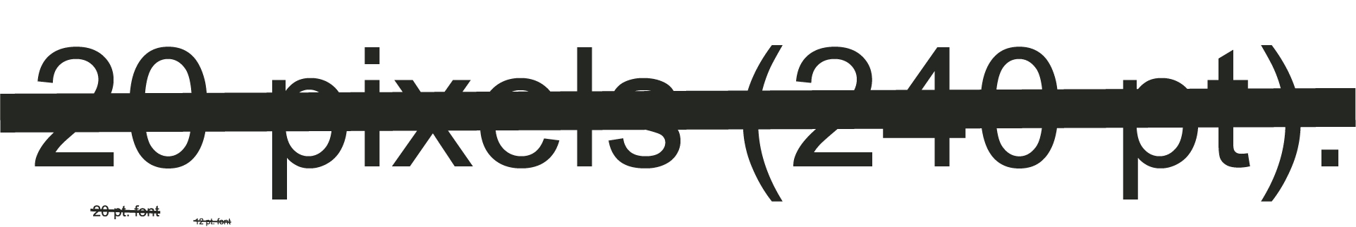
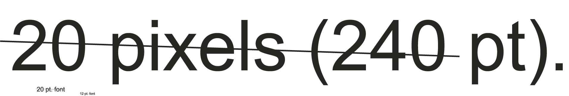
Based upon our conversations last month, I have attached a suggested
rewording of guidelines 1.4 and 1.5.

In the process we've collapsed 1.4 and 1.5 together since 1.5 only had a
single Level 3 guideline, although we've suggested a Level 2 guideline as
well based on Andi's suggestion.

While we were at it we also went through all of the open issues for
guidelines 1.4 and 1.5 and cleared as many of those as we could. Ben will be
sending a summary of the issues and proposed resolutions shortly.

We've also begun to incorporate some new materials around contrast which
have been developed in conjunction with the Human Factors software
guidelines and IEEE voting usability accessibility committees.

The work on voting uses luminance while we need to use brightness or
lightness.   I am working on determining values for X1, Y1, X2 and Y2 as
well as a description of the measurement procedure to complete the text.


Rationale and notes:

VISUAL

In Level 2, allowances made for the text to be easily readable.   If text is
over a background or color then there needs to be enough contrast to make
out the letters.  If the lightness between the text and the background is
enough then even if colors are similar to a user (or the same) they can read
the text.

If the text is over a background that has lines intersecting the text that
could be mistaken for parts of the text (when viewing the characters at very
close range)then the contrast between the text and the background lines has
to be greater than for a solid background.

In Level 3, the requirement is that it be easily readable at all times. In
level 3 the text and background must have contrast as high as for the text
over lines in level 2.


AUDIO

The Level 2 audio requirement is to prevent pages from playing sounds that
cannot be turned off and which may be played on the same computer channels
as the speech synthesis making it difficult or impossible to turn those
sounds down without turning down the speech synthesizer at the same time.
(especially since it's necessary to turn those sounds very low or off and
still be able to have the speech synthesis be on and loud in order to
overcome the environmental sounds).

The reason that there is a requirement for text over graphics (in levels 1
and 2) but not for speech over background sounds (at level 1 and 2) there is
already a requirement that the audio be captioned.   Thus, someone who is
having trouble hearing the speech over the background sounds can turn on the
captions.  There is no similar requirement that text over the top of
graphics be read aloud.  Hence, there is a need for Level 1 and Level 2
criteria in dealing with visual text over graphical information.


Attached is an HTML page that shows the proposed 1.4 and 1.5 combination.

Also attached is a copy of some graphics showing what a line that is 500%
larger and smaller than the width of the character looks like.  This is the
point where the lines are deemed so different that they can not be mistaken
for a character part even if viewed at a very close range where you can only
see a part of the letter at a time.  (you can use the Microsoft Default
Picture viewer or any graphics program.  Zoom in til you can only see part
of a letter to get an idea what it looks like with very close viewing.)
(There is of course no contrast between these lines and characters.  It is
just to give you an idea of where lines are too different to be mistaken.)


Gregg

 -- ------------------------------
Gregg C Vanderheiden Ph.D.
Professor - Ind. Engr. & BioMed Engr.
Director - Trace R & D Center
University of Wisconsin-Madison
Attachments
- text/html attachment: visual-audio-contrast.html
- image/jpeg attachment: lines_and_text_example_5xwider.jpg
- image/jpeg attachment: lines_and_text_example_5x-thinner.jpg
Received on Friday, 17 September 2004 01:43:18 UTC