- From: Andrew Somers <andy@generaltitles.com>
- Date: Mon, 2 Jan 2023 11:40:08 -0800
- To: Laura Carlson <laura.lee.carlson@gmail.com>
- Cc: public-low-vision-a11y-tf <public-low-vision-a11y-tf@w3.org>
Received on Monday, 2 January 2023 19:40:25 UTC
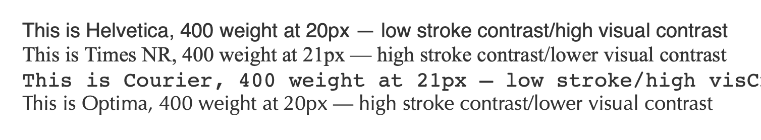
Thank you Laura, that's a very interesting study, and directly echoes my personal viewpoint on this particular subject.


I want to make a note here for anybody that reads this study:

The study uses the term "stroke contrast". It's very important to recognize that in the context that they are using it, stroke-contrast relates to the variation in stroke within a particular glyph.


And the effect is exactly opposite of the actual visual contrast.

In other words in the context of font contrast as in the stroke-contrast within a glyph, e.g. Times New Roman has very high stroke contrast.

But the visual contrast of Times is lower than that of Helvetica. Helvetica, having a uniform stroke width therefore has a low stroke contrast but (perhaps counterintuitively) that results with its visual contrast as higher.

Here's an example:


> On Dec 27, 2022, at 8:17 AM, Laura Carlson <laura.lee.carlson@gmail.com> wrote:
>
> Fyi:
> https://www.sciencedirect.com/science/article/pii/S0001691822003250
>
> Kind Regards,
> Laura
>
> --
> Laura L. Carlson
>
Received on Monday, 2 January 2023 19:40:25 UTC