- From: Alastair Campbell <acampbell@nomensa.com>
- Date: Thu, 15 Aug 2019 10:55:29 +0000
- To: Andrew Somers <me@AndySomers.com>
- CC: public-low-vision-a11y-tf <public-low-vision-a11y-tf@w3.org>
- Message-ID: <51E24822-1E8B-44FD-8604-ECC169905EA9@nomensa.com>
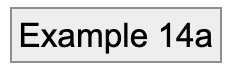
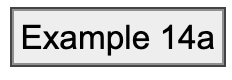
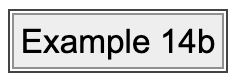
Hi Andrew,

Thanks for that, I think we are agreeing then that an extra requirement is needed rather than just size and contrast. I’m just trying to work out what makes sense for the WCAG 2.2 SC.

On the detail:
> A cardinal rule of design is *color as in hue should not be necessary for legibility” —if it does not work in greyscale, then it does not work as a design choice.

Agreed, and my previous examples have been greyscale, but I just wanted to make that point that:
For people with good vision, the change in hue can make it seem very legible/obvious, when it is not obvious to everyone.


> The need for a distinctive “change” depends partly on if it is in a group of similar items close together, or the focus is relative some dissimilar items far apart.

I agree that context is a factor, but for the purpose of WCAG 2.2 I’d like to take an approach of working out a good minimum requirement that works across contexts.

A good point that Jon raised previously is that: People might be magnified in on a small part of the screen. Even when the focus is going down a list of links, you might not see more than two items on screen at the same time.

That is a good reason to ignore the context and trying to find a good baseline-metric for focus indicators in general. I.e. it might not be perfect across all possible contexts, but it is relatively easy to provide a pass/fail for any particular link/button/control.


> In closing, a 1px border add MAY be enough or MAY NOT depending on CONTEXT of use.

Agreed, but the question at hand is similar to your last example with the outset focus-outlines, and asking ‘what is sufficient’ for the purpose of providing baseline ‘discernability’ of focus styles.

Looking at the examples as images in email, I think something is being lost in the image conversion or email compression (it didn’t pass 3:1). I recreated those styles as HTML/CSS in this test page, example 14:
https://alastairc.uk/tests/wcag21-examples/ntc-focus-styles.html#example14


With the new SC wording, example 4 on that page (adding a black outline adjacent to a black border) would fail, but the examples in 14a-c would pass.

Plase see theHTML page, but I’ll include the examples in this email below as well. The new SC text is saying example 4 would fail, 14a-c pass.

Default button with back border:
[cid:image001.png@01D55360.54E99E20]
1px black outline added (fail):
[cid:image002.png@01D55360.54E99E20]

Non-focused button with grey (#909090) border:
[cid:image003.png@01D55360.54E99E20]
1px outline (#444) which is > 3:1 with border AND background:
[cid:image004.png@01D55360.54E99E20]
Then offset by 1px:
[cid:image005.png@01D55360.54E99E20]
Then offset by 2px:
[cid:image006.png@01D55360.54E99E20]

We can agree that 14c is clearer than 14b, which is clearer than 14a.
However, are they sufficient?

(And this is in comparison with the current focus-visible SC under which everything on that test page would pass!)

Cheers,

-Alastair
Attachments
- image/png attachment: image001.png

- image/png attachment: image002.png

- image/png attachment: image003.png
- image/png attachment: image004.png
- image/png attachment: image005.png
- image/png attachment: image006.png

Received on Thursday, 15 August 2019 10:55:56 UTC