- From: Andrew Somers <me@AndySomers.com>
- Date: Wed, 14 Aug 2019 17:34:44 -0700
- To: Alastair Campbell <acampbell@nomensa.com>
- Cc: Jonathan Avila <jon.avila@levelaccess.com>, public-low-vision-a11y-tf <public-low-vision-a11y-tf@w3.org>
- Message-Id: <B9F843BA-F7AE-4452-A635-54E5ECDD7055@AndySomers.com>
Some variety of comments below, also repeats I sent to Alastair separately forgetting to include the list.
> On Aug 13, 2019, at 1:21 AM, Alastair Campbell <acampbell@nomensa.com> wrote:
>
> SNIP
> Without the thickness/separation requirement this would pass the proposed SC, which is equivalent to adding a 1px black outline to a solid black button:
> <image001.png>
>
> For those struggling to see it, there is a 1px red line around the left-hand solid blue button.
>
> The changed pixels are going from white to dark red, so meet 3:1. However, the blue-red contrast ratio is 1:1.6, so if you can’t discern the hue then it is just a slightly thicker button.
Essentially everyone except a true “monocrhromat” (no color perception at all) can distinguish between red and blue, with the following notes:
Protanopia can distinguish blue and “red or green” as distinctly different, but red will appear darker (about 25%-30% perceptually darker on an sRGB monitor)
Deuteranopia can distinguish blue and “red or green” as distinctly different.
Tritanopia will see the blue as black, and can distinguish the red.
But IMO even normal vision would have a problem with such a fine line there.
AND:
A cardinal rule of design is *color as in hue should not be necessary for legibility” —if it does not work in greyscale, then it does not work as a design choice. The examples I have below are all in greyscale:
Also to repeat some of what I said in an email that didn’t get to the list: 1px as a sole indicator is likely not enough. Here are some of the examples and related thoughts:
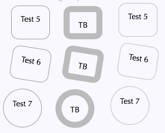
A 1px line needs much more contrast than a 12px line. This is something that is evolving relating to Silver (contrast based on spatial frequency). A 12 px line around a box for focus might work fine with less than 2:1 contrast. A 1px line needs more. On the left, 1px at 3:1 In the middle 12px at 1.9:1, on the right 1px at 1.9:1
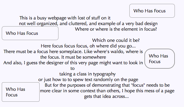
A second consideration with focus: The need for a distinctive “change” depends partly on if it is in a group of similar items close together, or the focus is relative some dissimilar items far apart. If items are far apart, and shaped and sized differently, then I’d submit that they need more distinction than if they are in, say, a column of 5 similar items.
...as opposed to this cluttered example (intentionally chaotic) :
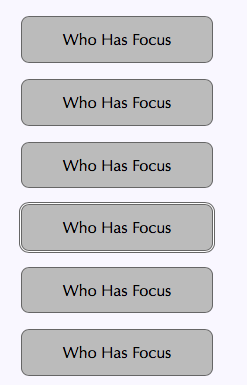
In both cases focus is a 2px border instead of a 1px.
And finally, if you have 5 items with a box around them, and the manner of indicating focus is just to change the contrast of one of the boxes, are you specifying a contrast change amount? Or a size change?
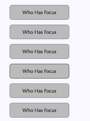
SIZE contrast can be important here. In the bottom example, they all have a 1px border, and that border is 3:1 contrast relative to the grey button. And the FOCUS is an additional 3:1 in CHANGE from the other buttons. Yet it is still VERY hard to see. Simply having a border be 3:! contrast different than the others isn’t enough.
In other words, everything below has 3:1 contrast from its nearest adjacent pixel.
For the record the one with focus is the fourth one down. So in a context like this, simply varying the contrast of the border is not enough, even though EVERYTHING is 3:1 OR MORE in all directions including the change of focus.
A 1px border is similar to a small, thin font. Small thin fonts should be in the 9:1 and higher contrasts, and in this last example, a 3:1 contrast variation (using WCAG math which does have some issues in this regard) is not enough in this case for change.
BUT here is a 1px border, that is set at 1 px away (left) or 2 pixels away (right)
The following box-shadow property puts a solid 1px border 3px away from the button without changing center to center vertical spacing, as in the example on the right:
box-shadow: 0 0 0 3px #FFF, 0 0 0 4px #666;
In closing, a 1px border add MAY be enough or MAY NOT depending on CONTEXT of use.
Andrew Somers
Color Science Researcher
(contact redacted for list)
Attachments
- text/html attachment: stored
- image/png attachment: Screen_Shot_2019-08-14_at_2.43.51_PM.png
- image/png attachment: Screen_Shot_2019-08-14_at_3.03.40_PM.png

- image/png attachment: Screen_Shot_2019-08-14_at_3.13.11_PM.png
- image/png attachment: Screen_Shot_2019-08-14_at_3.21.29_PM.png
- image/png attachment: Screen_Shot_2019-08-14_at_5.20.11_PM.png
- image/png attachment: Screen_Shot_2019-08-14_at_5.20.33_PM.png

Received on Thursday, 15 August 2019 00:35:17 UTC