- From: Alastair Campbell <acampbell@nomensa.com>
- Date: Fri, 9 Aug 2019 14:32:34 +0000
- To: public-low-vision-a11y-tf <public-low-vision-a11y-tf@w3.org>
- Message-ID: <CEB38BB5-30FD-4E77-873D-AEABE175DC22@nomensa.com>
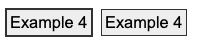
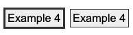
Hi everyone,

I wasn’t sure from the minutes if there were any additions / thoughts about the new focus-visible criteria?

Jim’s comment (in a co-ordination call) about separation of lines helping perception helped triggered a thought.

This is my test page with some black/white/grey examples to test various options:
https://alastairc.uk/tests/wcag21-examples/ntc-focus-styles.html


Comparing examples 4 & 6 (dark border with dark outline vs an out-set outline), I wondered about adding another requirement such as:

Minimum focus thickness: If the focus indication area is adjacent to a color with which it does not have a 3:1 contrast ratio difference, the thickness of the focus indicator is at least 2 CSS pixel.

I.e. if you put a dark outline around a dark button, it must be 2px thick. If you separate it, it can be 1px thick.

So this would fail:
[cid:image001.png@01D54EC7.A9D9CF60]
But either of these would pass:
[cid:image002.png@01D54EC7.A9D9CF60]
[cid:image003.png@01D54EC7.A9D9CF60]
It probably needs re-wording, but does that idea make sense? And if so, are there any pointers to supporting research?

Cheers,

-Alastair
Attachments
- image/png attachment: image001.png
- image/png attachment: image002.png
- image/png attachment: image003.png

Received on Friday, 9 August 2019 14:32:59 UTC