- From: Jim Allan <jimallan@tsbvi.edu>
- Date: Tue, 29 May 2018 09:51:35 -0500
- To: public-low-vision-a11y-tf <public-low-vision-a11y-tf@w3.org>
- Message-ID: <CA+=z1WmzBRrYJw3VgUZB5J-wpCw8+JvN_HPNvqcAN4Xy6UpBrA@mail.gmail.com>
Low Vision Folks. Need thoughts. Jon and Wayne have spoken up. There is a
question about the gestalt of borders and boundaries. I can live with that.
Please give this a read and comment.
Jim
---------- Forwarded message ---------
From: Andrew Kirkpatrick <akirkpat@adobe.com>
Date: Sat, May 26, 2018 at 5:46 PM
Subject: Resolving 1.4.11
To: WCAG <w3c-wai-gl@w3.org>
AGWG’ers,
**WARNING – lengthy but important and time-critical email!**
We have a few concerns raised about 1.4.11 Non-text contrast:
1. Concern from Funka (see Word doc attachment at
https://lists.w3.org/Archives/Public/public-comments-wcag20/2018May/0001.html)
that the Color limitations for buttons with text on a colored background
are too limiting. People either won’t be able to use yellow or will need to
use an extra border and that will be unpopular for designers. This is the
same issue as the concern about boundaries in Issue 914:
https://github.com/w3c/wcag21/issues/914.
2. Does the hover state indicator need to have 3:1? (Issue 913:
https://github.com/w3c/wcag21/issues/913)
*So, what do we do? I think that it helps to look at a bunch of examples:*
As a reminder, this is the SC text:
1.4.11
The visual presentation <https://www.w3.org/TR/WCAG21/#dfn-presentation> of
the following have a contrast ratio
<https://www.w3.org/TR/WCAG21/#dfn-contrast-ratio> of at least 3:1 against
adjacent color(s):
*User Interface Components*
Visual information used to indicate states
<https://www.w3.org/TR/WCAG21/#dfn-states> and boundaries of user interface
components <https://www.w3.org/TR/WCAG21/#dfn-user-interface-components>,
except for inactive components or where the appearance of the component is
determined by the user agent and not modified by the author;
*Graphical Objects*
Parts of graphics required to understand the content, except when a
particular presentation of graphics is essential
<https://www.w3.org/TR/WCAG21/#dfn-essential> to the information being
conveyed.
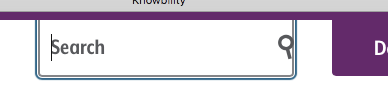
1. Knowbility’s search box. There is 4.5:1 text that indicates that
there is something for the user to activate. It is a search box and when
you click on it the placeholder text shifts to the left and exposes the
full area of the input.
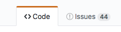
1. Github’s tab interface. It is pretty clear which tab has the selected
state because of the red accent, but there is definitely not 3:1 contrast
between the background colors of “code” and “issues”, nor is the line
between these 3:1.
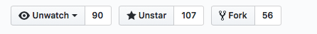
1. Github buttons. For the “unwatch” button, the contrast between the
inside of the button and the outside is 1.08:1, and between the border line
and the outside background is 1.62:1. The contrast between the unwatch text
and the little triangle that indicates the drop down is 13.79:1.
1. Github buttons #2. The contrast everywhere is sufficient except in
the thin border line around the not-currently-selected items.
1. New WAI site. The difference in contrast between a hovered item and a
non-hovered item in the nav is 1:40:1, but there is a high-contrast
underline that is also part of the hover.
1. CNN. Contrast of hovered and non-hovered text is greater than 4.5:1.
Contrast between the hovered and non-hovered text is 1.84:1.
1. Adobe. The light gray background appears on hover and the tiny little
triangle appears. The text has sufficient contrast in hover and non-hover
states, but the hover background and triangle don’t.
1. LevelAccess – high-contrast throughout.
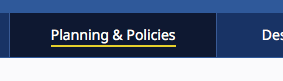
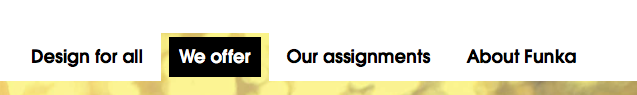
1. Funka. Active/selected tab shows sufficient contrast for state. The
non-selected tabs don’t use color to indicate the boundaries.
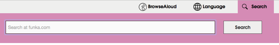
1. Funka Search. The three items in the top nav – the left two don’t use
color to indicate the boundary. The right button does but the contrast
isn’t 3:1.
1. Funka search open. Once the search button is open, everything seems
to have suffient 4.5/3:1 contrast.
1. Material design. Text fields come in two forms. The example on the
left has a field background that is less than 3:1 with the background, but
the line marking the bottom boundary of the field is 3.28:1 on the
background. For the triangle in the drop down the ratio is 3.02:1 relative
to the field background. On the right, the border has a 3.64:1 ratio to
the background, but it goes all the way around.
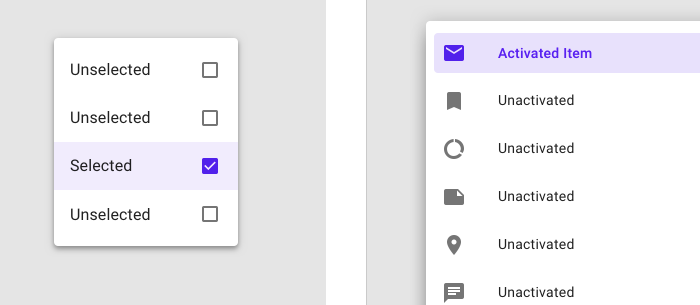
1. Material design selection. The selected item on the left has a
greater than 3:1 ratio for the checked/unchecked box, but the purple
background is not 3:1. On the right, the purple activated color has >6:1
contrast against the light purple and >7:1 against the white, but the
purple background is less than 3:1 against the white.
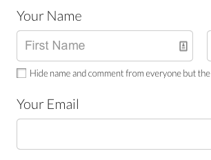
1. GoFundMe donate page: The “your name” label text (not properly
labeled) is >4.5:1, but the field border and placeholder text are less than
3:1.
1. Buttons with specific boundaries – contrast between states is 1.75:1,
so to some people this just looks like one green area.
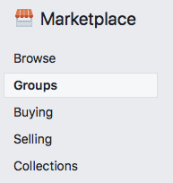
1. Facebook marketplace active area indicator. The greatest contrast is
the whitish background of groups and the thin border between that and the
light grey background. 1.22:1 contrast.
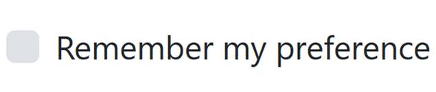
1. Bootstrap checkbox. The checkbox is 1.30:1 contrast relative to the
background.
https://getbootstrap.com/docs/4.1/components/forms/#inlineFormCustomSelect
<https://na01.safelinks.protection.outlook.com/?url=https%3A%2F%2Fgetbootstrap.com%2Fdocs%2F4.1%2Fcomponents%2Fforms%2F%23inlineFormCustomSelect&data=02%7C01%7Cakirkpat%40adobe.com%7C05736cdf6373468230e408d5c31ae33d%7Cfa7b1b5a7b34438794aed2c178decee1%7C0%7C0%7C636629442639781231&sdata=TMFTI316LNA3T8bUUPXyKIZFx7xFqdw5wbyvsbke4Tw%3D&reserved=0>
*Interpretation:*
My interpretation of the SC, and what I believe that the WG intended is
that:
1. Visual information that is important to identifying the state or
existence (boundary) needs to be at least 3:1.
2. All visual aspects of a UI Component at not required to meet 3:1,
only if it is required to identity the state or existence of the control.
3. For some components, text that is 4.5:1 is entirely sufficient to
meet the requirements of 1.4.11.
1. Are we requiring a full boundary around links (which are UI
Components)? I don’t believe so.
2. Are we ok with a set of tabs like in example #9 above, or does
each tab need a full boundary to indicate the click area? I believe so.
4. If a color is less than 3:1, you need to pretend that it doesn’t
exist at all and assess whether the component passes based on other
information.
1. Compare the same set of tabs in example #9 and consider whether it
is less accessible if the non-active tabs have a pale color background.
5. Hover is covered, but not relative to the component’s own non-hover
state. What is covered is that the hover state needs to meet the 3:1 ratio
for any non-text content. This means that if there is an icon in a button
that fades out when hovered, it would fail (just like is the case for 1.4.3
if text in a hovered button fades on hover).
*With my interpretation the examples above are rated:*
1. Pass
2. Borderline fail – perhaps an uncomfortable pass?
3. Pass
4. Pass
5. Pass
6. Pass
7. Pass
8. Pass
9. Pass
10. Pass
11. Pass
12. Pass – the right side example passes easily. The left side, with the
underline border is, I think, an uncomfortable pass. Like a lined paper
form, people can figure out the rough size of the fields by proximity and
spacing, so one line is minimally sufficient.
13. Pass
14. Is interesting – this example clearly fails, but if the control was
properly associated with the label would that help since that creates a
clickable region that has sufficient contrast and then the control becomes
more visible when focused because of the focus rectangle or input carat?
15. Fail – the contrast for the boundary is particularly significant in
this situation.
16. Fail – the contrast for the selected state. This is an example of
communicating information by color alone and the contrast doesn’t make up
for the color.
17. Fail - Similar to #14. Some might argue that if the label is
properly associated that this makes the text label and image part of one
control and therefore ok, and we should be clear about that in a technique
or failure.
If you find that you are agreeing that my interpretation reflects the
intent of the Working Group, or that you are disagreeing that it reflects
the intent of the Working Group, please say so.
I have a pull request that implements changes in the Understanding document
in line with this: https://github.com/w3c/wcag21/pull/943/files?utf8=✓
&diff=split
*Is there a downside?*
One of the comments we received requested that we implement a requirement
for a thicker boundary around components. This would unquestionably help
people, but also creates problems in that we are specifying UI Components,
including links and other interactive controls. Are we requiring that
individual items within a select/drop down show clear boundaries since each
is a separate clickable region? Both of these come into play if the strict
interpretation of this SC is the intent of the group.
I believe that we need to be unified and clear about this SC’s
interpretation, and soon!
AWK
--
Jim Allan, Accessibility Coordinator
Texas School for the Blind and Visually Impaired
1100 W. 45th St., Austin, Texas 78756
voice 512.206.9315 fax: 512.206.9452 http://www.tsbvi.edu/
"We shape our tools and thereafter our tools shape us." McLuhan, 1964
Attachments
- image/png attachment: image001.png

- image/png attachment: image002.png
- image/png attachment: image003.png
- image/png attachment: image004.png
- image/png attachment: image005.png
- image/png attachment: image006.png
- image/png attachment: image007.png

- image/png attachment: image008.png

- image/png attachment: image009.png

- image/png attachment: image010.png
- image/png attachment: image011.png

- image/png attachment: image012.png
- image/png attachment: image013.png

- image/png attachment: image014.png
- image/png attachment: image015.png
- image/png attachment: image016.png
- image/png attachment: image017.png
- image/jpeg attachment: image018.jpg
- image/png attachment: 19-image008.png
Received on Tuesday, 29 May 2018 14:52:22 UTC