- From: Repsher, Stephen J <stephen.j.repsher@boeing.com>
- Date: Fri, 20 Oct 2017 19:07:39 +0000
- To: Jim Allan <jimallan@tsbvi.edu>
- CC: Alastair Campbell <acampbell@nomensa.com>, Glenda Sims <glenda.sims@deque.com>, LVTF - low-vision-a11y <public-low-vision-a11y-tf@w3.org>
- Message-ID: <e73a09208224452ebd73c7c8951b0b7a@XCH15-08-08.nw.nos.boeing.com>
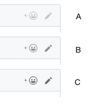
Hey Jim,

Just to be clear, I wasn’t saying #1 was a good idea, just pointing out that moving to #2 requires thinking about functional output possibilities and how they may vary from one task to the next.

You mentioned adding a border – perfectly possible in the wild, but think how that changes things.  Is it the only button and I know what it does from context so finding the clickable area is paramount?  Or is it in a toolbar with many other buttons and I need to pick the right icon?  What if they have 2 different ratios with the background?

Also, for simplicity and to be more realistic, adding other buttons should have the same contrast as what you are trying to test.  An author is very unlikely to have great contrast on an entire form or toolbar except for one loner.

As I’m thinking about this, coding would take some time, but such a test would be fairly straightforward to design.  If Survey Monkey or another platform allows for very customized questions with scripting, that would help a lot.

Steve

From: Jim Allan [mailto:jimallan@tsbvi.edu]
Sent: Friday, October 20, 2017 2:39 PM
To: Repsher, Stephen J <stephen.j.repsher@boeing.com>
Cc: Alastair Campbell <acampbell@nomensa.com>; Glenda Sims <glenda.sims@deque.com>; LVTF - low-vision-a11y <public-low-vision-a11y-tf@w3.org>
Subject: RE: Pop quiz


On Oct 20, 2017 10:57 AM, "Repsher, Stephen J" <stephen.j.repsher@boeing.com<mailto:stephen.j.repsher@boeing.com>> wrote:
Full disclosure: I operate with colors inverted always since I am glare sensitive and can’t see much of anything on the screen otherwise.  So the contrast ratio I see is not exactly the same, but very similar.

Looking from a comfortable chair position, C is the only one I can notice quickly.  B takes me several seconds to spot, but then again I learned where to study my gaze from the letters and icon for C.  I can’t see anything next to A without getting very close to the screen
I wonder if a dark border would help call attention to where to look. Seems the edges help cue the eye where to pay attention and what the boundaries of attention should be.

Glenda’s point is perfectly valid, but random ordering is not a solution.  Again I’ll caution against trying to put together a survey without considering and planning for the many input variables and outcomes to study in an objective, measurable, and statistically significant manner.

The inputs are too many to control in a single study, but all the major ones need to be controlled or recorded (e.g. eye conditions, distance from screen, size of screen, resolution/magnification, focal point of vision, color inversion, other active assistive technology, etc.).
Agree.
As for outputs, take the pencil I assume?) icon of this email as a single example.  Presenting the same icon at different ratios and asking which I can “see” is very subjective and won’t correlate well to practical usage.  So what other outputs could be studied?  Just off the top of my head:

1.       Varying the screen location and contrast between questions, you could determine if I see it or not in a fixed amount of time (similar to a field of vision test).
For a random test of random user in random location on random device... in the wild... seems difficult. Difference between clinical vision eval and a functional vision eval that teachers do.  Dr.s Are always surprised at what kids can and cant see in the wild. We can capture demographic data and some on ocation, device, lighting etc. And send out to masses.

2.       Varying the contrast of a typical scenario that icon might be used between questions,  you could ask me to click it with the mouse and time how long it takes me it would matter greatly if other things were clickable, labeled, and what they were though.
Distractors with better contrast. Like it.
The first is more basic research while the second is more about objective usability.  For every type of graphic, the latter becomes very different.  For example, a pie, bar, or line chart is about reading the results correctly in a reasonable amount of time, whereas focus or selection indicator is just about finding it visually in a reasonable time.
Like the practical usability. For icons, buttons, etc. Charts etc ate more complicated. Like what AC has done with same graphic ... different treatment.
I’m happy to help plan a test that I think would be useful, but I do not think a multiple choice contrast survey is going to produce useful results.
Understand where you are comming from. Sti think some iterative research would bee good.

Jim
Steve

From: Alastair Campbell [mailto:acampbell@nomensa.com<mailto:acampbell@nomensa.com>]
Sent: Friday, October 20, 2017 11:01 AM
To: Glenda Sims <glenda.sims@deque.com<mailto:glenda.sims@deque.com>>

Cc: LVTF - low-vision-a11y <public-low-vision-a11y-tf@w3.org<mailto:public-low-vision-a11y-tf@w3.org>>
Subject: Re: Pop quiz

Hi Glenda,

Yep, makes sense, I’m beta-testing at the moment, just need to create more examples first such a survey I think.
Do you know if Survey monkey allows for random ordering?

That’s one side, the “is 3:1 enough” question.

The other side is: “How do you identify and test various graphics”, for which I’ve asked Andrew & Josh for an agenda item at TPAC – a graphics contrast quiz.

I’ll email out to the main list soon asking for examples.

Cheers,

-Alastair


From: Glenda Sims <glenda.sims@deque.com<mailto:glenda.sims@deque.com>>
Date: Friday, 20 October 2017 at 15:53
To: Alastair Campbell <acampbell@nomensa.com<mailto:acampbell@nomensa.com>>
Cc: LVTF - low-vision-a11y <public-low-vision-a11y-tf@w3.org<mailto:public-low-vision-a11y-tf@w3.org>>
Subject: Re: Pop quiz

A is not enough
B is okay  (but this may be due to the surrounding clues giving in C)
C is best

A quiz like this would be cool in survey monkey...where I'm not seeing all 3 at the same time.  Because C is in my field of vision...I can use it to tell me what I should see in B and A.  Once my eyes understand "C"....I think my brain fills in gaps in A and B.

Make sense?
G

glenda sims  |   team a11y lead   |    deque.com<http://deque.com>    |    512.963.3773<tel:(512)%20963-3773>
web for everyone. web on everything. -  w3 goals

[IAAP International Association o]<http://www.accessibilityassociation.org/certification>

On Fri, Oct 20, 2017 at 9:42 AM, Alastair Campbell <acampbell@nomensa.com<mailto:acampbell@nomensa.com>> wrote:
Hi everyone,

I’m dealing with github comments and thinking about ratios.

I think most people know the github site to some degree?

Without testing, which of these has ‘enough’ contrast for you?

[cid:image001.png@01D349B2.FA7479A0]

You can probably guess the ratios, so my question is really: Is B enough for you?

The level of difficulty to meet (with various colours) goes up a lot between B & C, does the perceptibility?

To me, there is more difference between A & B than B & C, but I’m not target audience…

Kind regards,

-Alastair

--

www.nomensa.com<http://www.nomensa.com/>
tel: +44 (0)117 929 7333<tel:+44%20117%20929%207333> / 07970 879 653
follow us: @we_are_nomensa or me: @alastc
Nomensa Ltd. King William House, 13 Queen Square, Bristol BS1 4NT<https://maps.google.com/?q=13+Queen+Square,+Bristol+BS1+4NT&entry=gmail&source=g>

Company number: 4214477 | UK VAT registration: GB 771727411
Attachments
- image/png attachment: image001.png
Received on Friday, 20 October 2017 19:08:11 UTC