- From: Brandon Jones <bajones@google.com>
- Date: Thu, 11 Jul 2019 11:47:39 -0700
- To: Klaus Weidner <klausw@google.com>
- Cc: Leonard Daly <web3d@realism.com>, public-immersive-web-wg@w3.org
- Message-ID: <CAEGwwi27c8AE9bdv67roj2WYz7Sep0BTkRcygPGyV+5rUDUmuQ@mail.gmail.com>
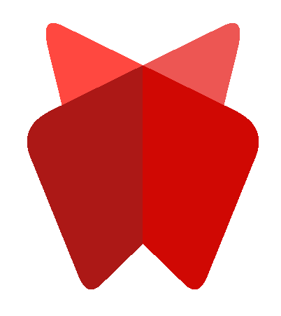
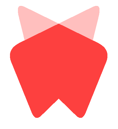
To compliment Klaus' edits, since I've heard several times now that
gradients may be difficult in a variety of situations (printing,
embroidery, etc) I tweaked my realtime version of the logo to get a couple
of screenshots for what a flatter color scheme would look like. (Colors are
not intended to be final, just for illustrative purposes.)

[image: Screenshot 2019-07-11 at 11.26.42 AM.png]
If you just strip out the gradients but leave the planes a different color
to simulate lighting you end up with this four color variant (though the
back "wings" should either be more differentiated or made identical). This
is pretty crisp and still reads as the same logo to me, which is nice. I
wouldn't necessarily see this fully replacing the gradient version, but it
would be nice to have as an officially sanctioned alternative for the
situations that call for it.

We can take it a step further, though, if we really want to embrace the
flatness. :)

[image: Screenshot 2019-07-11 at 11.41.23 AM.png]
Diego's original pitch to the chairs actually used this coloring, with the
"seam" between planes being implied only by the silhouette. I don't mind
the minimalism of this version, honestly, but it does start to feel like a
different mark when we reduce it this much, and is a lot more abstract.

When it comes to the font I'm not particularly attached to any specific
approach, aside from urging someone other than myself to make the call. :)
Given my track record with these things I'd select something that the
design community regards with the same amount of respect as Comic Sans and
Papyrus.

--Brandon

On Thu, Jul 11, 2019 at 11:20 AM Klaus Weidner <klausw@google.com> wrote:

> On Thu, Jul 11, 2019 at 10:57 AM Leonard Daly <web3d@realism.com> wrote:
>
>> I like the design, and especially wish to recognize the people that did
>> the work getting this done.
>>
>> I have had to deal with logos in a variety of media and have a few
>> questions about this one (or any of the discussed variants)
>>
>>
>>    1. Is there a one-color version -- something that can be embroidered
>>    using a single color thread?
>>    2. Is there a gray-scale version - something for B/W laser printers
>>    or single color silk-screen?
>>    3. Is there a (nearly) square version - many times the provided area
>>    is more square than linear?
>>    4. The contrast with back red wings and the dark background is a bit
>>    low  -- can that be increased?
>>    5. Has this been checked against various visibility conditions (low
>>    light, color-blindness/insensitivity, etc)?
>>
>>  I really like the design!
>
> Just out of curiosity, I did a quick experiment to rearrange the parts to
> fit into a square space, and I think this has potential. Apologies for
> mangling the original, just trying to get a feel for it.
> [image: webxr-square.png]
>
> Since a few people asked for a thicker font, here's a quick attempt using
> Trebuchet MS:
> [image: webxr-square-trebuchet.png]
>
> And just for fun, here's what it looks like when simply converted to
> grayscale:
> [image: webxr-square-grayscale.png]
>
Attachments
- image/png attachment: webxr-square.png

- image/png attachment: webxr-square-grayscale.png

- image/png attachment: webxr-square-trebuchet.png

- image/png attachment: Screenshot_2019-07-11_at_11.26.42_AM.png
- image/png attachment: Screenshot_2019-07-11_at_11.41.23_AM.png
Received on Thursday, 11 July 2019 18:48:17 UTC