- From: Richard Ishida <ishida@w3.org>
- Date: Thu, 20 Sep 2007 11:46:31 +0100
- To: "'Martin Duerst'" <duerst@it.aoyama.ac.jp>, <www-style@w3.org>, <public-i18n-core@w3.org>
- Message-ID: <004901c7fb73$8202a250$6501a8c0@rishida>
> From: Martin Duerst [mailto:duerst@it.aoyama.ac.jp]
> Sent: 20 September 2007 03:24
...
> >This is not sufficient. The accents in bopomofo ruby are not
> displayed as a
> >unidirectional run of text. Bopomofo accents are
> non-combining characters
> >that in memory follow the sequence of bopomofo alphabetic characters
> >spelling out a syllable. However, the second to fourth tones
> are displayed
> >in a separate vertical column to the right of the alphabetic
> characters,
> >and the neutral tone marker is displayed as a dot above the
> column of
> >alphabetic characters.
>
> My understanding is that the placement of accents on bopomofo, like
> the placement of all accents and diacritics or other combining
> characters, is an issue of basic text rendering, rather than a
> layout/styling issue. So I think a reference to some material
> explaing how Bopomofo tone markers are placed may be appropriate
> here, but the CSS Ruby spec should not go into detail.
>
> This is of course unless there are variations of placement that
> depend on style that can otherwise not be expressed or derived
> from the existing/proposed CSS properties.


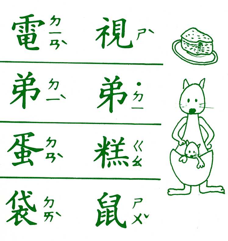
First, bopomofo tone marks are *not combining characters*.  They are regular spacing characters that are stored *after* the sequence of bopomofo letters that make up a syllable. In ruby text tones 2-4 are displayed in a vertical column alongside the bopomofo letters, and tone 1 is displayed above the column of bopomofo letters.

02C9:     MODIFIER LETTER MACRON
02CA:     MODIFIER LETTER ACUTE ACCENT
02C7:     CARON
02CB:     MODIFIER LETTER GRAVE ACCENT
02D9:     DOT ABOVE

The attached image shows some examples of bopomofo from a set of Taiwanese flash cards for kids.

The sequence of characters for the example at top left is ㄉㄧㄢˋ  ie.

3109:     BOPOMOFO LETTER D
3127:     BOPOMOFO LETTER I
3122:     BOPOMOFO LETTER AN
02CB:     MODIFIER LETTER GRAVE ACCENT

Michel had written "In order to achieve that effect, vertical-ideographic layout should be set on each individual ruby. That can be accomplished with the following simple CSS rule: ruby.bopomofo { writing-mode: tb-rl }"

That would not put the accent in the right place for this example.  At the very least you would have to set the styling to writing-mode: tb-lr, vertically centre the alphabetic bopomofo characters, force a line break (something that doesn't make sense for normal ruby), then correctly align the tone mark vertically (see http://lists.w3.org/Archives/Member/w3c-i18n-wg/2000Jan/att-0118/zhuyin-ruby-posn.gif , but note that the attached image shows that the tone mark is vertically positioned alongside the last bopomofo character).

Things are more complicated when a light tone is used (DOT ABOVE).  This appears at the top of the column of bopomofo letters, even though when written it appears after these in memory.  See the example 2nd row from top to the right: ㄉㄧ˙

3109:     BOPOMOFO LETTER D
3127:     BOPOMOFO LETTER I
02D9:     DOT ABOVE

I don't know how you would achieve these effects properly by using existing or currently proposed CSS properties, and even approximating them would be such a complicated setup that it would probably merit a simple shortcut anyway.  If the 'right' value was designed specifically to handle bopomofo, I think it should not require a bunch of additional properties and classes to display the text as expected.  The presence of the right value should indicate to the user agent that it should expect bopomofo text and arrange any tone marks appropriately. (Which is why I had also suggested that this value be renamed 'bopomofo', to more clearly indicate its use.)

Hth
RI
Attachments
- image/jpeg attachment: bopomofo-examples1.jpg

Received on Thursday, 20 September 2007 10:44:18 UTC