- From: Zouhir ⚡️ via GitHub <sysbot+gh@w3.org>
- Date: Tue, 17 Mar 2020 23:48:10 +0000
- To: public-css-archive@w3.org
Great point @Dan503 -- I was actually meaning to reply to your comment regarding multi-monitor.
I completely understand that the concepts are related (dual-screen, foldables and multi-monitor) and I am not opposed at all to consider multi-monitor setups, therefore, if we were heading down that path, I agree we need to find a better name than `fold-*`.
While working with developers who are planning to add support for dual-screen & foldable devices, multi-monitor never came up as something they are wanting to target or apply their dual-screen layouts to. So, if we can have a customer with a good use-case for multi-mon, that'd be ideal, until then, I think we can brainstorm what we need to do to enable that path, some questions I have:
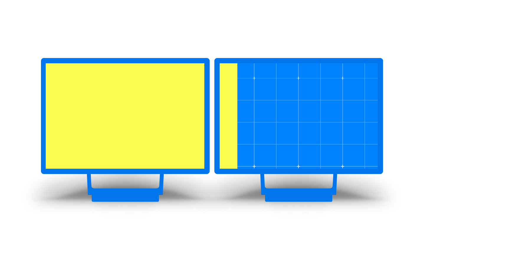
1. What do we need to do if the browser window is not maximized across the 2 monitors?

the right side in the figure above is not good for any content, and media queries does not yet enable us to check how big that side is, example:
```css
@media (display-span-x: 2) and (min-width: 900px) and (calc(100vw - env(fold-right) >= 400px) {
/* only now apply spanning layout, because it's more than a tablet with enough room on the right side of the fold */
}
```
2. How can multi-monitor be excluded? or should we allow its exclusion at all?
I am worried developers will start using device specific `ratio` or other stuff to only apply spanning for portable foldables if we don't offer multi-monitor exclusion.
--
GitHub Notification of comment by zouhir
Please view or discuss this issue at https://github.com/w3c/csswg-drafts/issues/4736#issuecomment-600354605 using your GitHub account
Received on Tuesday, 17 March 2020 23:48:12 UTC