- From: Jen Simmons via GitHub <sysbot+gh@w3.org>
- Date: Thu, 23 Jan 2020 09:39:38 +0000
- To: public-css-archive@w3.org
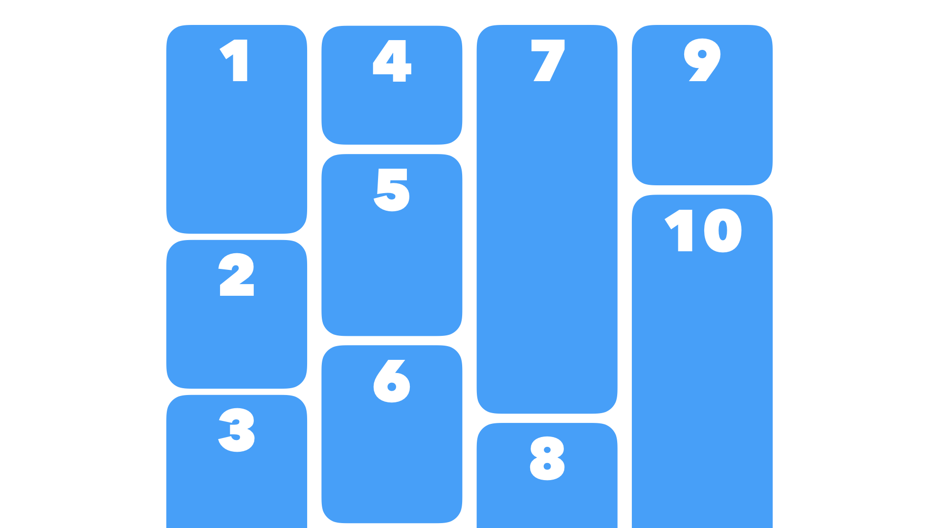
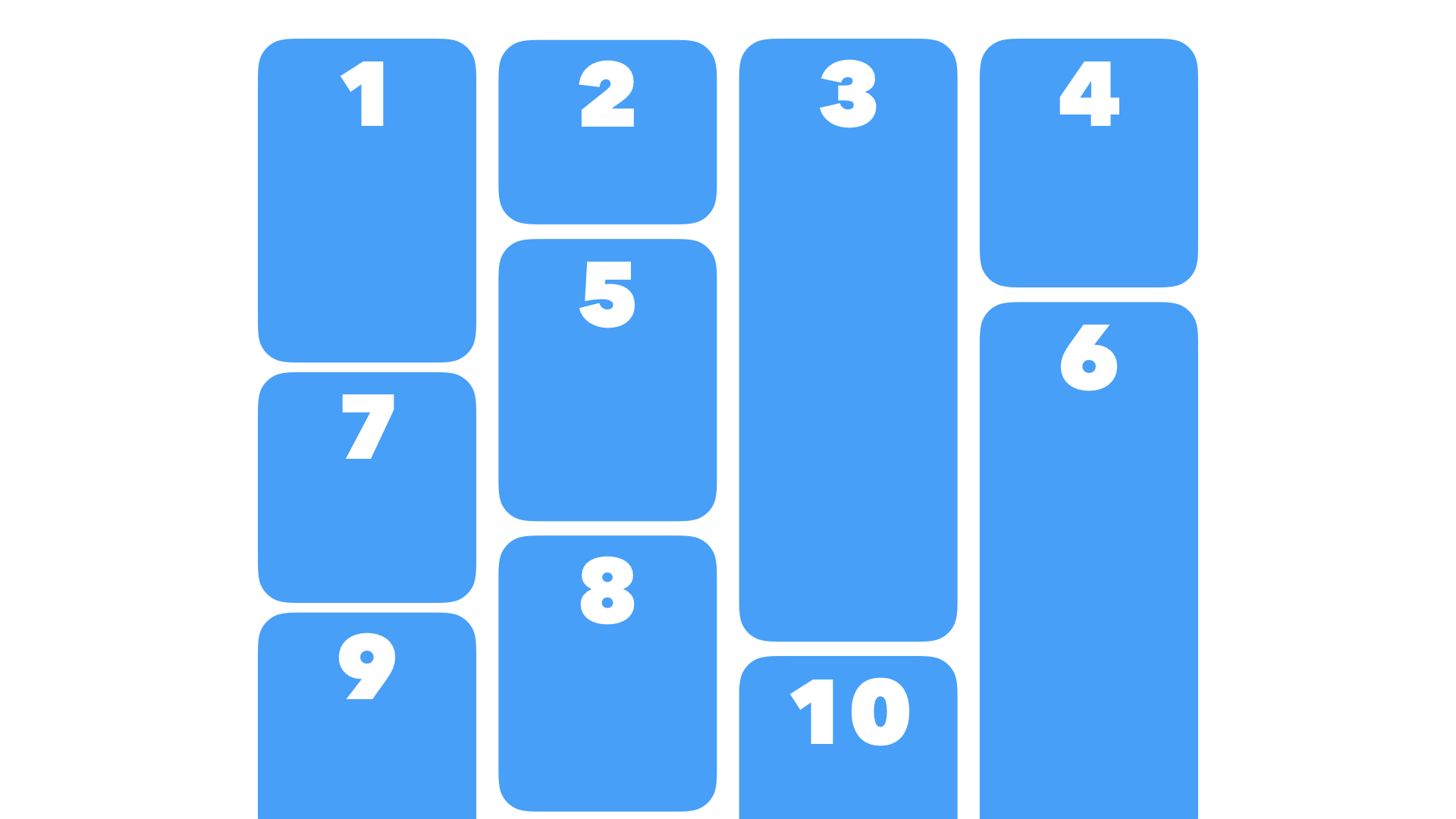
@argyleink I believe that if the desire result is what you drew in your first diagram, you can already do that today using Multicolumn.  The key with Masonry is the content order. The Masonry JS library can do both of these content orders: The default order puts the next item in the order as close to the top as possible.  An alternative order (`horizontalOrder: true`) usually puts the next item in the next column, without regard to how close to the top the next slot is:  I believe Masonry-style layout belongs in Grid, because the algorithm is thinking about both the rows and columns, and autoplacing content with regards to both. Flexbox can be thought of as a long content snake, that wraps around and around... same with multicolumn. Masonry requires "jumping" from one column to another — there's no content snake. No long unbroken wrapping chain. Making this part of Grid also gives Authors all the other powers of Grid — track sizing, names, etc. -- GitHub Notification of comment by jensimmons Please view or discuss this issue at https://github.com/w3c/csswg-drafts/issues/4650#issuecomment-577602456 using your GitHub account
Received on Thursday, 23 January 2020 09:39:40 UTC