- From: Zouhir ⚡️ via GitHub <sysbot+gh@w3.org>
- Date: Tue, 04 Feb 2020 05:42:04 +0000
- To: public-css-archive@w3.org
zouhir has just created a new issue for https://github.com/w3c/csswg-drafts: == Proposing new CSS primitives to enable great web experiences on foldable & dual-screen devices == My colleague @dlibby- and I have published an explainer on [MicrosoftEdge's Explainers repo](https://github.com/MicrosoftEdge/MSEdgeExplainers/blob/master/Foldables/explainer.md) where we have proposed a new JavaScript API and a [CSS media query with a set of pre-defined env() variables](https://github.com/MicrosoftEdge/MSEdgeExplainers/blob/master/Foldables/explainer.md#proposal-css-primitives-for-building-dual-screen-layouts). Both aim to enable developers to lay content out effectively in a window that spans multiple displays, and more specifically for dual screen devices. We wanted to communicate our thought process behind why are we proposing the new CSS primitives and collaborate with the working group to help web developers continue to build great responsive experiences on the web for every device that runs a browser. ### The flexible form factor trend The trend started in 2019 when Samsung, Huawei, Asus and others released their foldable & dual screen devices, and in 2020 Microsoft will be adding 2 devices, Surface Neo and Surface Duo to this flexible device category. ### Why are we proposing new CSS primitives? When the browser window is spanning across the device fold, informing developers about the fold orientation and display boundaries can help them design great experiences. Here’s a quick overview of possible patterns and opportunities for the web platform when CSS can provide the necessary information on this class of devices: **1. Bringing wider-screens UI patterns to smaller portable devices & Creating enlightened UIs on the web** Due to screen size limitation, traditional portable touch-screen devices rely a lot on “stacking views” where clicking on an email in your inbox list for example will cause that whole inbox list view to be replaced with the selected email content view. This behavior usually creates additional navigation steps while wider screen devices have a more natural configuration where the email inbox list view and email content view are side-by-side. When the browser is spanning across the 2 screens on a dual-screen device developers should be able take advantage of the wider-viewing area and also snap to the natural boundary of each screen. 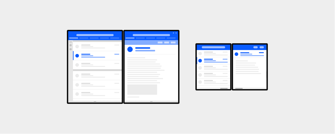 We also strongly believe that re-creating patterns that make sense is not the only PRO here - this device category with 2 displays and flexible hinge can offer unique opportunities for developers and designers to create new experiences as long as the web platform provides necessary information (eg. screen boundaries, fold orientation).  **2. Easily improve existing sites & UI components** Developers might not want to introduce major UI changes for this class of devices and would just want to simply move some components around. In the example below, it makes more sense for the modal dialogue to avoid the device fold, whether the foldable device is seamless or has a seam; and we want CSS to offer the capability to match this device class and allow developers to progressively enhance their site. 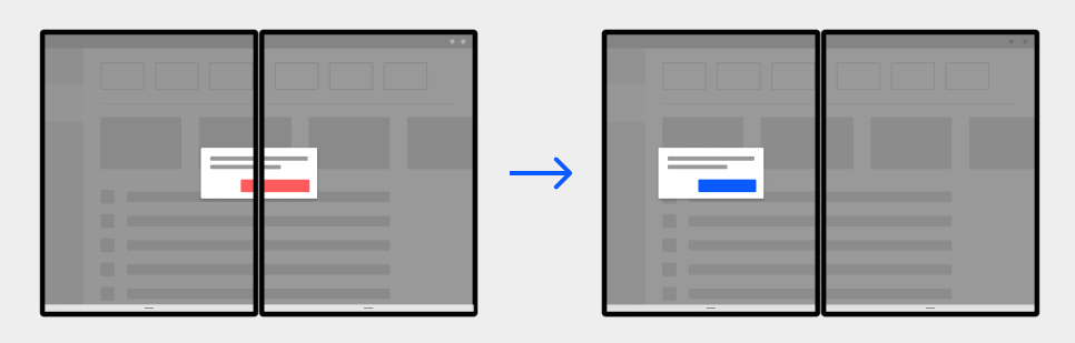 ### Operating systems & Native app platforms status Microsoft has released some information about OS & native app platform APIs and SDKs. - [Android SDK & Emulator for surface Duo](https://docs.microsoft.com/en-us/dual-screen/android/index) - [Windows 10x API documentation ](https://docs.microsoft.com/en-us/dual-screen/windows/index) - [Microsoft blog post about app patterns for dual-screen devices](https://docs.microsoft.com/en-us/dual-screen/introduction) We’d like to have a standard declarative web API browser vendors can implement so website and PWAs can match native app platforms capabilities. ### Proposed CSS primitives and general design principles **The 'spanning' CSS media feature** A simple CSS media feature to test whether the browser window is spanning across multiple displays on a dual-screen device. 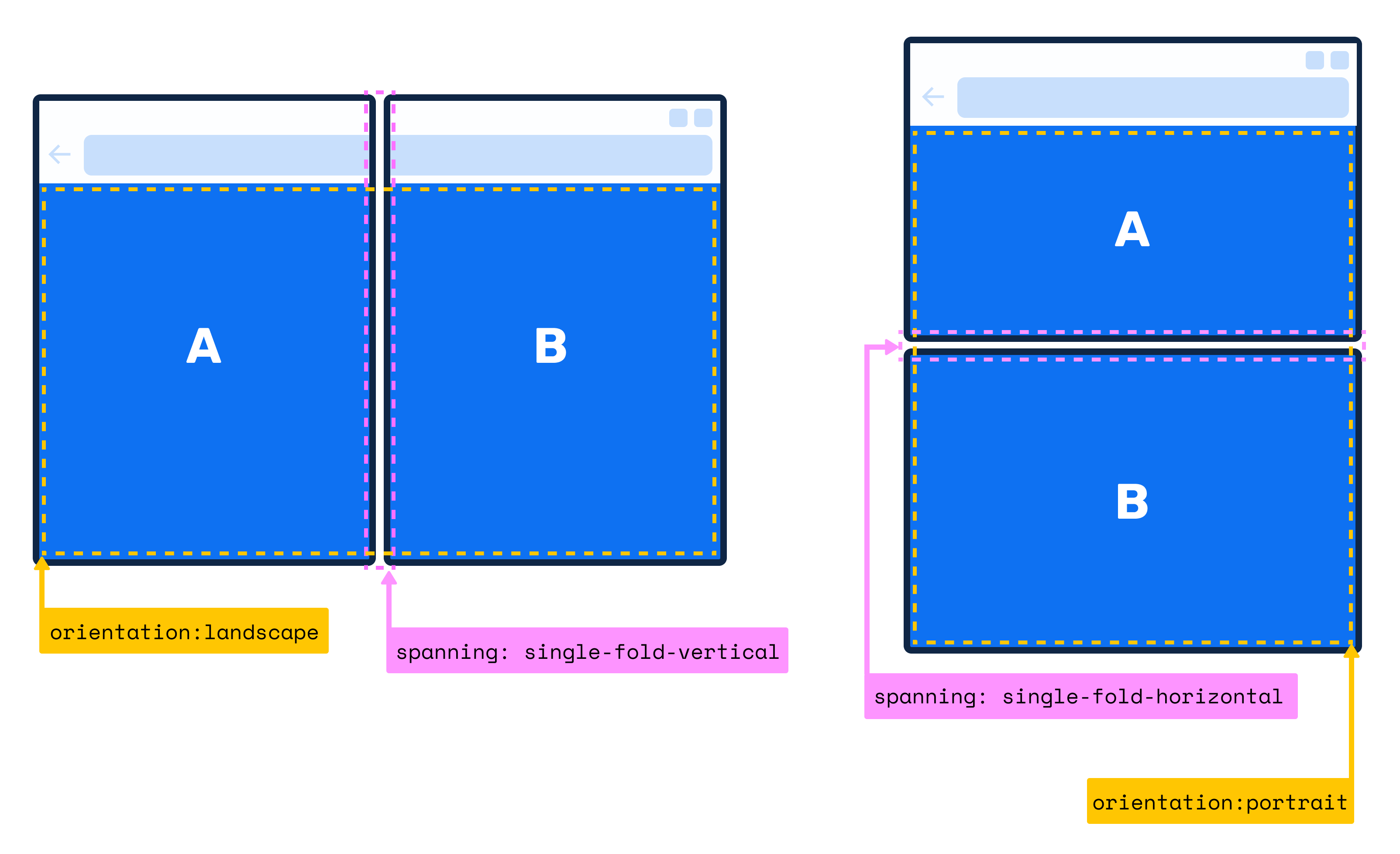 The `spanning` media feature value can be one of the following keywords: - `single-fold-vertical`: This value matches when the layout viewport is spanning a single fold (two screens) and the fold posture is vertical. - `single-fold-horizontal`: This value matches when the layout viewport is spanning a single fold (two screens) and the fold posture is horizontal. - `none`: This value describes the state of when the browser window is not in spanning mode. **Device fold CSS environment `env()` variables** We propose the addition of 4 pre-defined CSS environment variables `fold-top`, `fold-left`, `fold-width` and `fold-height`. They represent the fold's (device hinge) rects and web developers can utilize those variables to calculate each screen segment size at both landscape and portrait orientations. 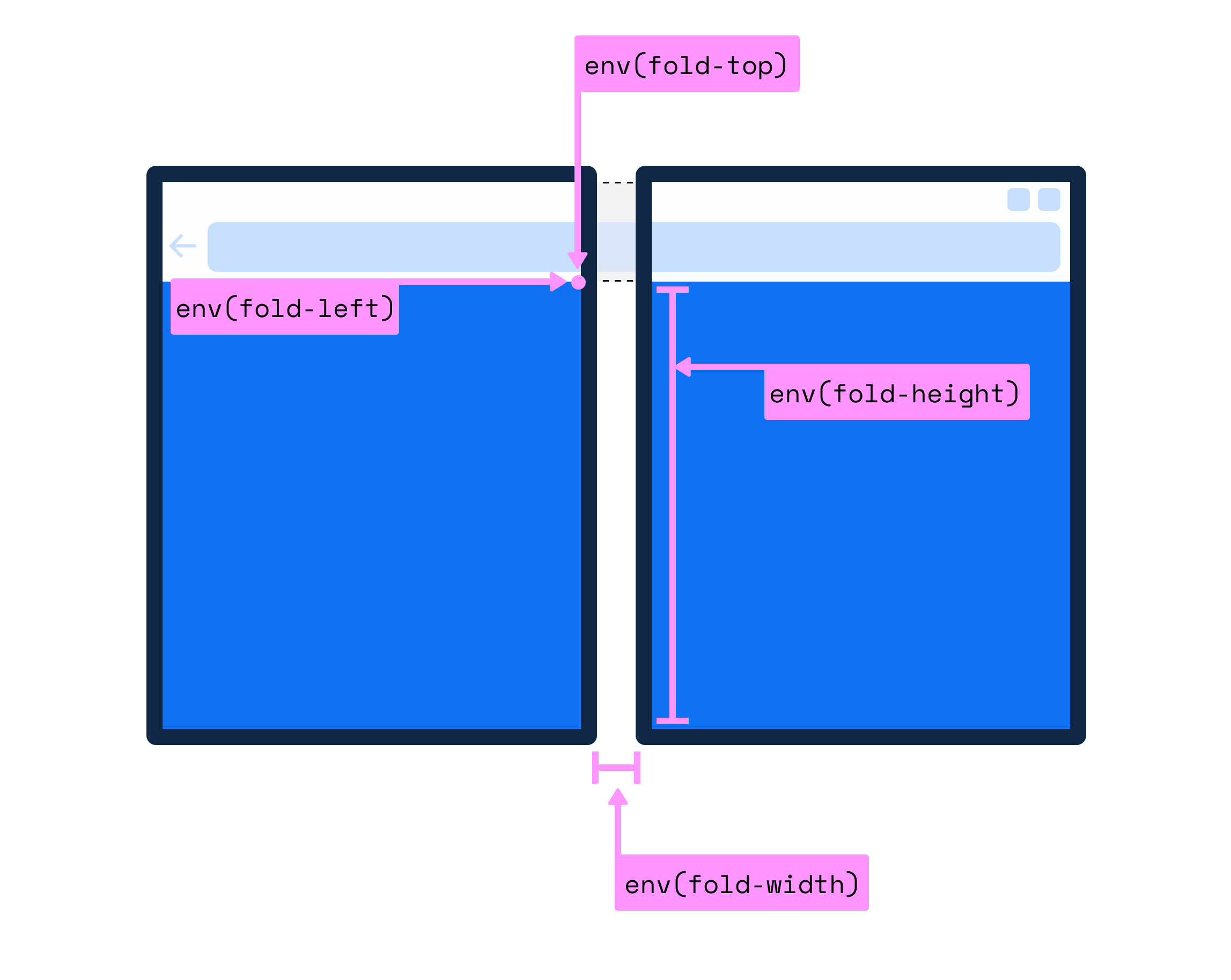 #### Some notes on our general design principles 1. **Introduce as little new API surface area as possible** Our first attempt tried to find a way to infer the hinge orientation using the existing orientation media feature. However, we quickly found that this is something we can’t generalize; a device can be in landscape orientation but has a vertical fold (folds like a book) another device in landscape may have horizontal fold (like a laptop). 2. **Future proofing** It’s much simpler to design a JavaScript API that returns an array for DOMRects and have it scale for a device with `n` number of screen; the reason is in JavaScript mappings are more direct, we have concept of for loops, conditionals and arithmetic operations. These can be combined to enable the developer to react to arbitrary topologies. For CSS, we decided to scope our solution to this new class of device that has specific design principles around how the displays are utilized by an application. However, we believe the new media feature can be extended with new values that match future form factors down the line. ### Final thoughts We'd like to hear your thoughts and feedback, so please feel free to use this GitHub thread as a discussion forum or open issues for us on our [Edge Explainers GitHub repo](https://github.com/MicrosoftEdge/MSEdgeExplainers/issues/new). Additional material you might be interested in looking at: - [Demo URL](https://foldables-emulator.netlify.com/?url=https://css-spanning.netlify.com/demo/basic/) - [Demo source code](https://github.com/zouhir/spanning-css-polyfill/blob/master/demo/basic/index.html#L64) - [Colored boxes positioned absolutely example](https://github.com/MicrosoftEdge/MSEdgeExplainers/blob/master/Foldables/explainer.md#colored-boxes-absolutely-positioned) Please view or discuss this issue at https://github.com/w3c/csswg-drafts/issues/4736 using your GitHub account
Received on Tuesday, 4 February 2020 05:42:06 UTC