- From: Delisi, Jennie (MNIT) <jennie.delisi@state.mn.us>
- Date: Thu, 18 Feb 2021 14:41:12 +0000
- To: public-cognitive-a11y-tf <public-cognitive-a11y-tf@w3.org>
- Message-ID: <DM8PR09MB64215085DBDA137C35AC2819BB859@DM8PR09MB6421.namprd09.prod.outlook.com>
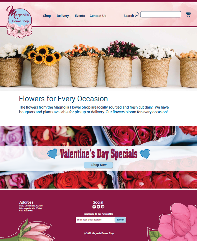
Hello,
Thank you for your feedback about the previous version of the image.

Here is the latest draft from the designer. The image is for Content Usable (good example). It hopefully addresses the concerns brought up during last week’s meeting.

Changes from the last version include:

  *   Font in the logo is now all the same color, flower shop is more prominent and bold
  *   Navigation region text (shop, delivery…) is bold, font has more spacing within each word
  *   The basket/cart at the end of the banner region looks more like a traditional shopping cart and is spaced further from the search text box
  *   Background design/color in the navigation area is darker
  *   Main content area has more consistent font (no bold). Valentine’s Day Specials has darker font. Text on Shop Now button is darker.
  *   Footer background color is darker.
  *   Submit button added to the subscribe option in the footer.
  *   Placeholder text in subscribe text field has been darkened.

Jennie
[cid:image001.png@01D705D1.CE61F930]

Jennie Delisi
Accessibility Analyst | Office of Accessibility
Minnesota IT Services | Partners in Performance
658 Cedar Street
St. Paul, MN 55155
O: 651-201-1135
Information Technology for Minnesota Government | mn.gov/mnit<http://mn.gov/mnit>
[Minnesota IT Services Logo]
[Facebook logo]<https://www.facebook.com/MN.ITServices>[LinkedIn logo]<https://www.linkedin.com/company/minnesota-it-services/>[Twitter logo]<https://twitter.com/mnit_services>
Attachments
- image/png attachment: image001.png
- image/png attachment: image002.png

- image/png attachment: image003.png

- image/png attachment: image004.png

- image/png attachment: image005.png

Received on Thursday, 18 February 2021 14:41:28 UTC