- From: Rain Michaels <rainb@google.com>
- Date: Thu, 11 Feb 2021 10:02:10 -0800
- To: public-cognitive-a11y-tf <public-cognitive-a11y-tf@w3.org>
- Message-ID: <CAJO5HuuWKj7JOSQ8XfK_EeYEzL4+mwuvgDScLrOXpWTUVMQKNg@mail.gmail.com>
Hello,

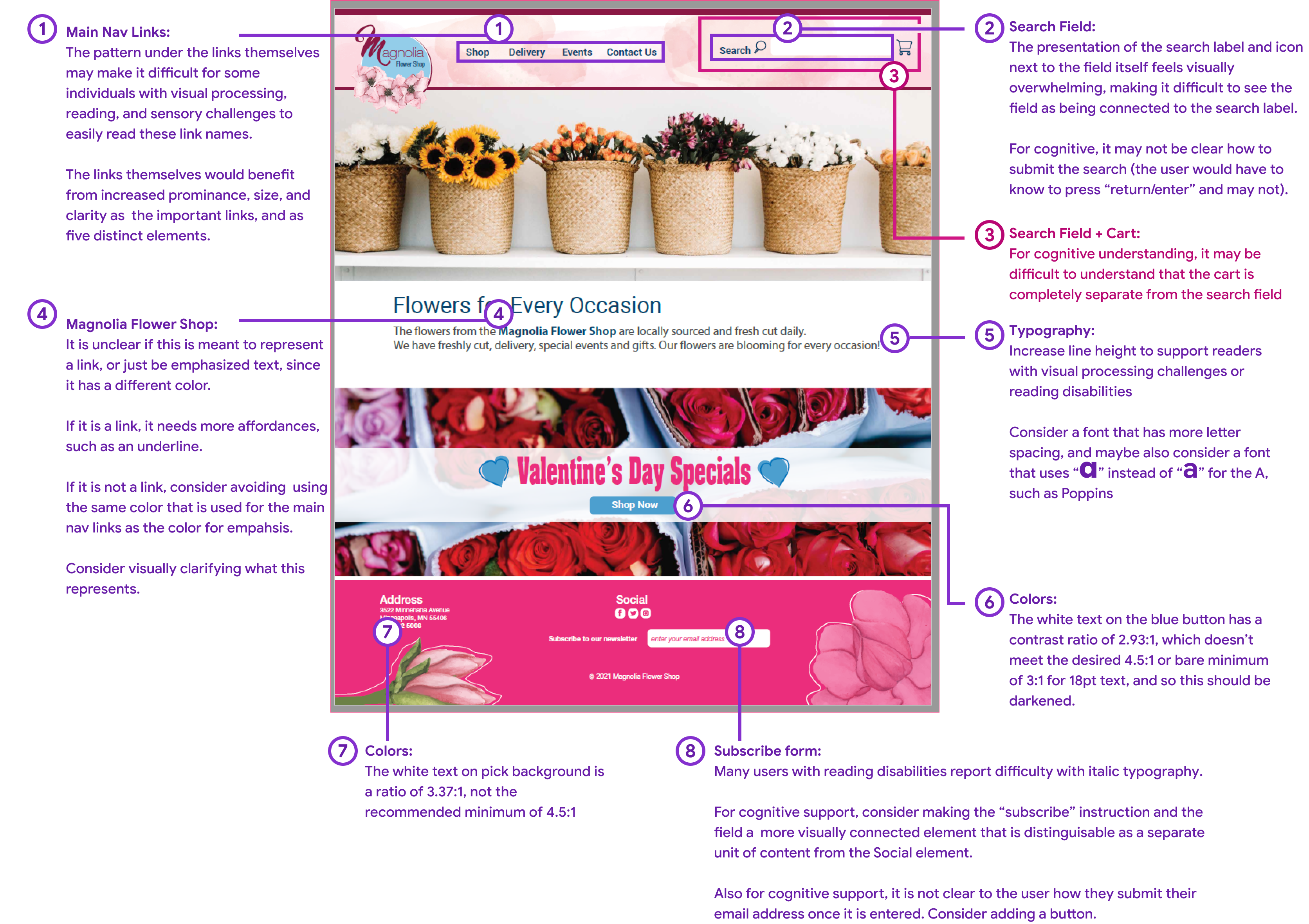
I've attached an image that marks up a few recommended requests for edits
to the image representing a "correct" example that can be used to
illustrate the guidelines.

Per our action item in our meeting today, please provide feedback by the
end of day tomorrow (Feb. 12) so that the designer has time to work on
revisions.

*My notes in text-only format:*

   1. Main Nav Links:
   The pattern under the links themselves may make it difficult for some
   individuals with visual processing, reading, and sensory challenges to
   easily read these link names.
   The links themselves would benefit from increased prominence, size, and
   clarity as the important links, and as five distinct elements.
   2. Search Field:
   The presentation of the search label and icon next to the field itself
   feels visually overwhelming, making it difficult to see the field as being
   connected to the search label.
   For cognitive, it may not be clear how to submit the search (the user
   would have to know to press “return/enter” and may not).
   3. Search Field + Cart:
   For cognitive understanding, it may be difficult to understand that the
   cart is completely separate from the search field
   4. Magnolia Flower Shop:
   It is unclear if this is meant to represent a link, or just be
   emphasized text, since it has a different color.
   If it is a link, it needs more affordances, such as an underline.
   If it is not a link, consider avoiding using the same color that is used
   for the main nav links as the color for emphasis.
   Consider visually clarifying what this represents.
   5. Typography:
   Increase line height to support readers with visual processing
   challenges or reading disabilities
   Consider a font that has more letter spacing, and maybe also consider a
   font that uses “*a*” (without the hat) instead of “*a*” (with the hat)
   for the A, such as Poppins
   6. Colors:
   The white text on the blue button has a contrast ratio of 2.93:1, which
   doesn’t meet the desired 4.5:1 or bare minimum of 3:1 for 18pt text, and so
   this should be darkened.
   7. Colors:
   The white text on pink background is a ratio of 3.37:1, not the
   recommended minimum of 4.5:1
   8. Subscribe form:
   Many users with reading disabilities report difficulty with italic
   typography.
   For cognitive support, consider making the “subscribe” instruction and
   the field a more visually connected element that is distinguishable as a
   separate unit of content from the Social element.
   Also for cognitive support, it is not clear to the user how they submit
   their email address once it is entered. Consider adding a button.
Attachments
- image/png attachment: Feedback_on_the_correct_example.png

Received on Thursday, 11 February 2021 18:03:03 UTC