- From: Edward Chalk <edwardchalk@gmail.com>
- Date: Fri, 8 Oct 2021 10:17:52 +1100
- To: public-coga-community@w3.org
- Message-ID: <CALuG9w-bj6w6=pKb6vwW4cX_-hhSqcOvh2NkSU8Fh7eown4VLg@mail.gmail.com>
Hi Folks,

I was complaining vociferously about the usability of the eBay website a
couple of weeks ago. I have re-gone through the steps I need to take to
list an item on eBay and maybe it is not bad enough to warrant a complaint
to eBay. (This is possibly because I have got used to the eBay layout.)

However, some reasons I feel the eBay interface is confusing to the
unititated are as follows.

*********************************************************************************************************************

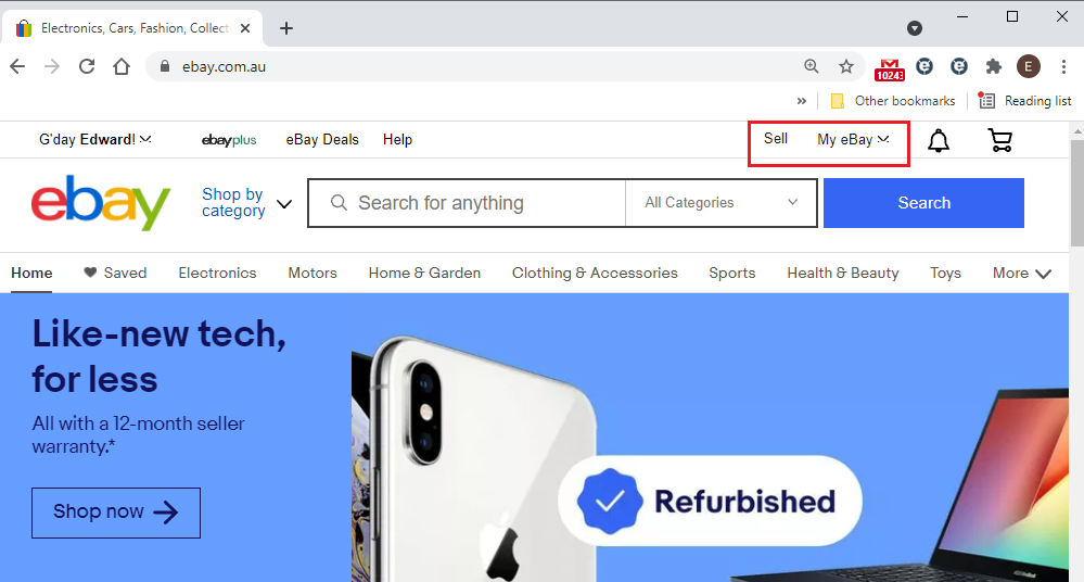
1. If I go to the eBay homepage, I get 2 main menu items, "Sell" and "My
eBay"

[image: image.png]

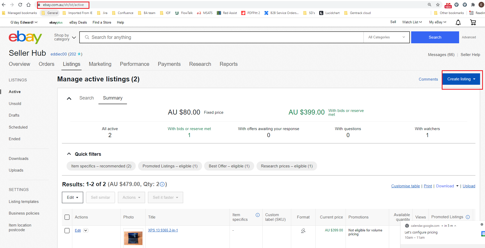
Clicking on "Sell" leads me to the following screen:

[image: image.png]

This is not the screen from which I "sell", rather it is the "manage active
listings" screen, as can be seen from the URL. In order to actually sell, I
need to click on the Create Listing button. From this I deduce that the
word "Sell" in the homepage, does not mean that "I am going to sell",
rather it means, "I am a seller, and I want to manage my sales listings",
which I feel is unintuitive/misleading.

*********************************************************************************************************************

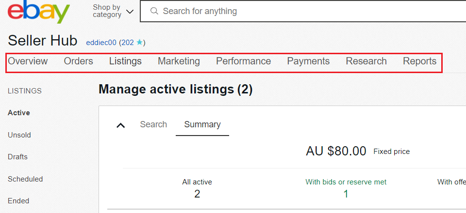
2. In the Manage Active Listings webpage, there is a horizontal menu.

[image: image.png]

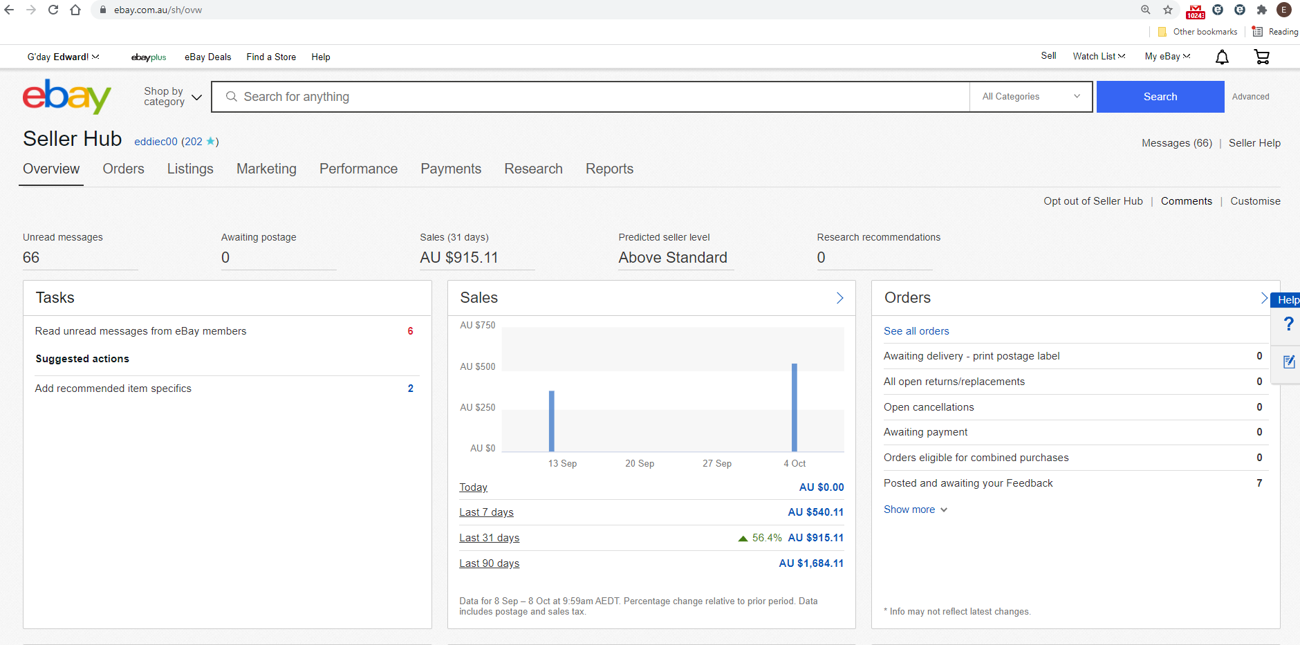
If I click on Overview, I get to the Seller/Overview page.

[image: image.png]

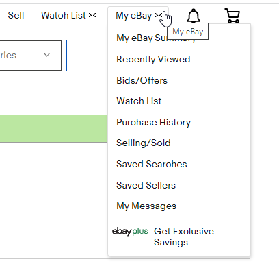
Now, If I click on "My eBay" in the home page I get the following drop down
menu.

[image: image.png]
And if I click on the Selling/Sold option I also get to the Seller/Overview
page. So it comes out that I have 2 seperate ways of getting to the same
webpage, for no particular reason, which I think is bad design for the top
level menu options.

It is possible that eBay are trying to address a design problem here, which
is that eBay is used to both buy and sell. So we have "Sell" on the
homepage to provide selling functionality, and My eBay, to provide buying
functionality. But if that is the case, then we should not have a
Selling/Sold option under My eBay, especially since the Selling/Overview
page is also accessible through the Sell option on the homepage.

*********************************************************************************************************************

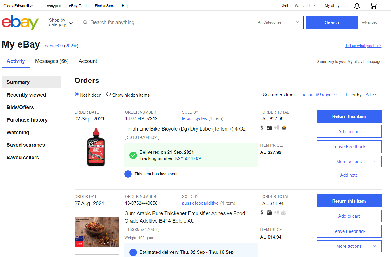
3. Under "My eBay" on the homepage, there is a "My eBay Summary" option, if
I click on this, I get to the following webpage.

[image: image.png]
This page only displays items I have bought, however I use eBay for both
buying and selling, so why should "My eBay Summary" only mean "items I have
bought", and not "items which I have bought and sold"?

Cheers,

Edward
Attachments
- image/png attachment: image.png
- image/png attachment: 02-image.png
- image/png attachment: 03-image.png
- image/png attachment: 04-image.png
- image/png attachment: 05-image.png
- image/png attachment: 06-image.png
Received on Thursday, 7 October 2021 23:18:21 UTC