- From: John Foliot <john.foliot@deque.com>
- Date: Fri, 29 Jan 2016 09:59:32 -0600
- To: "'fantasai'" <fantasai.lists@inkedblade.net>, <public-apa@w3.org>
- Message-ID: <056601d15aae$0b80ba10$22822e30$@deque.com>
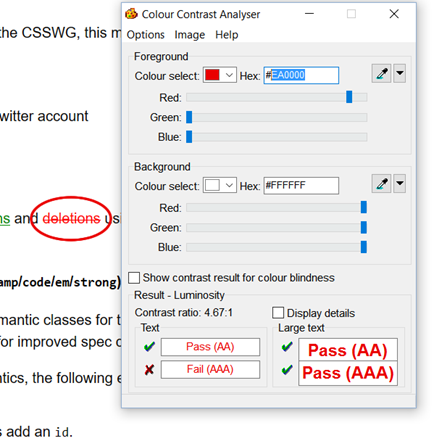
Greetings Fantasai, This has been sitting on my desk for too long, apologies. I have reviewed the changes you made to the CSS for the proposed new Spec Look and Feel (http://fantasai.inkedblade.net/style/design/w3c-restyle/2016/sample). Thank you for addressing the ‘hyperlink underline color-contrast’ concern, the new solution works well for me. One final observation (sorry) regarding color contrast, after which I think I’m done. For the <del> element (<del>deletions</del>) it currently appears to be styled as color:#ff0000, which, (sadly, yes) also fails color contrast requirements. May I suggest an alternative? A slight shift to #EA0000 will bring the ‘red’ into the acceptable color contrast ratio (note: there are numerous other “reds” that will also meet the requirement, this is but one suggestion). (For a visual reference, the “circle” on the deletions text in the enclosed image is red @ #EA0000 – note how it is slightly darker the red text) Outside of that, I really think this looks awesome, and I appreciate the extra effort you are providing to ensure we Eat Our Own Dogfood ™ Cheers! JF -- John Foliot Principal Accessibility Strategist Deque Systems Inc. <mailto:john.foliot@deque.com> john.foliot@deque.com Advancing the mission of digital accessibility and inclusion
Attachments
- image/png attachment: image001.png
Received on Friday, 29 January 2016 16:00:04 UTC