- From: Richard Schwerdtfeger <schwer@us.ibm.com>
- Date: Sat, 9 Jan 2016 11:34:40 -0600
- To: public-apa@w3.org
- Cc: Bo J Campbell <bcampbell@us.ibm.com>, Fred Esch <fesch@us.ibm.com>
- Message-ID: <OF9764EBAD.65CAE679-ON86257F35.0060058E-86257F35.00608EC9@us.ibm.com>
Yet, another issues that is not being addressed by the CSS working group.
Fortunately Bo alerted me to this one.

I have not looked at the accessibility api used in an apple watch but all
accessibility api, I know of, store things in rectangles based on cartesian
coordinates. So, there would need to be a conversion under the covers that
restructures things so that the are laid out in a grid.

The CSS working group is going to have to defining how this stuff maps to
accessibility services layers in browsers.

It is possible to define an ARIA module that allows the author to place
things in an order within the DOM so that it maps correctly to platform
accessibility API. However, that work would need to be done and again we
would need to define the API mappings. We would need a better understanding
of the UIs are created (types of controls, etc.).

My big concern is we are tackling 2 of the 3 biggest technologies used on
the web (HTML and SVG), yet CSS continues to roll on without a core
accessibility team to address their issues. CSS is too big and pervasive to
not fix this problem and they need to take it as serious as the SVG working
group has done. They need people who understand they underlying platform
accessibility architectures for the targeted platforms, developer and test
requirements, etc.

Cheers,
Rich


Rich Schwerdtfeger
----- Forwarded by Richard Schwerdtfeger/Austin/IBM on 01/09/2016 11:28 AM
-----

From:	Bo J Campbell/Los Angeles/IBM
To:	Richard Schwerdtfeger/Austin/IBM@IBMUS
Cc:	Fred Esch/Arlington/IBM@IBMUS
Date:	01/08/2016 04:28 PM
Subject:	CSS Round Display


Hi Rich,

Happy New Year.

I wanted to relay some information regarding CSS Round Display which is in
draft format now: https://drafts.csswg.org/css-round-display/ and is being
discussed on a regular basis (though they are not really settling much).

There are a couple objectives listed for Round Display but the main
objective stated at the top is to display html on displays that are round
or have rounded corners without having it overflow off of the display like
watches and other wearables.

However, the spec continues to describe Polar Coordinates that allow the
display of containers around a polar coordinate at varying angles and
distances. This poses the same dangers as Flexbox because (even in their
example) you can get things listed at the bottom of the DOM but visually
presented at the top of the screen.

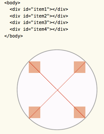
In this example, the top left box is the 4th div in the code and has an
angle of 315 degrees from the pole.


My imagination isn't wild enough to imagine the uses of this that would
endanger meaningful sequence, but I do think this has a risk factor and I
also think that this could possibly lead to some solution that would fit
any further CSS layout advances that will be made (along with Flexbox).
This seems to be the flavor du jour right now. They also mention animations
of the objects so I can imagine a ticking clock built entirely with CSS,
etc. This has some overlap possibly into complex visualizations.

It's early in the spec but something that should be known.


Regards,
Bo


Bo J Campbell | +1-805-453-0028 | bcampbell@us.ibm.com
Advisory UX Designer | Accessibility Design Lead | IBM Accessibility | IBM
Research
Attachments
- image/gif attachment: 13628191.gif

Received on Saturday, 9 January 2016 17:35:16 UTC