- From: Mikel Zorrilla <mzorrilla@vicomtech.org>
- Date: Wed, 10 Jun 2015 14:02:16 +0200
- To: george@cantinaconsulting.com
- Cc: public-respimg@w3.org
- Message-ID: <CAMjfpMB0mUwOatdC7NAAt6wQ1nUuk0Y=VBWzBj_wjm9XS61MQw@mail.gmail.com>
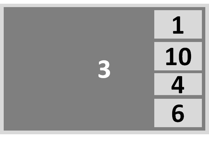
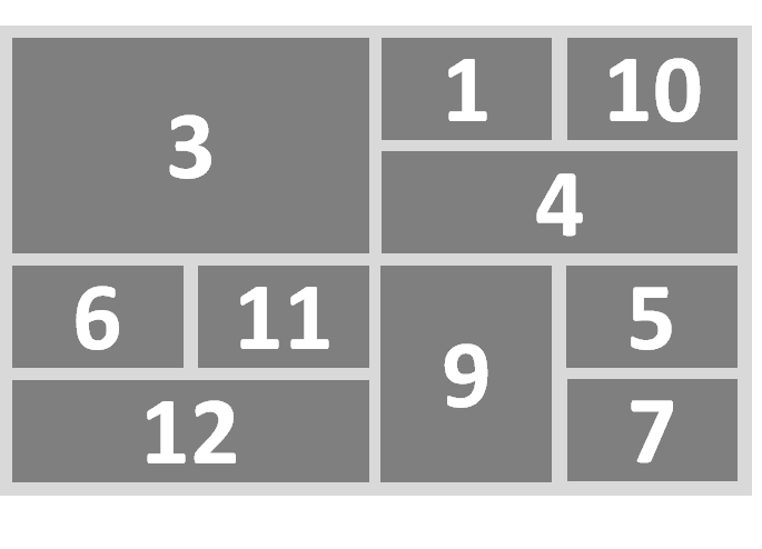
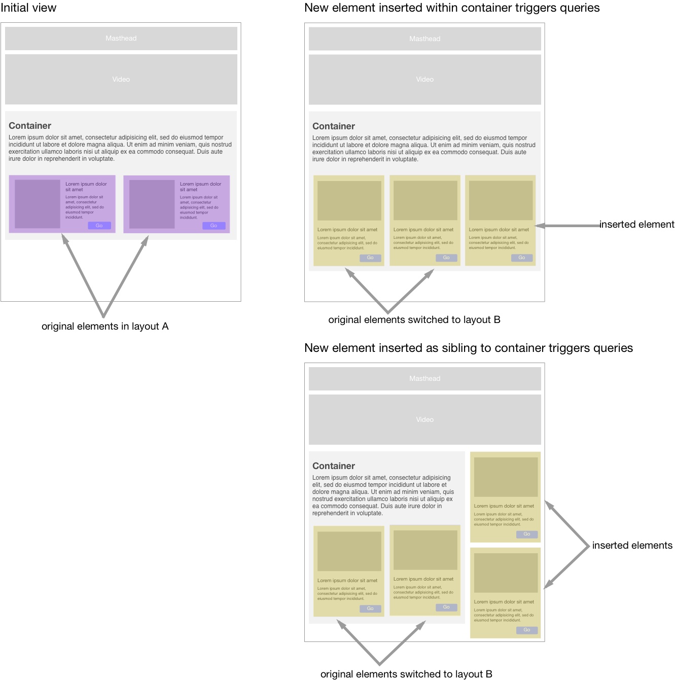
Dear George,

Please, find my comments inline

2015-06-09 18:50 GMT+02:00 <george@cantinaconsulting.com>:

>  Mikel,
>
> A couple of questions about your example:
>
> * Are we assuming that the elements that appear on the tablet are newly
> inserted into the DOM, i.e. not hidden elements?
>
Not necessarily. In fact, in our main use case, the same app is loaded in
both devices with all the elements. Depending the multi-device context,
only some elements will be shown on each device. We also manage the
resources of the elements following the lazy-load approach (e.g. not to
load resources of a element you are not showing).

* Are we assuming that the containing element for the new elements (the
> body or some component) is further constrained by an applicable container
> query, media query or another CSS property?
>
All the elements can be defined in terms of media query and CSS. When a
developer is facing a single-device user interface, you can also define a
style to organise the elements in the layout, usually with media queries to
address each target device. However, if the developer is dealing with
multi-device applications, this approach becomes unachievable. For
instance, for an application with 6 different elements, within
a multi-device scenario, a single device could show all the components,
only 5 of them, 4 of them, etc. Furthermore, when for example 4 elements
are shown on a device, the combinatory of selecting 4 elements from a total
of 6 rises 15 different options. As a result, an application of 6 elements
has 64 different combinations to create a layout template for each target
device. That's why we are organising the elements on the layout using
templates on top of the CSS Grid Layout (grid-auto-flow in row dense mode,
a Picture-in-Picture layout, etc.).

So an example would be: We have an app with 12 elements. First we have the
tablet showing 5 of 12 elements (number 1, 3, 5, 6 and 10) and we are
showing them in the tablet with Picture-in-Picture layout (other elements
will be shown in the TV):

[image: Imágenes integradas 1]
The the TV turns off, so the tablet decides to show all the elements that
are suitable for the tablet (e.g. 10 of 12 components; number 1, 3, 4, 5,
6, 7, 9, 10, 11 and 12) in the grid-auto-flow in row dense mode:

[image: Imágenes integradas 2]
All the elements, even those that were on the device (e.g. number 3)
changed their size. Changing the size of the element creates the need to
fire an event allowing content to respond to its container’s dimensions.
This happened motivated by a change on another device, but not from a
change in the viewport of the current device.

So, our main point was, are you considering to fire events for
container-based element queries when there is a change on the size of each
element?

Many thanks,
Mikel.


> I've attached a diagram that illustrates what I think you're suggesting as
> a use case. Can you confirm that I've got it right?
>
>
>
> Also: Hello RICG! I’ve been this list quite for a while, but it’s time to
> start participating!
>
> Cheers,
> George
>
> George White
> george@cantina.co
> stonehippo@gmail.com
>
>
>
>
> —
> Sent from Mailbox <https://www.dropbox.com/mailbox>
>
>
> On Tue, Jun 9, 2015 at 6:00 AM, Mikel Zorrilla <mzorrilla@vicomtech.org>
> wrote:
>
>> Dear RICG.
>>
>> Please, find on this emails some comments to the "Use Cases and
>> Requirements for Element Queries" draft document in
>> https://responsiveimagescg.github.io/cq-usecases/ :
>>
>> We find this work very interesting since we completely agree on the need
>> to "define styles within an individual module on the basis of the size of
>> the module itself rather than the viewport" and "the need for a
>> standardized method of allowing content to respond to its container’s
>> dimensions".
>>
>> From the code in GitHub you provide, we find that you enable
>> container-based element queries fired by a change on the viewport size. We
>> think this could be extended to a change on the size of each element. We
>> are working on the MediaScape (www.mediascapeproject.eu) project, where
>> we are creating tools and libraries to create a multi-device media
>> application based on Web technologies. For example, if we have an
>> application with N elements, and a user is consuming that application from
>> two devices at the same time (let's say a TV and a tablet), the TV will
>> show only some of the N elements, and the tablet will show other elements.
>> In this scenario, if the user turns off the TV, all the elements will be
>> presented in the tablet. All the layout in the tablet will be resized,
>> changing the size of each element. The container-based element queries
>> should be applied, even if there is not a viewport change event.
>>
>> We are implementing this using Web Components as the elements. We find
>> Web Components interesting, since they provide the containter/element
>> concept.
>>
>> We would like to know if you have thought about extending your proposal
>> in this direction, adding this as a new requirement for the element
>> queries. Don't hesitate to contact us for more explanations.
>>
>> Best regards,
>>
>> Mikel Zorrilla Berasategi
>> Senior Researcher & Project Manager
>> Digital Television and Multimedia Services
>>
>> Vicomtech-IK4 - Visual Interaction Communication Technologies
>> Mikeletegi Pasealekua, 57 - Parque Tecnológico
>> 20009 Donostia - San Sebastián - Spain
>> Tel: +[34] 943 30 92 30
>> Fax: +[34] 943 30 93 93
>> e-mail: mzorrilla@vicomtech.org
>> www.vicomtech.org
>>
>> *** member of IK4 Research Alliance ****
>> www.ik4.es
>> *** member of GraphicsMedia.net ****
>> www.graphicsmedia.net
>>
>> -----------------------------------------------------
>> Vicomtech-IK4 is an ISO 9001:2000 certified institute
>> -----------------------------------------------------
>>
>> Legal Notice - Privacy policy (
>> http://www.vicomtech.org/en/proteccion-datos)
>>
>>
>>
>>
>>
>
Attachments
- image/png attachment: image.png
- image/png attachment: 02-image.png
- image/jpeg attachment: RICG_example.jpg
Received on Wednesday, 10 June 2015 12:02:47 UTC