- From: Ville Skyttä <ville.skytta@iki.fi>
- Date: Sat, 02 Jun 2007 10:15:31 +0000
- To: www-validator@w3.org
- Message-Id: <C32255C7-88C5-48BC-8D95-D305A831485B@iki.fi>
On Friday 01 June 2007, olivier Thereaux wrote:
> == Beta test for the W3C Markup Validator - version 0.8.0 beta 2 ==
[...]
> Below are the changes between 0.8.0 beta 1 and beta 2:
>
>    *  Revised main UI. Cleaner design. Improved tabbing between
> validation methods. Adding toggled option visibility

The JavaScript GUI effects introduced in beta 2 appear to work very
unreliably
for me with Firefox 1.5.0.12 on Linux (Fedora Core 6, x86_64).  The
symptoms
are that all "transition" type effects appear to abort prematurely very
often.

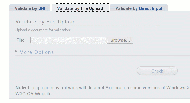
For example, when switching between tabs, I guess the text is
supposed to fade
quickly from gray to black.  For me it seldom reaches black, and is
often
left gray, making the UI look grayed out as if the options were
disabled.
See attached grayed-out.png and compare it with the other attachment.

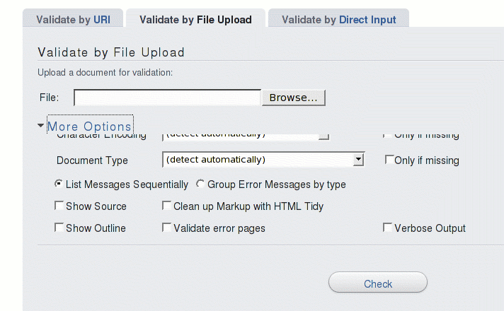
Also, there is some animation in the "More options" toggle when the
options "slide" into view and out from it.  Even when it works, it
looks very
choppy here, but what's worse is that it too often does not finish
and leaves
the option controls halfway visible, and I get JavaScript errors in the
Firefox JS console ("Error in parsing value for property 'height'.
Declaration dropped.").  See attachment halfway-there.png.  Getting the
options fully visible/hidden often requires multiple clicks to the "More
options" toggle.

This is probably nothing specific to the Validator, as I can see the
same
effects in the mootools demos at http://demos.mootools.net/
("Accordion", "Fx.Morph", and "Fx.Slide").  This is a AMD64 3200+
workstation
so I suppose it should be fast enough to handle this.  Things work much
better with Konqueror (faster, more reliable) on the same box.

Another comment about the tabs: I find it somewhat backwards that when
hovering over them, their colors go "dimmer" towards gray, ie.
towards to
what looks like a disabled control/link.  I would expect them to be
highlighted, ie. made more prominent when hovering, not the opposite.
Attachments
- image/png attachment: grayed-out.png

- image/png attachment: halfway-there.png

Received on Monday, 4 June 2007 14:08:51 UTC