- From: Richard Ishida <ishida@w3.org>
- Date: Fri, 01 Mar 2013 13:57:18 +0000
- To: "fantasai (fantasai@inkedblade.net)" <fantasai@inkedblade.net>
- CC: www International <www-international@w3.org>
- Message-ID: <5130B3BE.4080800@w3.org>
Hi Fantasai,

Here are a couple of graphics for the note in the text decoration spec
about the fact that complex scripts require consideration of gaps in
underline where glyphs are subjoined or combined in some way with others
nearby: characters that normally wouldn't have an descenders, when
combined in this way should produce a gap in the underlining, and
sometimes the visual order of the glyphs doesn't match the order of the
underlying characters.

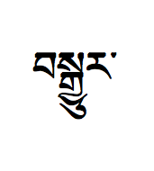
The first example is Tibetan.  The characters in the image are:

U+0F56 TIBETAN LETTER BA

U+0F66 TIBETAN LETTER SA

U+0F92 TIBETAN SUBJOINED LETTER GA

U+0FB1 TIBETAN SUBJOINED LETTER YA

U+0F74 TIBETAN VOWEL SIGN U

U+0F62 TIBETAN LETTER RA

U+0F0B TIBETAN MARK INTERSYLLABIC TSHEG


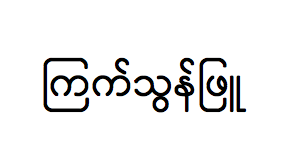
The second example is Myanmar:

U+1000 MYANMAR LETTER KA

U+103C MYANMAR CONSONANT SIGN MEDIAL RA

U+1000 MYANMAR LETTER KA

U+103A MYANMAR SIGN ASAT

U+101E MYANMAR LETTER SA

U+103D MYANMAR CONSONANT SIGN MEDIAL WA

U+1014 MYANMAR LETTER NA

U+103A MYANMAR SIGN ASAT

U+1016 MYANMAR LETTER PHA

U+103C MYANMAR CONSONANT SIGN MEDIAL RA

U+1030 MYANMAR VOWEL SIGN UU


Note that in this case, the same character RA (the square one) has
different widths, dependingo on the visual context, and also begins to
be drawn to the left of the character it follows in the text stream.


I left lots of white space around the glyphs so that you can crop as you
prefer.


Hope that helps,

RI


--
Richard Ishida, W3C
http://rishida.net/
Attachments
- image/png attachment: tibetan.png

- image/png attachment: myanmar.png

Received on Friday, 1 March 2013 13:57:53 UTC