- From: Kevin White <kevin@w3.org>
- Date: Tue, 18 Aug 2015 14:25:51 +0100
- To: wai-eo-editors <wai-eo-editors@w3.org>, Sharron Rush <srush@knowbility.org>
- Message-Id: <E6D8A8FE-834A-411F-81AD-84D08A9FC334@w3.org>
Hi All,

Shadi raised a concern (correct me if I don’t represent all your thoughts) that the captions for the examples should stand out more, and should be associated more with the example itself. He also proposed the idea of incorporating more information into the header to better introduce the examples.

I am sending this email prior to Thursday’s meeting so that everyone has an opportunity to consider it.

The images below are ideas for presenting the captions in the examples in slightly different ways.

I have not mocked these up in Github yet, as it will start to get messy in there if I did.

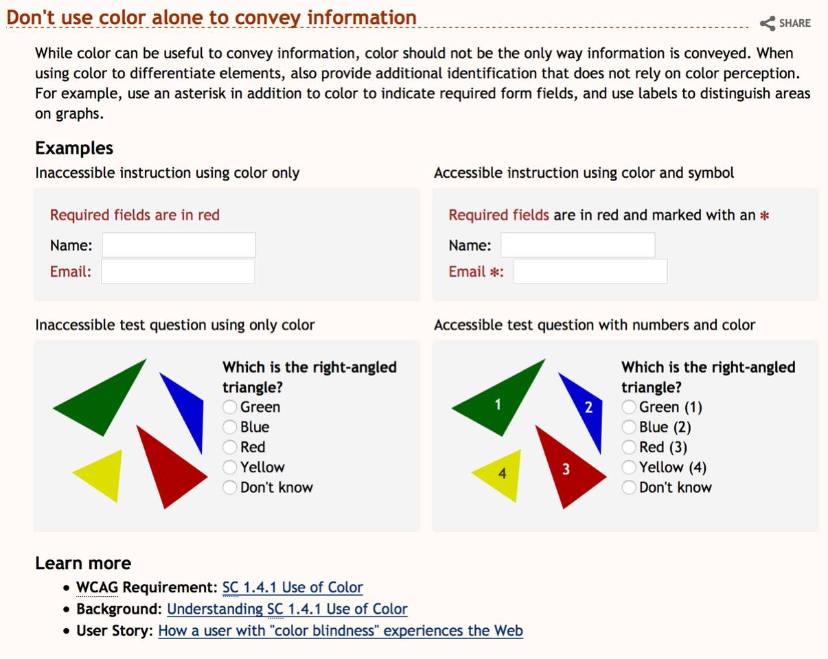
Current:


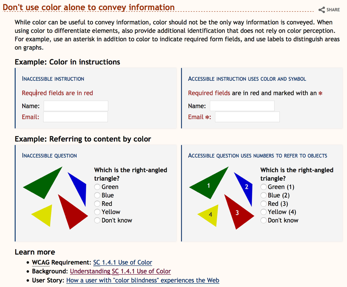
Alternative 1:

This approach incorporates some of the design ideas from the tutorials. It uses the bar, same color for the caption, and changes to all caps (actually small-caps but only one capital so not worth quibbling).

Comments:
• Caption may be lost in the example
• Caption may be considered part of the example
• Heading may be too long and involved
• Heading may end up repeating some information that needs to be in the caption
• Border may grab too much attention


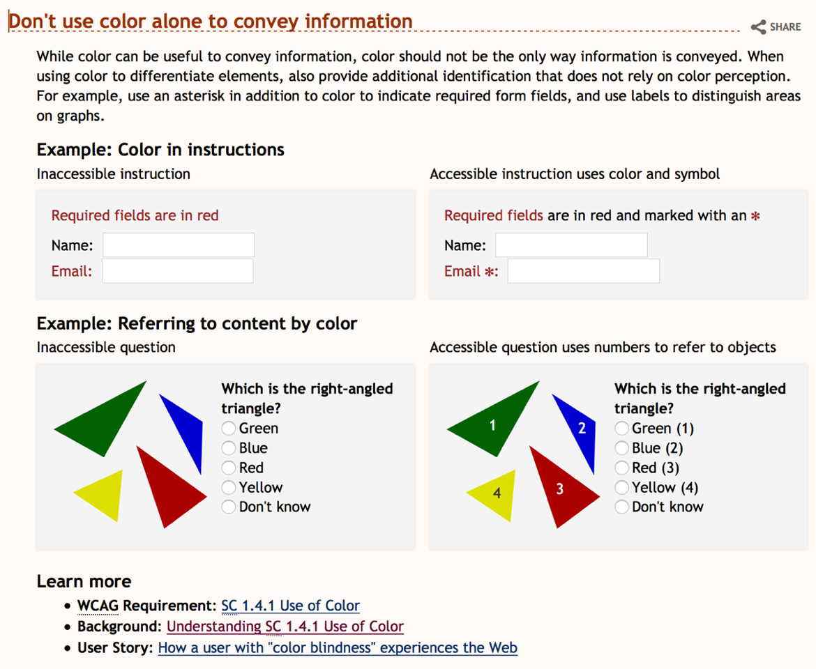
Alternative 2:

This approach simply changes the example heading.

Comments:
• May not address Shadi’s original concern as caption is still simple and above the example box
• Heading may be too long and involved
• Heading may end up repeating some information that needs to be in the caption


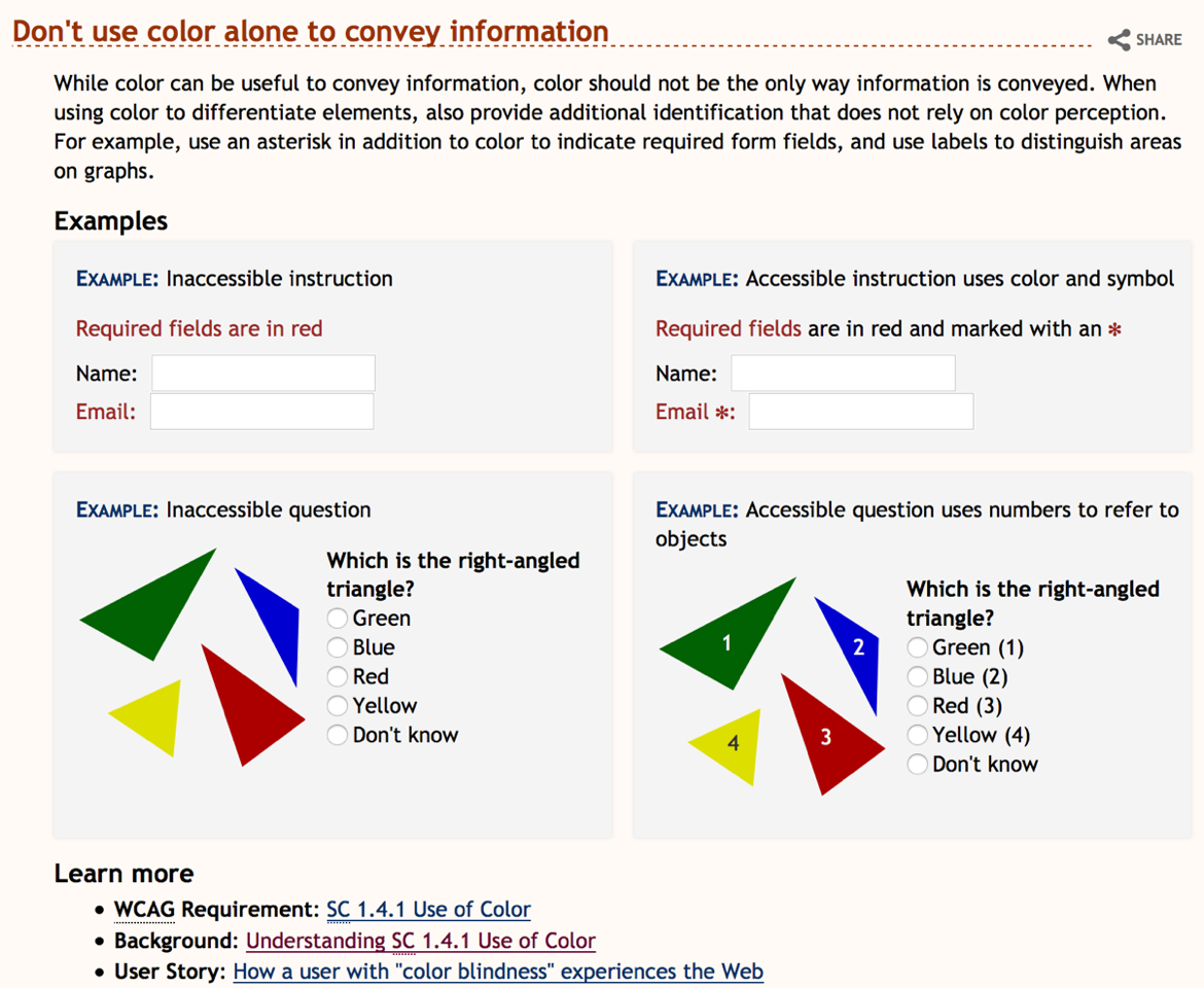
Alternative 3:

Incorporates the caption into the example box with a leading ‘Example:’ to help distinguish it from the actual example content. Styles the label to help differentiate it from surrounding content. Avoids styling the caption itself to maintain readability and avoid it looking like a link. Removes border to reduce visual noise.

Comments:

• Caption stands out well from example without being separated
• Little in the way of attention grabbing
• Heading does not introduce specific example content.
• Says ‘Example’ quite a bit
• Might additionally benefit from index for the examples, so ‘Example 1:…’, ‘Example 2:…’, etc. Although if there is only one example, this may look a little silly


Overall comments:

• It is worth noting that what works in the tutorial is unlikely to work within the core WAI design template. The tutorial has different constrains, a slightly different palette, different typeface, etc.
• These are piece meal changes that really should be done as part of a broad set of design guidelines that consider all possible cases for use. Even when considering just the examples, there are a variety of types of examples and this approach may not work for all of them, for example,
 • http://w3c.github.io/wai-quick-start/designing.html#ensure-that-interactive-elements-are-easy-to-identify <http://w3c.github.io/wai-quick-start/designing.html#ensure-that-interactive-elements-are-easy-to-identify>
 • http://w3c.github.io/wai-quick-start/designing.html#create-designs-for-different-viewport-sizes <http://w3c.github.io/wai-quick-start/designing.html#create-designs-for-different-viewport-sizes>
 • http://w3c.github.io/wai-quick-start/developing.html#associate-all-form-elements-with-labels <http://w3c.github.io/wai-quick-start/developing.html#associate-all-form-elements-with-labels>

Thanks

Kevin
Attachments
- text/html attachment: stored
- image/png attachment: PastedGraphic-2.png

- image/png attachment: PastedGraphic-1.png

- image/png attachment: PastedGraphic-3.png

- image/png attachment: PastedGraphic-4.png

Received on Tuesday, 18 August 2015 13:26:32 UTC