- From: Taliesin Love Smith <Taliesin.Smith@Colorado.EDU>
- Date: Thu, 6 Mar 2025 18:52:21 +0000
- To: Nicholas Bromley <nick@redkiteda.com>
- CC: Taliesin Love Smith <Taliesin.Smith@Colorado.EDU>, WAI IG <w3c-wai-ig@w3.org>
- Message-ID: <C82AA5F8-8871-4DA0-9209-9A2550B1F3C0@colorado.edu>
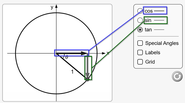
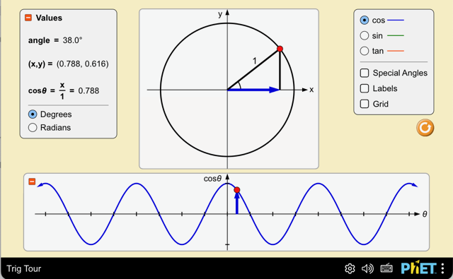
Thank you Nick for your professional opinion and guidance. It is much appreciated.
Taliesin

~.~.~.~.~.~.~.~.~.~.~.~.~.~.~.~.~
Taliesin L. Smith
taliesin.smith@colorado.edu

Inclusive Design Research Specialist
PhET Interactive Simulations
http://phet.colorado.edu/

Department of Physics
University of Colorado, Boulder


On Mar 6, 2025, at 05:32, Nicholas Bromley <nick@redkiteda.com> wrote:

[External email - use caution]

Hi Taliesin,

For Natural Selection, I think there’s a risk that the current use of colour would be a violation of 1.4.1, or at the very least a borderline pass. Although a user can isolate a single line, it seems important for content understanding to be able to view multiple lines at once to more easily compare different populations over time and in response to different variables. Although a user could toggle lines on and off to locate a specific one, that’s creating extra work for the user and doesn’t seem in-keeping with the spirit of the success criterion. There may also be situations where this approach isn’t effective, perhaps if the lines are close together.

So I’d suggest exploring ways you can differentiate each line uniquely. You already have some solid and dotted lines, so maybe you could introduce additional types, and/or change the data point markers to use a different shape for each line.

For Trig Tour I also think there’s a fail. At first I thought there was only ever one coloured line displayed at a time, but if you select ‘tan’ and drag the red dot around the circle circumference, both the blue ‘cos’ and green ‘sin’ line appear. Although some users could use their trigonometry knowledge to work out which is which, not all users may be able to do that easily, and it’s still an extra burden on them. If you view in greyscale the problem becomes more apparent:


So maybe use different line styles or different arrowheads for these. Some people suggest you can use a difference in contrast as the additional signifier, but that needs to be at least 3:1 and the two lines have a contrast of 2.8:1. I’m not a fan of using this other than as a last resort because I don’t think it’s as good as the other options and it’s debatable as to whether it’s even a valid technique.

Using text labels is only suitable if you place them alongside the lines in the actual simulations, not just in the legends.


Kind regards,

Nick

---
Nick Bromley
Director & Accessibility Consultant
Red Kite Digital Accessibility Ltd


From: Taliesin Love Smith <Taliesin.Smith@Colorado.EDU<mailto:Taliesin.Smith@Colorado.EDU>>
Sent: 05 March 2025 18:00
To: WAI IG <w3c-wai-ig@w3.org<mailto:w3c-wai-ig@w3.org>>
Subject: Question about meeting SC 1.4.1 Use of Color

Dear Interest Group,

Our team is diving more deeply into where and how our highly interactive simulations (some with inclusive features) meet Level A and Level AA requirements.

I have a question about SC 1.4.1 Use of Color.

Color is often used to make connections between representations in our interactive simulations. Generally, there are additional visual cues, like a selected radio button, or checkbox or differences in position of a colored line that can help differentiate the meaning of one colored line or vector from another.

I think we meet 1.4.1, but I want to be sure we are meeting the spirit of the guidance of not relying on color alone for meaning. Can location, the ability to isolate and visual labels be used to meet the criteria?

Example 1: Natural Selection<https://phet.colorado.edu/sims/html/natural-selection/latest/natural-selection_all.html> - Note I am asking about the visual design. This sim has no screen reader access or keyboard access yet.
In this sim learners can explore generations of bunnies and how their traits and conditions change over each generation. There is a visualized graph of the traits and each pair of traits is represented by a solid colored line and a matching dotted colored line. Labeled checkboxes allow learners to isolate the lines.
I think being able to interactively isolate the lines in the graph in addition to having corresponding labels allows the representation to meet 1.4.1. Is that the correct interpretation of 1.4.1 - do not use color alone?


Example 2: Trig Tour<https://phet-dev.colorado.edu/html/trig-tour/1.1.0-rc.1/phet/trig-tour_all_phet.html> - note this version has keyboard access and some description.

Trig Tour is a math sim that allows learners to interactively explore relationships between the value for angle theta and cosine, sine and tangent by moving interactive point on a unit circle. The learner can change the exploration mode from Cosine to Sine to Tangent from a radio button group and in so doing vectored sides of the triangle and the representations in the graph below the unit circle change colors: blue vector for cosine, green vector for sine, and orange representations for tangent.

There’s a lot of visual information a learner can rely besides the colored lines next the radio button labels, so I think this sim meets the criteria as well. Does anyone disagree or have other guidance on interpretation of 1.4.1?


Best,
Taliesin
~.~.~.~.~.~.~.~.~.~.~.~.~.~.~.~.~
Taliesin L. Smith
taliesin.smith@colorado.edu<mailto:taliesin.smith@colorado.edu>

Inclusive Design Research Specialist
PhET Interactive Simulations
http://phet.colorado.edu/

Department of Physics
University of Colorado, Boulder

[image002.png][image001.png][image003.png]
Attachments
- image/png attachment: image002.png

- image/png attachment: image001.png
- image/png attachment: image003.png
Received on Thursday, 6 March 2025 18:52:29 UTC