- From: Adam Cooper <cooperad@bigpond.com>
- Date: Sun, 24 Mar 2024 11:47:04 +1100
- To: "'Vanessa Tillemans'" <vtillemans@gmail.com>
- Cc: <w3c-wai-ig@w3.org>
- Message-ID: <000001da7d84$cae76b90$60b642b0$@bigpond.com>
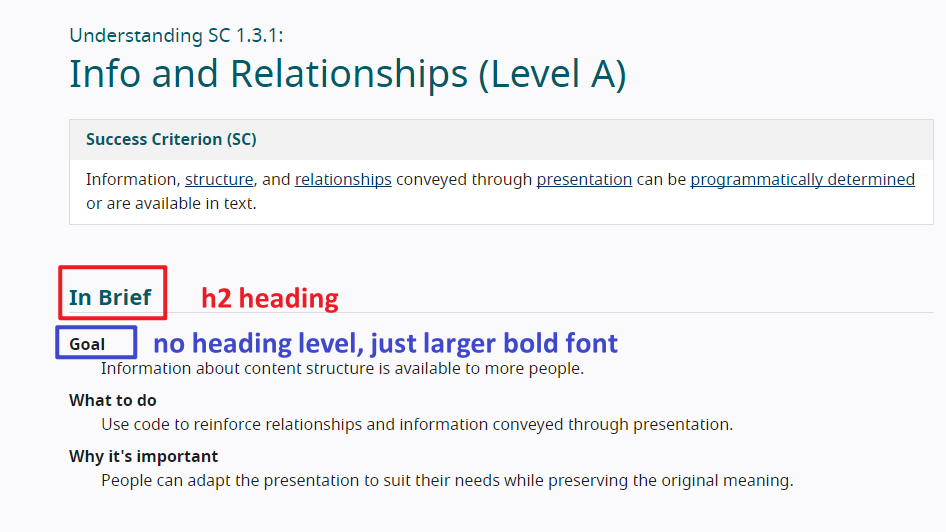
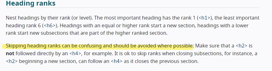
Vanessa wrote: “Deciding on where to use headings can be somewhat subjective, and also is up to the author. “


And it is precisely that subjectivity that is the problem.


The resources you cite are only a re-presentation of the existing sufficient techniques, but thank you all the same.


What might be of greater value for people designing and implementing content is an algorithmic approach whose intention is to minimise ambiguity and guide people in making decisions about when to include headings … something like the Accessibility Name and Description Computation algorithm.


The description term in the example must have been made bold by design which begs the question because <dt> accepts a <hn>.


This is exactly the point I am making: if there is this kind of variance in implementation, then conformance is always going to be problematic.


Can I navigate to a description term with a screen reader? Sure, but it’d be more comprehensible and easier if it was programmatically a heading.


Am I going to configure my screen reader to announce everything that is bold by default? Absolutely not because bold is everywhere and is in and of itself utterly meaningless.


From: Vanessa Tillemans <vtillemans@gmail.com>
Sent: Sunday, March 24, 2024 7:04 AM
To: Adam Cooper <cooperad@bigpond.com>
Cc: w3c-wai-ig@w3.org
Subject: Re: Skipped headings


Hi Adam,


You asked a lot of really great questions, and I can understand your frustration!  WCAG does talk about this some more in their Developers document:


https://wcag.com/developers/1-3-1-info-and-relationships/


It might not give the specifics you want, but it also is not plausible to provide those kinds of specifics in a way that can apply to everyone, regardless of industry or types of content.  Of course, having more guidance is always helpful, and it is likely that the team working on WCAG 3 is taking that into consideration, while still making it possible for everyone to comply.


As Patrick noted, those terms in the Understanding document example are part of a descriptive list.  What I was showing is that the term “heading” might look like it applies to the text there because the text is bold and larger, but it is not a programmatic heading.  Deciding on where to use headings can be somewhat subjective, and also is up to the author.  I can see how this can lead to more questions than answers though!


It find it helpful to look at what is considered best practice, which is addressed in Mozilla's documentation on heading levels:


https://developer.mozilla.org/en-US/docs/Web/HTML/Element/Heading_Elements


 I appreciate your questions, Adam!  Communicating via threads like this can be challenging though (and I am not always available to check them), so if you would like, I am happy to hop on a call with you where we can continue the discussion and go over some website examples and test the heading structure, and how you and I would approach it if some elements are not in compliance with WCAG.  You are welcome to email me off-list and I'll get you added to my calendar.  ;)


Enjoy your weekend!

Vanessa Tillemans

Website Accessibility Instructor

  <https://mailfoogae.appspot.com/t?sender=adnRpbGxlbWFuc0BnbWFpbC5jb20%3D&type=zerocontent&guid=184a6bb3-8d94-4884-9401-124c5b3a4e4a> ᐧ


On Fri, Mar 22, 2024 at 6:55 PM Adam Cooper <cooperad@bigpond.com <mailto:cooperad@bigpond.com> > wrote:

Vanessa, if I understand you correctly, that whether a heading is implemented using h1 – h6 rather than just making text bigger and/or bolder is a matter of a web author’s preference?


Again, the WCAG guidance is at best incomplete or worse inconsistent with regards to this.


when is a heading a heading and when is a heading not a heading?


what VISUAL characteristics make a heading? Colour? Size? Style? Vertical and/or horizontal alignment? Spacing? Topic? What comes before and after it? Author intention? Aesthetic preference?


What are the characteristics that are conveyed by presentation that are significant in SC1.3.1 exactly?


How can two implementations with different implications for a cohort of users – one larger and bolder font by way of designer preference and one a heading whose styling is controlled by a user agent – conform with the same success criterion?


People who use a screen reader because they do not have functional vision (there are many use cases for screen reader use)  are no more or less likely to be ‘confused’ by non-contiguous headings or jumbled nesting levels than people who don’t use a screen reader.


frustrated because navigation  is not as straightforward as it could be, annoyed because web authors don’t understand their needs’, dismayed because they miss content or discover it by accident or it is disconnected from other content, and so on …


confusion is the state of an individual’s thinking not a phenomenon of a web site or application.


I’d suggest that the utility of a heading for most screen reader users is as a navigational waypoint first and as a signpost for document structure second and as a descriptor for what it heads third.


For people using vision, however, document structure and descriptions may be a higher priority as wayfinding is not an issue.


From: Vanessa Tillemans <vtillemans@gmail.com <mailto:vtillemans@gmail.com> >
Sent: Friday, March 22, 2024 2:06 AM
To: Kevin Prince <kevin.prince@fostermoore.com <mailto:kevin.prince@fostermoore.com> >
Cc: w3c-wai-ig@w3.org <mailto:w3c-wai-ig@w3.org>
Subject: Re: Skipped headings


Hi Kevin,


If you test the heading levels on the page for the Understanding document for 1.3.3, you will find that there is an h2 heading called "In Brief" followed by text that could appear to be headings because they are in bold and larger font, but they do not have a heading level assigned to them.  The word "Goal" could be assumed to be a heading, but it is not programmatically, as there is no heading level assigned to it.  This is one way to approach your question.  Not all things need a heading level assigned to them.  You could simply use bold text and larger font, to avoid cluttering the page with a bunch of heading levels.


https://www.w3.org/WAI/WCAG22/Understanding/info-and-relationships.html


there


W3C does say that skipping headings can be confusing and should be avoided.

https://www.w3.org/WAI/tutorials/page-structure/headings/#heading-ranks


Note that it says it can be confusing.  Not that it is.  It can be.  Your screen reader colleagues might be fine, but perhaps not all screen reader users would be, especially if they have cognitive limitations.  The idea with WCAG standards is to make the web a more accessible place to as many people as possible, including those screen reader users who would consider a skipped heading level a confusing thing.


As you noted, skipping heading levels is not considered best practice.  And it's not about strictly adhering to a set of rules.  It's about being able to say, "By assigning heading levels in this way, the maximum number of people possible will be able to understand and navigate this content."  If it is indeed the goal that your content is accessible to as many people as possible, then there's the logic you were asking for. ;)


You have the option to do what WCAG did in their Understanding document: you do not have to use headings for everything.  Bold, larger font can also suffice.  They could have used h3 headings there if they had wanted to, but they did not.  I do not disagree with that decision because the user can still access and navigate the content in an organized way.  In the case of your example, I would not assign heading levels to the "ingredients" text, but just make it a bold, larger font than the ingredients themselves.  The h3 heading for "Spaghetti" is great for getting a user to that point in the content, where they can continue reading to get the ingredients.  Also, by doing it this way, you avoid having the issue of skipped heading levels, going from h3 for "Spaghetti" to h5 for "ingredients."


Hope this helps!  Have a great day!  ;)


~Vanessa Tillemans

Website Accessibility Instructor

https://www.linkedin.com/in/vanessa-tillemans/

ᐧ


On Wed, Mar 20, 2024 at 9:55 PM Kevin Prince <kevin.prince@fostermoore.com <mailto:kevin.prince@fostermoore.com> > wrote:


Disclosure – I’m sighted and look for logic not slavish adherence to a rule for the sake of it.


Firstly my colleagues who use screenreaders say that skipped headings do cause them to be confused: is that because  we, as an industry, have made the case too strongly that nesting must be seamless? Should we not be reflecting the relationships in the content not looking to plug apparent gaps.


Take this example (which is an extension of the Webaim example on their page)


H1: My Favorite Recipes


H2: Quick and Easy


H3: Spaghetti


* Ingredients of spaghetti


H3: Hamburgers


H3: Tacos


H4: Beef Tacos


* Ingredients of Beef tacos


H4: Chicken Tacos


H4: Fish Tacos


I would strongly argue that visually, logically and semantically both sets of ingredients should be the same heading level – they are the same thing. However, because there are sub-types of Taco the Taco ingredients drop to H5. As the semantics are supposed to convey relationships then surely spaghetti ingredients are also H5 irrespective of where the sit respective to Spaghetti?

I’m genuinely looking to understand why grouping similar things is wrong purely to maintain a lack of gaps. Visually you would clearly not miss the H4 under Spaghetti because it’s not needed – why is it so important for a screenreader?


My reading also shows it’s strong best practice but not, as far as I can tell, a failure of 1.3.1.. And the essence of 1.3.1 is to convey the relationships shown visually (and visually all the ingredients are peers.


Sorry – really  would like to hear the consensus on how this should be marked up and why?


Kevin


Kevin Prince


Product Accessibility & Usability Consultant


E  <mailto:kevin.prince@fostermoore.com> kevin.prince@fostermoore.com


Christchurch


 <http://www.fostermoore.com/> fostermoore.com


This email and its contents are confidential. If you are not the intended recipient, you should contact the sender immediately, you must not use, copy or disclose any of the information in the email, and you must delete it from your system immediately.
Attachments
- image/png attachment: image001.png
- image/png attachment: image002.png
- image/jpeg attachment: image003.jpg

- image/jpeg attachment: image004.jpg

Received on Sunday, 24 March 2024 00:47:13 UTC