- From: Vanessa Tillemans <vtillemans@gmail.com>
- Date: Thu, 21 Mar 2024 10:06:29 -0500
- To: Kevin Prince <kevin.prince@fostermoore.com>
- Cc: "w3c-wai-ig@w3.org" <w3c-wai-ig@w3.org>
- Message-ID: <CAPVzZPq=p8whbkkzWZjULm2jWZv4H0Uw5+uJJ0hKbj79O1Gc+w@mail.gmail.com>
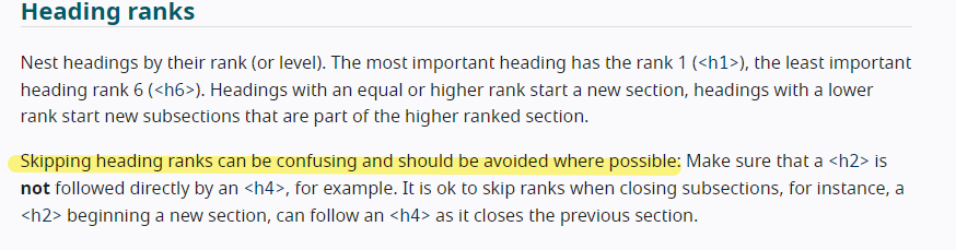
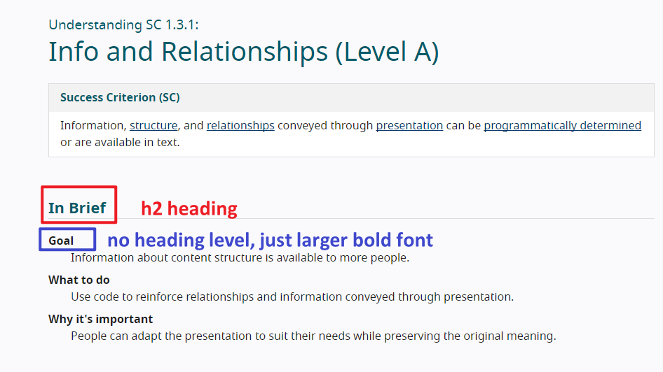
Hi Kevin,

If you test the heading levels on the page for the Understanding document
for 1.3.3, you will find that there is an h2 heading called "In Brief"
followed by text that could appear to be headings because they are in bold
and larger font, but they do not have a heading level assigned to them.
The word "Goal" could be assumed to be a heading, but it is not
programmatically, as there is no heading level assigned to it.  This is one
way to approach your question.  Not all things need a heading level
assigned to them.  You could simply use bold text and larger font, to avoid
cluttering the page with a bunch of heading levels.

https://www.w3.org/WAI/WCAG22/Understanding/info-and-relationships.html

[image: image.png]

W3C does say that skipping headings can be confusing and should be avoided.
https://www.w3.org/WAI/tutorials/page-structure/headings/#heading-ranks

[image: image.png]

Note that it says it *can* be confusing.  Not that it *is*.  It *can* be.
Your screen reader colleagues might be fine, but perhaps not all screen
reader users would be, especially if they have cognitive limitations.  The
idea with WCAG standards is to make the web a more accessible place to as
many people as possible, including those screen reader users who would
consider a skipped heading level a confusing thing.

As you noted, skipping heading levels is not considered best practice.  And
it's not about strictly adhering to a set of rules.  It's about being able
to say, "By assigning heading levels in this way, the maximum number of
people possible will be able to understand and navigate this content."  If
it is indeed the goal that your content is accessible to as many people as
possible, then there's the logic you were asking for. ;)

You have the option to do what WCAG did in their Understanding document:
you do not have to use headings for everything.  Bold, larger font can also
suffice.  They could have used h3 headings there if they had wanted to, but
they did not.  I do not disagree with that decision because the user can
still access and navigate the content in an organized way.  In the case of
your example, I would not assign heading levels to the "ingredients" text,
but just make it a bold, larger font than the ingredients themselves.  The
h3 heading for "Spaghetti" is great for getting a user to that point in the
content, where they can continue reading to get the ingredients.  Also, by
doing it this way, you avoid having the issue of skipped heading
levels, going from h3 for "Spaghetti" to h5 for "ingredients."

Hope this helps!  Have a great day!  ;)

~Vanessa Tillemans
Website Accessibility Instructor
https://www.linkedin.com/in/vanessa-tillemans/
ᐧ

On Wed, Mar 20, 2024 at 9:55 PM Kevin Prince <kevin.prince@fostermoore.com>
wrote:

>
>
> Disclosure – I’m sighted and look for logic not slavish adherence to a
> rule for the sake of it.
>
>
>
> Firstly my colleagues who use screenreaders say that skipped headings do
> cause them to be confused: is that because  we, as an industry, have made
> the case too strongly that nesting must be seamless? Should we not be
> reflecting the relationships in the content not looking to plug apparent
> gaps.
>
>
>
> Take this example (which is an extension of the Webaim example on their
> page)
> *H1:* My Favorite Recipes *H2:* Quick and Easy *H3:* Spaghetti
>
>    - *Ingredients of spaghetti*
>
> *H3:* Hamburgers *H3:* Tacos *H4:* Beef Tacos
>
>    - *Ingredients of Beef tacos*
>
> *H4:* Chicken Tacos *H4:* Fish Tacos
>
> I would strongly argue that visually, logically and semantically both sets
> of ingredients should be the same heading level – they are the same thing.
> However, because there are sub-types of Taco the Taco ingredients drop to
> H5. As the semantics are supposed to convey relationships then surely
> spaghetti ingredients are also H5 irrespective of where the sit respective
> to Spaghetti?
>
> I’m genuinely looking to understand why grouping similar things is wrong
> purely to maintain a lack of gaps. Visually you would clearly not miss the
> H4 under Spaghetti because it’s not needed – why is it so important for a
> screenreader?
>
>
>
> My reading also shows it’s strong best practice but not, as far as I can
> tell, a failure of 1.3.1. And the essence of 1.3.1 is to convey the
> relationships shown visually (and visually all the ingredients are peers.
>
>
>
> Sorry – really  would like to hear the consensus on how this should be
> marked up and why?
>
>
>
> Kevin
>
>
>
> *Kevin Prince *
> Product Accessibility & Usability Consultant
> *E* kevin.prince@fostermoore.com
> Christchurch
>
> *fostermoore.com <http://www.fostermoore.com/>*
> This email and its contents are confidential. If you are not the intended
> recipient, you should contact the sender immediately, you must not use,
> copy or disclose any of the information in the email, and you must delete
> it from your system immediately.
>
Attachments
- image/jpeg attachment: noname
- image/png attachment: image.png
- image/png attachment: 03-image.png
Received on Friday, 22 March 2024 13:44:29 UTC