- From: Mark Magennis <Mark.Magennis@skillsoft.com>
- Date: Mon, 8 Apr 2024 15:48:12 +0000
- To: "w3c-wai-ig@w3.org" <w3c-wai-ig@w3.org>
- Message-ID: <LV3PR08MB9482EBE7E32A082E19A4EC7FE5002@LV3PR08MB9482.namprd08.prod.outlook.com>
To answer your question Benjamin I would say I have no hard and fast rules. It depends on the specifics of the situation including the complexity of the content and the use cases. I am usually dealing with web applications that may include things like a list of available media, a media player, a filtering tool a notation tool, and other things all on the one page, all laid out visually clearly but with no headings, or at least no headings on the functional areas. Sometimes it just seems that hidden headings would be helpful. I don't think the existence of landmarks really changes anything since screen reader users very frequently rely on headings for efficient navigation and very rarely use landmarks for the same.
Mark
________________________________
From: Benjamin Love <benjamin.james.love@gmail.com>
Sent: Friday 29 March 2024 01:07
To: Mark Magennis <Mark.Magennis@skillsoft.com>
Cc: Adam Cooper <cooperad@bigpond.com>; Benjamin Love <benjamin.love@seewritehear.com>; David Richter <david.richter@seewritehear.com>; Tammy Burdick <tammy.burdick@seewritehear.com>; w3c-wai-ig@w3.org <w3c-wai-ig@w3.org>
Subject: Re: [EXTERNAL] Re: Skipped headings
You don't often get email from benjamin.james.love@gmail.com. Learn why this is important<https://aka.ms/LearnAboutSenderIdentification>
Mark,
Yes, I agree with your summary of general scenarios and approach to “visually hidden” headings, though I will say I do not encounter such “need” in more recent years.
However, would you agree that such applications of headings should only be used in UI layout design (note, we are now distinguishing between narrative that lives within a main region from web interface architecture that most often (should?) only frame the document main, but is not a part of it) to denote meaningfulness of “layout” content and if and only if a natively supported “identifier”/“label” is not already supported or useful, as in semantic landmarks or other element types?
I have only really ever encountered the scenario you describe outside main, where something like multiple divisions of aside content are applied and it would be confusing without labeling to understand the meaningfulness of the content in context.
In my opinion (just opinion based on experience), outside some approaches to apply H1 outside main, I stay clear of using document headings to “label” UI architecture, applying only to the document main. Very interested to learn competing opinions on this position.
But even within main, are headings always necessary? In designing applications, with a more functional, focused purpose, rather than more information driven content, I find headings are not always necessary at all. HTML specification provides a lot of help here (nothing near as complexly engineered as the TEI!, but still…).
Again, my original reply was to address whether the “rules” of headings would stand up to praxis-level examples, which I do believe they do?
Ben
On Thu, Mar 28, 2024 at 9:42 AM Mark Magennis <Mark.Magennis@skillsoft.com<mailto:Mark.Magennis@skillsoft.com>> wrote:
Benjamin,
A narrative may not require visible headings if other visual treatments such as layout, outlines and separators, colors, etc. are often used to differentiate pieces of content from each other, indicate where a block of content starts and ends, or give cues as to meaning. The reason hidden headings are often useful to screen reader users is that those users may not be able to perceive these visual treatments so they don't get the information and cues that they provide and they need alternatives. Hidden headings are just one form of alternatives.
Mark
________________________________
From: Benjamin Love <benjamin.love@seewritehear.com<mailto:benjamin.love@seewritehear.com>>
Sent: Tuesday 26 March 2024 00:11
To: Adam Cooper <cooperad@bigpond.com<mailto:cooperad@bigpond.com>>; 'Benjamin Love' <benjamin.james.love@gmail.com<mailto:benjamin.james.love@gmail.com>>; w3c-wai-ig@w3.org<mailto:w3c-wai-ig@w3.org> <w3c-wai-ig@w3.org<mailto:w3c-wai-ig@w3.org>>
Cc: w3c-wai-ig@w3.org<mailto:w3c-wai-ig@w3.org> <w3c-wai-ig@w3.org<mailto:w3c-wai-ig@w3.org>>; Tammy Burdick <tammy.burdick@seewritehear.com<mailto:tammy.burdick@seewritehear.com>>; David Richter <david.richter@seewritehear.com<mailto:david.richter@seewritehear.com>>
Subject: [EXTERNAL] Re: Skipped headings
I’m not sure I completely follow.
If a narrative requires a heading (to topically identify / segment major and minor sections of information), why would only a screen reader user benefit from the heading. Wouldn't a non-screen reader also benefit? We all use headings to understand and, yes, navigate major and minor sections of a narrative. Again, how we technologically navigate is what varies, but we all cognitively "navigate."
There are scenarios where a visually hidden heading (among other element types) may make good sense: for example, as a way to build in structure/semantics otherwise unavailable to a screen reader user but already available to a non-screen reader user. E.g., crafting a visually hidden description of say a complex graphic for which leveraging added structure/semantics will optimize the end user's experience.
But even in such a case, I'm not sure I understand how this refers to the original claim that "ingredients" should all be the same heading level simply because they are all of type ingredient. As I tried to suggest, the issue with that logic is that it assumes an example that "may" not be optimal for illustrating the given "rules" for headings. I'm curious what an example of visually hidden headings would be in your experience? There are definitely situations that may call for such a design choice, but they are most often (at least in my experience) either (a) in an alt-format approach, as I suggested above or (b) to address a document/environment design limitation, I.e., a missing required document heading, in which case the real question is can we "fix" the original design to more equitably promote both screen reader and non-screen reader access?
Ben
________________________________
From: Adam Cooper <cooperad@bigpond.com<mailto:cooperad@bigpond.com>>
Sent: Monday, March 25, 2024 4:11:18 PM
To: 'Benjamin Love' <benjamin.james.love@gmail.com<mailto:benjamin.james.love@gmail.com>>; w3c-wai-ig@w3.org<mailto:w3c-wai-ig@w3.org> <w3c-wai-ig@w3.org<mailto:w3c-wai-ig@w3.org>>
Cc: w3c-wai-ig@w3.org<mailto:w3c-wai-ig@w3.org> <w3c-wai-ig@w3.org<mailto:w3c-wai-ig@w3.org>>; Tammy Burdick <tammy.burdick@seewritehear.com<mailto:tammy.burdick@seewritehear.com>>; Benjamin Love <benjamin.love@seewritehear.com<mailto:benjamin.love@seewritehear.com>>; David Richter <david.richter@seewritehear.com<mailto:david.richter@seewritehear.com>>
Subject: RE: Skipped headings
Benjamon wrote: “Note: Any assumption that we should distinguish in how Screen Reader users use headings from how non-screen reader users use headings is also misguided.”
So what about the very common practice of visually hidden headings? Is that misguided?
And people who use a screen reader use headings as navigational waypoints whereas people who don’t use a screen reader don’t require or have access to this facility (does Opera still offer this?). Is this similarly misguided?
From: Benjamin Love <benjamin.james.love@gmail.com<mailto:benjamin.james.love@gmail.com>>
Sent: Saturday, March 23, 2024 1:35 PM
To: Adam Cooper <cooperad@bigpond.com<mailto:cooperad@bigpond.com>>
Cc: Kevin Prince <kevin.prince@fostermoore.com<mailto:kevin.prince@fostermoore.com>>; Vanessa Tillemans <vtillemans@gmail.com<mailto:vtillemans@gmail.com>>; w3c-wai-ig@w3.org<mailto:w3c-wai-ig@w3.org>
Subject: Re: Skipped headings
If I’m following, the semantic logic of categorizing information in the proposed example is flawed. Therefore the subsequent structural logic argument is also flawed. I do believe that if one works from commonplace narratology and categorization of information, the rules of headings in marking information as both structural and semantic elements will hold.
In other words, the issue here isn’t the “rules” of headings but the quality of designing a meaningful narrative to which headings can meaningfully be applied.
Note: Any assumption that we should distinguish in how Screen Reader users use headings from how non-screenreader users use headings is also misguided. Headings serve the same function for all readers of narrative even if the functional technologies differ. Cognitively they assist in the same way.
They topically outline the structurally meaningful units of a narrative. That is kind of it. Hugely important but also pretty straightforward.
Spaghetti is neither of type “meal” or the similar or same as “Taco” in the discourse of cuisine or food preparation. Note, in the example, they are positioned structurally and semantically at the same level.
Spaghetti is, perhaps, of type “Pasta,” “Taco” is of type, perhaps, “Mexican Cuisine”… finger foods vs played utensil foods? But neither spaghetti or tacos are of likeness in the context of cuisine or food ways discourse (I believe).
If we were actually designing a cookbook narrative, Spaghetti and Taco wouldn’t seem to sit at the same categorical level. I.e., they meaningfully represent very different “types” of things in a discourse on cuisine and cooking instruction. Spaghetti could be a type of “Italian Cuisine,” but work out the ingredients and instructions for preparing, without adding additional characteristics, how does spaghetti differ from say linguini or angel hair or penne or etc.? Cook time, sure, of a few other aspects. But work the same logic to “Taco.” There’s “beef” (or chicken, fish, etc., of type meat), but what about hard/soft, corn/flower, flat/bent, etc., which are types of “taco” the material “thing” defined semantically by the phrase “taco.”
In other words, saying Spaghetti is very much like saying Beef Taco we just do not say “Spaghetti Pasta.” But you could and likely should if we were actually designing a cookbook.
h1 My International Cookbook
> h2 Italian Cuisine
>> h3 Pastas
>>> h4 Spaghetti
>>>> h5 History of Spaghetti
>>>> h5 Tools for Preparation
>>>> h5 Ingredients
> h2 Mexican Cuisine
>> h3 Tacos
>>> h4 Beef Tacos
>>>> h5 etc.
>>>> h5 Ingredients
But even if we retained the given example, regardless of the questionable nature of the informational design, the ingredients of spaghetti and the ingredients of beef tacos are children of their parents, each have their own unique genealogy, so no, heading levels will not be the same.
On Fri, Mar 22, 2024 at 5:24 PM Adam Cooper <cooperad@bigpond.com<mailto:cooperad@bigpond.com>> wrote:
Vanessa, if I understand you correctly, that whether a heading is implemented using h1 – h6 rather than just making text bigger and/or bolder is a matter of a web author’s preference?
Again, the WCAG guidance is at best incomplete or worse inconsistent with regards to this.
when is a heading a heading and when is a heading not a heading?
what VISUAL characteristics make a heading? Colour? Size? Style? Vertical and/or horizontal alignment? Spacing? Topic? What comes before and after it? Author intention? Aesthetic preference?
What are the characteristics that are conveyed by presentation that are significant in SC1.3.1 exactly?
How can two implementations with different implications for a cohort of users – one larger and bolder font by way of designer preference and one a heading whose styling is controlled by a user agent – conform with the same success criterion?
People who use a screen reader because they do not have functional vision (there are many use cases for screen reader use) are no more or less likely to be ‘confused’ by non-contiguous headings or jumbled nesting levels than people who don’t use a screen reader.
frustrated because navigation is not as straightforward as it could be, annoyed because web authors don’t understand their needs’, dismayed because they miss content or discover it by accident or it is disconnected from other content, and so on …
confusion is the state of an individual’s thinking not a phenomenon of a web site or application.
I’d suggest that the utility of a heading for most screen reader users is as a navigational waypoint first and as a signpost for document structure second and as a descriptor for what it heads third.
For people using vision, however, document structure and descriptions may be a higher priority as wayfinding is not an issue.
From: Vanessa Tillemans <vtillemans@gmail.com<mailto:vtillemans@gmail.com>>
Sent: Friday, March 22, 2024 2:06 AM
To: Kevin Prince <kevin.prince@fostermoore.com<mailto:kevin.prince@fostermoore.com>>
Cc: w3c-wai-ig@w3.org<mailto:w3c-wai-ig@w3.org>
Subject: Re: Skipped headings
Hi Kevin,
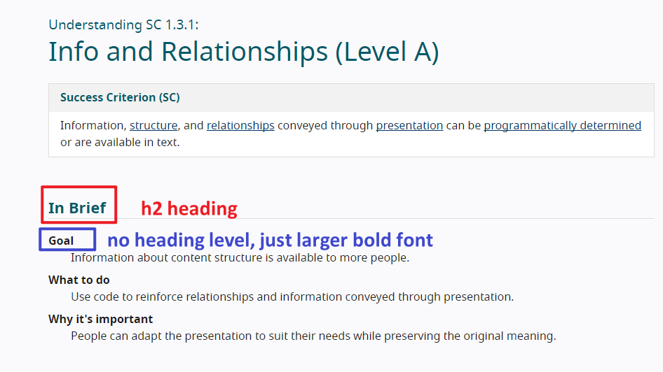
If you test the heading levels on the page for the Understanding document for 1.3.3, you will find that there is an h2 heading called "In Brief" followed by text that could appear to be headings because they are in bold and larger font, but they do not have a heading level assigned to them. The word "Goal" could be assumed to be a heading, but it is not programmatically, as there is no heading level assigned to it. This is one way to approach your question. Not all things need a heading level assigned to them. You could simply use bold text and larger font, to avoid cluttering the page with a bunch of heading levels.
https://www.w3.org/WAI/WCAG22/Understanding/info-and-relationships.html
[cid:ii_18e87ac6bf3ad7999131]there
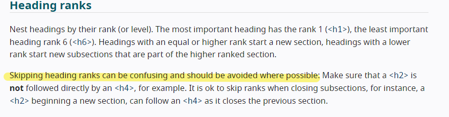
W3C does say that skipping headings can be confusing and should be avoided.
https://www.w3.org/WAI/tutorials/page-structure/headings/#heading-ranks
[cid:ii_18e87ac6bf311bfad142]
Note that it says it can be confusing. Not that it is. It can be. Your screen reader colleagues might be fine, but perhaps not all screen reader users would be, especially if they have cognitive limitations. The idea with WCAG standards is to make the web a more accessible place to as many people as possible, including those screen reader users who would consider a skipped heading level a confusing thing.
As you noted, skipping heading levels is not considered best practice. And it's not about strictly adhering to a set of rules. It's about being able to say, "By assigning heading levels in this way, the maximum number of people possible will be able to understand and navigate this content." If it is indeed the goal that your content is accessible to as many people as possible, then there's the logic you were asking for. ;)
You have the option to do what WCAG did in their Understanding document: you do not have to use headings for everything. Bold, larger font can also suffice. They could have used h3 headings there if they had wanted to, but they did not. I do not disagree with that decision because the user can still access and navigate the content in an organized way. In the case of your example, I would not assign heading levels to the "ingredients" text, but just make it a bold, larger font than the ingredients themselves. The h3 heading for "Spaghetti" is great for getting a user to that point in the content, where they can continue reading to get the ingredients. Also, by doing it this way, you avoid having the issue of skipped heading levels, going from h3 for "Spaghetti" to h5 for "ingredients."
Hope this helps! Have a great day! ;)
~Vanessa Tillemans
Website Accessibility Instructor
https://www.linkedin.com/in/vanessa-tillemans/
[Image removed by sender.]ᐧ
On Wed, Mar 20, 2024 at 9:55 PM Kevin Prince <kevin.prince@fostermoore.com<mailto:kevin..prince@fostermoore.com>> wrote:
Disclosure – I’m sighted and look for logic not slavish adherence to a rule for the sake of it.
Firstly my colleagues who use screenreaders say that skipped headings do cause them to be confused: is that because we, as an industry, have made the case too strongly that nesting must be seamless? Should we not be reflecting the relationships in the content not looking to plug apparent gaps.
Take this example (which is an extension of the Webaim example on their page)
H1: My Favorite Recipes
H2: Quick and Easy
H3: Spaghetti
* Ingredients of spaghetti
H3: Hamburgers
H3: Tacos
H4: Beef Tacos
* Ingredients of Beef tacos
H4: Chicken Tacos
H4: Fish Tacos
I would strongly argue that visually, logically and semantically both sets of ingredients should be the same heading level – they are the same thing. However, because there are sub-types of Taco the Taco ingredients drop to H5. As the semantics are supposed to convey relationships then surely spaghetti ingredients are also H5 irrespective of where the sit respective to Spaghetti?
I’m genuinely looking to understand why grouping similar things is wrong purely to maintain a lack of gaps. Visually you would clearly not miss the H4 under Spaghetti because it’s not needed – why is it so important for a screenreader?
My reading also shows it’s strong best practice but not, as far as I can tell, a failure of 1.3.1.. And the essence of 1.3.1 is to convey the relationships shown visually (and visually all the ingredients are peers.
Sorry – really would like to hear the consensus on how this should be marked up and why?
Kevin
Kevin Prince
Product Accessibility & Usability Consultant
[cid:ii_18e87ac6bf379a58b124]
E kevin.prince@fostermoore.com<mailto:kevin.prince@fostermoore.com>
Christchurch
fostermoore.com<http://www.fostermoore.com/>
This email and its contents are confidential. If you are not the intended recipient, you should contact the sender immediately, you must not use, copy or disclose any of the information in the email, and you must delete it from your system immediately.
Attachments
- image/jpeg attachment: image003.jpg

- image/png attachment: image002.png
- image/jpeg attachment: image004.jpg

- image/png attachment: image001.png
Received on Monday, 8 April 2024 15:48:22 UTC