- From: Kevin Prince <kevin.prince@fostermoore.com>
- Date: Wed, 31 May 2023 01:29:59 +0000
- To: Taliesin Smith <talilief@gmail.com>, Jorge Fernandes <jorge.f@netcabo.pt>
- CC: WAI - W3C Interest Group <w3c-wai-ig@w3.org>
- Message-ID: <ME2PR01MB3236BF667020A81ECCDA09F784489@ME2PR01MB3236.ausprd01.prod.outlook.com>
Nice work sir

From: Taliesin Smith <talilief@gmail.com>
Sent: Thursday, May 25, 2023 12:36 AM
To: Jorge Fernandes <jorge.f@netcabo.pt>
Cc: WAI - W3C Interest Group <w3c-wai-ig@w3.org>
Subject: Re: Focus visible

CAUTION: This email originated from outside of the organization.

Hi Jorge,

Our team creates highly interactive science and math simulations that are built in HTML5 and run natively in a web browser. Over a several year period we made 10 of our game-like interactives screen reader accessible with our Interactive Description feature<https://phet.colorado.edu/en/simulations/filter?type=html,prototype&a11yFeatures=interactive-description>. More recently, over the last couple of years we created an optional and customizable Voicing feature<https://phet.colorado.edu/en/simulations/filter?type=html,prototype&a11yFeatures=voicing>, now available in 4 simulations. This feature uses web speech to voice descriptions directly through the browser with no need of screen reader software. The two features use the same description strings wherever and whenever possible, but are quite different in terms of experience.

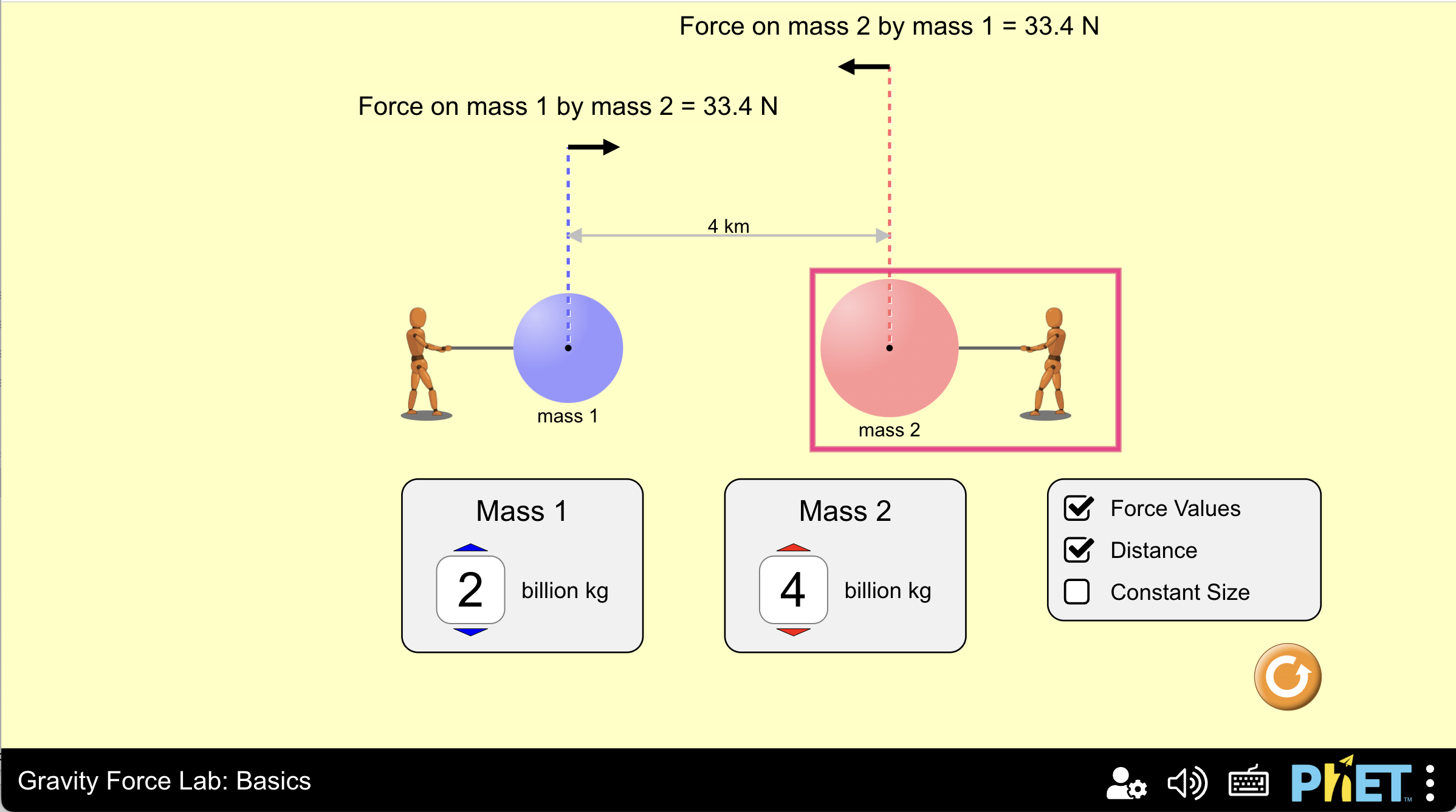
In an interview with a learner with low vision who was using an early prototype of Gravity Force Lab: Basics's Voicing feature, the learner was using mixed input methods, both the keyboard input and mouse input. They commented that they really liked the bright pink focus highlights and would like to have that same highlight when they used the mouse. We then implemented an optional Interactive Highlights feature and many other learners with or without low vision seemed to like it.

It's optional and does not get in the way.

Below are a couple of screenshots. Above are links to simulations.

Best,
Taliesin

Here's a screenshot of the Gravity Force Lab:Basics simulation. In the screenshot there is a bright pink highlight on mass 2 which is interactive. This highlight appears by default on focus when using keyboard navigation. It will appear on hover, click and tap if the learner turns on the Interactive Highlights feature in the Preferences Menu.
[cid:image001.png@01D993C3.FE2D7CC0]

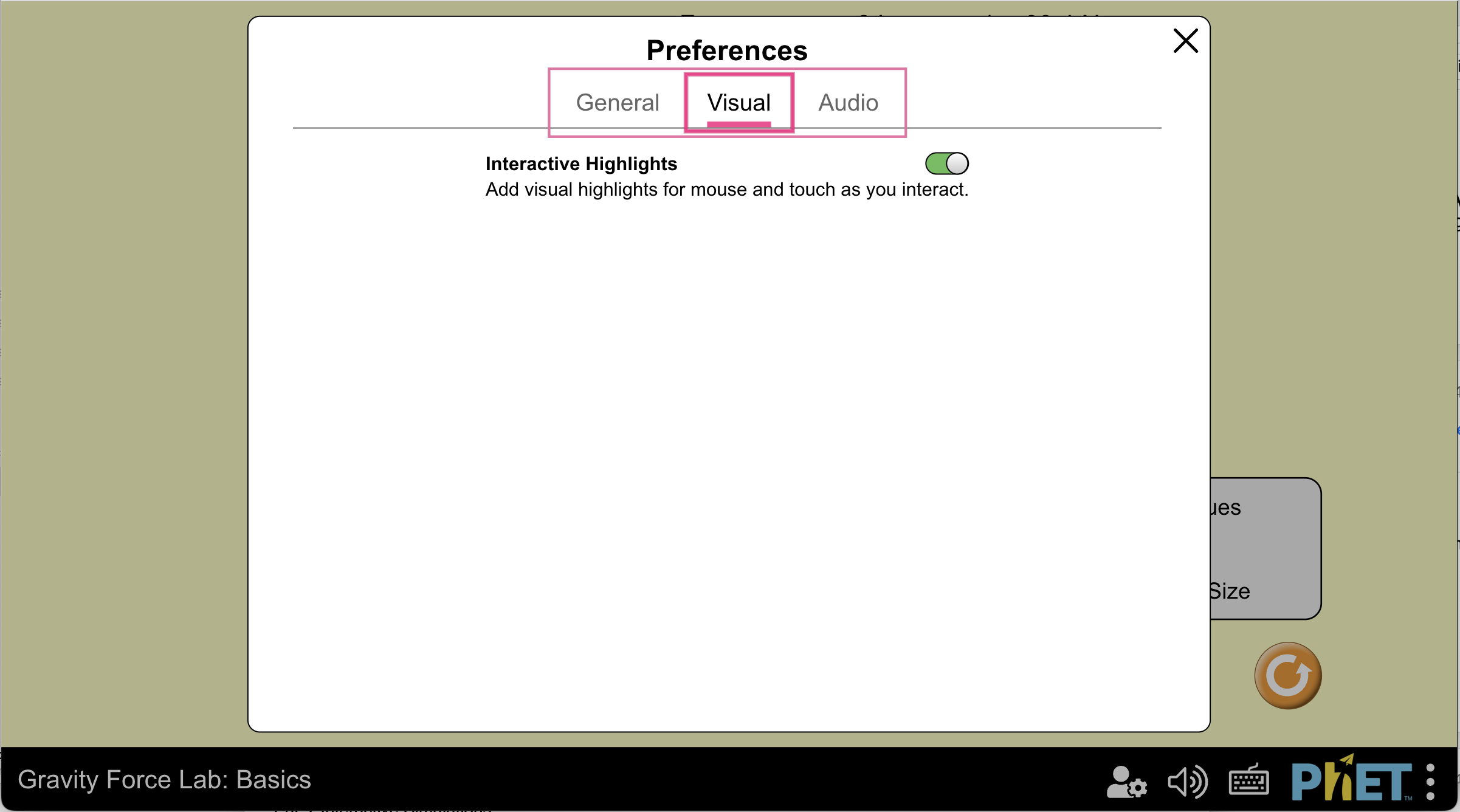
Here's a screenshot of the Visual Tab of the Preferences Menu. Interactive Highlights is toggled on and the learner is hovering over the Visual Tab, so the grouped Tabs are highlighted.
[cid:image002.png@01D993C3.FE2D7CC0]


~.~.~.~.~.~.~.~.~.~.~.~.~.~.~.~.~
Taliesin L. Smith
talilief@gmail.com<mailto:talilief@gmail.com>
taliesin.smith@colorado.edu<mailto:taliesin.smith@colorado.edu>

Inclusive Design Research Specialist
PhET Interactive Simulations
http://phet.colorado.edu/
Department of Physics
University of Colorado, Boulder


Kevin Prince
Product Accessibility & Usability Consultant


Foster Moore
A Teranet Company


E kevin.prince@fostermoore.com
Christchurch
fostermoore.com
On May 24, 2023, at 6:46 AM, Jorge Fernandes <jorge.f@netcabo.pt<mailto:jorge.f@netcabo.pt>> wrote:

Hi Smith,

Do you have any report of the studies or maybe some screenshots of the demos, that you could share?

Thanks,
  Jorge Fernandes


No dia 23/05/2023, às 22:49, Taliesin Smith <talilief@gmail.com<mailto:talilief@gmail.com>> escreveu:

I would like to add that in recent studies with our interactive simulations,
Attachments
- image/png attachment: image001.png

- image/png attachment: image002.png

Received on Wednesday, 31 May 2023 01:30:22 UTC