- From: Adam Cooper <cooperad@bigpond.com>
- Date: Thu, 15 Aug 2019 13:46:23 +1000
- To: "'Davis, Angela \(ITS\)'" <Angela.Davis@its.ny.gov>, <w3c-wai-ig@w3.org>
- Message-ID: <000001d5531c$043305a0$0c9910e0$@bigpond.com>
Hi Angela,


It's always difficult to make definitive assessments with an isolated
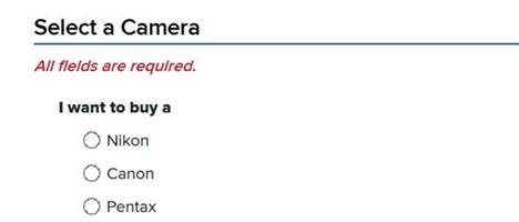
sample, but I'd hazard to suggest that the heading should  be 'choose a
Brand' or similar - presumably there's up or down stream screens that permit
the selection of other characteristics of the camera?


It's a question of information architecture and screen flow .


And I can't see any reason why the heading can't function as a legend
thereby eliminating any purported issues for screen magnifier users assuming
that an appropriate method for associating this heading with what it groups
is used (i.e., traditional fieldset and legend or the appropriate ARIA).


This could also include the word 'required' in brackets - it doesn't need
'all fields are required' given that it's the only radio group on the screen
(and how does one select all fields in a  radio grouping anyway?)


Oh, and as an aside, it's important to remember that not everyone on this
list can consume graphical content like screenshots .


Cheers,

Adam


From: Davis, Angela (ITS) [mailto:Angela.Davis@its.ny.gov]
Sent: Wednesday, August 14, 2019 2:25 AM
To: w3c-wai-ig@w3.org
Subject: Directions in form headings


Is it ok to include directions in form headings if a page does not have
multiple sections?  According to
https://www.w3.org/WAI/WCAG21/Techniques/general/G141.html it's best to keep
them generic but the example they show has multiple sections.


For example :


Angela Davis

Information Technology Specialist 2

NYS Office of Information Technology Services

Citizen Services Cluster | Application Systems Engineering

Campus, Building 5, Floor 6

(518) 474-4953 |  <mailto:Angela.Davis@its.ny.gov> Angela.Davis@its.ny.gov
Attachments
- image/jpeg attachment: image002.jpg

Received on Thursday, 15 August 2019 03:46:59 UTC