- From: Adam Cooper <cooperad@bigpond.com>
- Date: Sat, 15 Dec 2018 09:59:38 +1100
- To: "'Harry Loots'" <harry.loots@ieee.org>, "'W3C WAI ig'" <w3c-wai-ig@w3.org>
- Message-ID: <007001d49400$b0f0f800$12d2e800$@bigpond.com>
The subject of this thread is ‘disabled form fields’.


Is this a question about colour contrast or the appropriate use of the disabled attribute?


In my view, the disabled attribute should never be used on a text field – only the readonly attribute.


And, conversely, the readonly attribute shouldn’t be used on radio or push buttons or select elements etc.


This at least makes the problematic user agent styling go away for inactive text fields …


With regards to disabled elements with activation behaviours, however, there is tension in my mind between:

·         Colour being the only visual conveyor of information (i.e. success criterion 1.4.1) and this exception

·         There being a blanket exception for disabled controls


These seem to me to be glitches, though I can understand that changing this requirement could be problematic both then and now.


From: Harry Loots [mailto:harry.loots@ieee.org]
Sent: Friday, December 14, 2018 9:20 PM
To: W3C WAI ig
Subject: Disabled form fields


Dear all


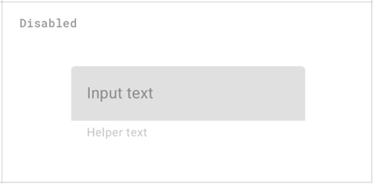
My understanding of SC 1.4.3 (Contrast) is that disabled form fields should also be subject to minimum contrast levels, since these fields may provide pertinent information to the user.


Example from Google Material Design assets:

image.png


What is the view of this group?


Kindest regards

Harry
Attachments
- image/png attachment: image002.png

Received on Friday, 14 December 2018 23:00:49 UTC