- From: Niemann, Gundula <gundula.niemann@sap.com>
- Date: Wed, 15 Mar 2023 19:08:00 +0000
- To: "WCAG list (w3c-wai-gl@w3.org)" <w3c-wai-gl@w3.org>
- Message-ID: <DB9PR02MB7372004E37BFA89C379C5C3DF7BF9@DB9PR02MB7372.eurprd02.prod.outlook.com>
Hi everyone,

when applying the SC 1.4.10 reflow I experience a lot of uncertainties and unclarities on how it should be tested and which issues are violations looking at the normative text.

According to the normative text,

  *   vertically scrolling content has to do with a restricted width while
  *   horizontally scrolling content has to do with a restricted height,
being functionable and all content available while not scrolling in two dimensions.
So, for vertically scrolling content, the available height is not restricted.

On the other hand, the test steps described in the techniques use a 400% zoom for testing starting with 1280 times 1024 pixel screen size, which virtually means restricting height and width at the same time.
(In contrast to the "page contents" box in the 1.4.10 Understanding document there is no section on test rules for the SC itself, so I had to go for the technique's tests, which do not justify a failure (or success in case of the failure technique).

On a third side, the understanding explicitly states that while zooming a page to 400% the text does not need to enlarge by 400%, but effectively enlarging to 200% is sufficient. It says
"For example, if at the default browser setting of 100% zoom, text is set at 20px when the window is 1280px wide, the same 20px at 200% zoom would mean a text size of 200%. At 400% zoom, the author may decide to set the text size to 10px: the text would now still be enlarged to 200% compared to the default browser setting of 100% zoom. It is not required to achieve 200% text enlargement at every breakpoint, but it should be possible to get 200% text enlargement in some way."
As a consequence, the behavior on restricting the dimensions and on zooming might be different, which makes it not logical to test via zoom.

Next, it states in the understanding :
"For organisations which are using legacy systems or are not able to update their layout methods for some reason, an alternative conforming version could be a mobile site which has a fixed 320px wide layout. The user should be able to find that version from the default website."
According to this paragraph, it is sufficient to make a mobile version of the application available on desktop which is able to restrict to 320 CSS px width (for vertically scrolling content). No restriction on height, and as it is a mobile version, it must be expected to rely on some height.
Again, this cannot be tested via zoom to 400% starting with 1280x1024 as this would imply both dimensions are restricted.

As a consequence, screens which have text to be read horizontally, content to scroll vertically, reflow to a width of 320 CSS px might rely on some height to have content and functionality readily available.
According to the normative text and also the paragraph I cited latest this complies.
Yet following the test procedure with 400%, it would fails.

Let me give you an example:
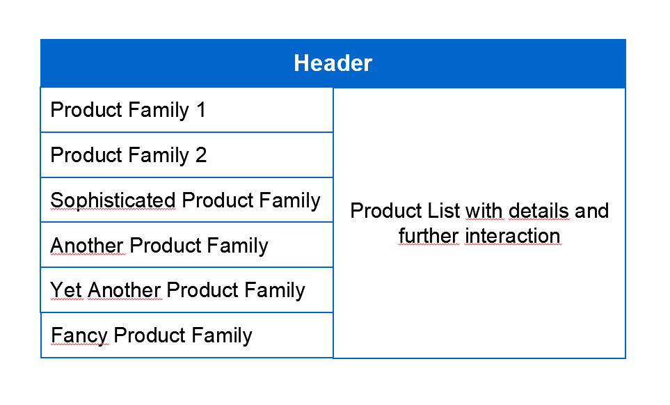
A page offers several options to choose from and further interaction within the choices. The content scrolls vertically.
[Fictive page sketch with a list of several options to choose from on thre left and details on the right.]


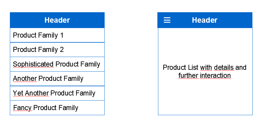
When restricting the  width to 320 CSS pixels, either the list of options or the details can be shown. From the details the list of options can be reached via the three bars menu (aka hamburger menu). Choosing an option brings the user to the details.
[Page sketch with restricted width and reasonable height. The page displays either  the list or the details, where the details can be reached from the list by choosing an item, and the list can be reached from the details via an icon button.]
This is compliant with the normative text.

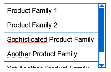
But when restricting the width and the height at the same time, the page cannot handle the missing height and loses its header (with the hamburger icon).
[sketch page with restricted width and height at the same time.]
This way, the details can no longer be reached and the page is not functionable anymore.

I feel it needs to be made clear that only one dimension is restricted and the other may rely on a greater value.
Please share your opinion.

Best regards,
Gundula


----------
Dr. Gundula Niemann
SAP PE UX Accessibility
SAP SE


Confidential
Attachments
- image/png attachment: image001.png

- image/png attachment: image002.png

- image/png attachment: image003.png

Received on Wednesday, 15 March 2023 19:08:20 UTC