- From: Alastair Campbell <acampbell@nomensa.com>
- Date: Fri, 15 Jul 2022 16:47:06 +0000
- To: "wilco.fiers@deque.com" <wilco.fiers@deque.com>
- CC: "WCAG list (w3c-wai-gl@w3.org)" <w3c-wai-gl@w3.org>
- Message-ID: <PR3PR09MB5347F87F402AAEF0D8815F73B98B9@PR3PR09MB5347.eurprd09.prod.outlook.com>
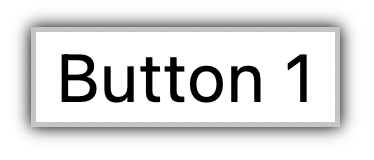
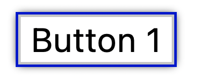
Hi Wilco,

Starting a new thread to respond to your points:


> Regarding component size; Knowing the exact size, shape, and position of a component is essential when applying this success criterion. Take a simple button with a box-shadow and a 1 pixel focus indicator for example. The focus indicator sits on top of the shadow, so whether or not the indicator encloses the button depends on if that shadow is considered part of the button or not. (example: https://codepen.io/wilcofiers/full/vYRXzRj)

[Button with a grey border and dark grey shadow all around.][The same button with a blue outline around the border, over the dark shadow.]

Having resolved to use the perceived control as the basis, the shadow would be perceived as part of the control. Therefore, an outline inside the shadow wouldn’t meet the “encloses” bullet. It also wouldn’t meet the 1px perimeter. It would meet the 4 CSS pixel thick line along the shortest edge.

That is easy to assess by eye, it is clearly more than 4px by the shortest side.

The fall-back measure provides flexibility for various reasonably visible indicators.

If it is at all close, it is easy to pass by using offset, or a 2px thick indicator. With either of those, no size calculation is needed (assuming sufficient contrast).


> Having had these discussions in AGWG, I believe the intent is for the shadow to be included, however the actual normative text leaves this largely open to interpretation. There are many other ways to determine the size and shape of a component, such as border box, content box, click area, etc. These can all be different. AGWG made several attempts to address this problem, yet kept finding problems it couldn't answer, and eventually settled on what to me looks like "let’s just leave it open".

We did find problems with the alternatives we tried (target size & underlying HTML). We came back to using the UIC as the basis, which is based on what people perceive as the control. We also expanded on that in the understanding document: https://w3c.github.io/wcag/understanding/focus-appearance.html#keyboard-focus

We ran through all the previous examples, particularly edge cases, and had good inter-rater agreement.


> Regarding complexity; This criterion has so many conditions, alternatives, sub-conditions, and exceptions it is really hard to keep track of. While determining a pass based on the "enclosed" item isn't too difficult, any focus indicator that’s on a background image with some dips in contrast, any indicator with some kind of fade to it, any indicator with gaps need to be evaluated with the “area” portion of the success criterion.


As a visual phenomenon, there is an intrinsic complexity to defining something sufficiently visible. However, we've introduced two approaches to the SC: An easy to understand (& harder to meet) version as the first approach. Then the more complex size calculations to allow for a greater range of focus indicators.

It would be difficult for an automated tool to fully evaluate the SC, however, there is no requirement for new SCs to be fully automatable.

We've reviewed the complexity multiple times, for example:
https://github.com/w3c/wcag/issues/1842#issuecomment-982735626

We resolved to agree the response and carry-on refining:  https://www.w3.org/2022/01/11-ag-minutes#item05

The refinements included separating the approaches and reorganizing the SC so it starts with an easier to understand version.


> To do so accurately may require counting pixels of the focus indicator, and of the component (focused and unfocused), and making dozens, if not hundreds of contrast calculations. That would all be fine if it could be done automatically, but as per my point on "component size", AGWG decided not to define an automatable measure for component size. All of that will have to be done manually.


This is also the case for text over varying backgrounds, that is also more difficult to test and I haven’t seen an automated tool do that properly.


> I believe that this success criterion is too complex to be workable in practice. The only good way to teach and apply this success criterion is by taking shortcuts. WCAG success criteria don’t just need to be accurate, they need to be teachable, and they need to be testable with a reasonable amount of effort. The success criterion as proposed is not.

I strongly disagree with this bit. I’ve taken several design teams through the new SC and found it simpler to convey than non-text contrast, and a magnitude easier than 1.3.1/4.12.
Also, an independent inclusive design engineer produced a good article based on the SC:
https://www.sarasoueidan.com/blog/focus-indicators/
(And I didn’t have to write in and correct anything based on the SC version of the time.)
At work we’ve been including the SC as a test for the best-practice section of our audit reports for a while and it hasn’t added to the time needed for an audit. In the vast majority of cases you have to tab around a page anyway to test keyboard, focus-order, focus-visible and non-text contrast. As part of that, most cases fall easily into pass/fail just based on a visual inspection as you tab through.


Regarding browser defaults: This success criterion can, in many situations, require content authors to address problems caused by the default focus indicator of user agents. The user agent exception in the success criterion is too limited, and does not reflect the current state of technology. Several user agents today adjust the color of its focus indicator based on the background. Limiting the user agent exception to pages where the background wasn’t set is significantly underappreciating the ability of user agents to ensure the default focus indicator is accessible.


Indeed, browsers have been responsible for the default indicators for decades, and it has been a well-known problem for that time. The requirement came originally from the initial WCAG 2.1 requirements<https://github.com/w3c/wcag21/issues/10>.

Browsers have improved their defaults since WCAG 2.1, but there are still common problems such as:

  *   A blue background (for Firefox/Safari);
  *   Setting a button background to a dark colour (Chrome/Edge).

These designs don't change the indicator itself, but they do render it invisible.

On a graphically simple site the defaults will often work and therefore the author doesn't have to do anything. However, where the author has made changes to the visual presentation, the focus-appearance needs testing.

If an author changes the background color we expect them to update the foreground text to ensure contrast, the same should apply to focus indicators.

I am curious about which browsers change the indicator based on the background? At least on the web I think >90% of people will get either a blue outline (FF/Safari), or a black/white combination (Chrome/Edge).

If browsers update to provide an always-contrasting indicator, great! Authors will pass the SC without effort.

Our main decision point on this was in February<https://www.w3.org/2022/02/22-ag-minutes#item05>, where we resolved that we would move forward with SC with exceptions of "The focus indicator and its background color are determined by the user agent and are not modified by the author." and "The focus indicator is defined by the user-agent and cannot be adjusted by the author."


> Expecting content authors to overcome user agent deficits is new territory for the Web Content Accessibility Guidelines and is going too far, putting responsibility in the wrong place.

There are many SC which *could* be met by user-agents but we include in WCAG, the most relevant example being 1.4.3.
The focus indicator is something the author can define so I don’t agree that it is out of scope.


> Regarding accessibility features; Browsers like Chrome and Edge have an accessibility feature that can be enabled to add a focus ring to the page. This focus ring is impossible to hide with CSS, so when enabled, it guarantees a visible focus, (except in rare cases where focus is simulated such as on canvas). This focus indicator meets all the requirements of the proposed success criterion, except for one thing; persistence.


We have logical reasons and anecdotal comments that a persistent focus indicator is needed in at least some circumstances (e.g. inputs where you have to look away and come back). Also, after decades of persistent indicators, we would need research to show that fading indicators are sufficient.

Focus-appearance does not prevent browsers from addressing this issue, and personalisation in this area should be encouraged. What the SC does is set a minimum requirement for the author. If the author relies on the browser defaults but changes other aspects of the design, that should be tested.

Kind regards,

-Alastair

--

@alastc / www.nomensa.com<http://www.nomensa.com>
Attachments
- image/png attachment: image001.png
- image/png attachment: image002.png
Received on Friday, 15 July 2022 16:47:51 UTC