- From: Wilco Fiers <wilco.fiers@deque.com>
- Date: Mon, 29 Mar 2021 13:11:33 +0200
- To: Alastair Campbell <acampbell@nomensa.com>
- Cc: "WCAG list (w3c-wai-gl@w3.org)" <w3c-wai-gl@w3.org>
- Message-ID: <CAHVyjGMw0R6n-m5AOxwPdhnMHc9Ascutfwkwia3ystQUsXN+wg@mail.gmail.com>
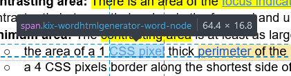
Hey Alastair,

> The one which the outline would appear around, which I think is the
border box?

Not sure what browser you were using, but yeah I think that's the border
box.


> That could be a problem because inline links that break over a link are
missing the inner sides:
> https://github.com/w3c/wcag/issues/1328
>
https://www.w3.org/WAI/WCAG22/Understanding/focus-appearance-minimum.html#focus-indicator-inline-link
> If each is treated as independent then an indicator could pass when
whole, and fail when it wraps, even though it’s the same size visually.

I'm not sure I follow. It sounds like we are in agreement on what it should
do; If you have two disconnected parts to a component, each part needs to
have a focus indicator. I think that means treat them as though they're
independent areas, no?


> I wonder if we can align the definition of perimeter with the CSS border
box?

My understanding is that you specifically didn't want to do that, to
address the scenario where padding is used to extend the touch target size.
On top of that, border-box is technology specific. SVG doesn't have an
equivalent. Not sure about other tech, but I doubt they all work like HTML
does. On top of that, there are lots of ways to clip a border-box. If we
required the exact border-box, you'd have the requirement extend to clipped
parts. I think the only way to do this is to do this based on what is
visible. I've thought about it a little more, and I think the outline
problem can be solved. Here's how:


*Component box*

The smallest rectangle, aligned on the X and Y-axis, that can be drawn
around the visible parts content of the component. *Shadows, highlights and
other effects around a component that largely blend into the background are
not considered to be part of a component*. Where a component consists of
disconnected parts, such as a link that wraps onto multiple lines, each
part has its own component box.

*Note*: In CSS the box of a component without border or background usually
corresponds to the content box. If the element has a border or background,
this is the border-box instead. If the element uses outline or box-shadow
to simulate the effect of a border, the component box extends to the
simulated border.


Thinking about *minimum** area* a little more, I'm not sold on the idea of
doing this using a bounding box yet. The perimeter of a bounding box on a
circle is larger than the perimeter of a circle (8r > 2𝜋r). So a 1px
outline on a square component would pass, but that same outline on a
circular component or a square component with rounded corners would fail.
The opposite can also happen too. If you take the perimeter of all letters
in a link, the length of that will usually be greater than that of a
bounding box.

The simplest fix to that would be to say the minimum area is shortest
diameter times pi (instead of 4), and remove the 2px thickness requirement
from it. If we wanted to keep the math easy we could also do 3. That
wouldn't make a noticeable difference. I'm not sure the 2px thickness makes
sense anyway. Thinking of the Deque crescent focus indicators. At the ends
of the crescent, the thickness isn't 2px.

[image: Screenshot 2021-03-29 at 13.09.20.png]
(pill button, with a crescent shape focus indicator)


On Fri, Mar 26, 2021 at 1:43 PM Alastair Campbell <acampbell@nomensa.com>
wrote:

> Hi Wilco,
>
>
>
> Thanks, I’ll take a look through and try to add something to the survey
> for the meeting.
>
>
>
> A couple of things:
>
>
>
> > The inspector shows in most browsers multiple boxes.. Which one of
> those is it?
>
>
>
> The one which the outline would appear around, which I think is the border
> box?
>
>
>
>
>
> > Where a component consists of disconnected parts, such as a link that
> wraps onto multiple lines, each part has its own component box.
>
>
>
> That could be a problem because inline links that break over a link are
> missing the inner sides:
>
> https://github.com/w3c/wcag/issues/1328
>
>
> https://www.w3.org/WAI/WCAG22/Understanding/focus-appearance-minimum.html#focus-indicator-inline-link
>
> If each is treated as independent then an indicator could pass when whole,
> and fail when it wraps, even though it’s the same size visually.
>
>
>
>
>
> > Note: In CSS the box of a component without outline, border, or
> background usually corresponds to the content box. If the element has a
> border or background, this is the border-box instead. If the element has a
> box-shadow or outline the component box extends around the outline or
> shadow.
>
>
>
> The way I read that, it means that components without a visible boundary
> are often smaller than those with a boundary? And a box-shadow expands the
> component? That doesn’t seem logical from a design/dev point of view,
> shouldn’t we stick to where the border would be?
>
>
>
> I wonder if we can align the definition of perimeter with the CSS border
> box?
>
>
>
>
>
> > It uses what is visible, so that we don't need the "fully obscured" case.
>
>
>
> This discussion doesn’t impact the need for the ‘obscured’ bullet at all.
> That bullet is addressing when other content (such as a sticky footer)
> stops you seeing the component (and it’s indicator).
>
>
>
> Thanks,
>
>
>
> -Alastair
>
>
>
>
>
> *From:* Wilco Fiers <wilco.fiers@deque.com>
> *Sent:* 26 March 2021 12:22
> *To:* Alastair Campbell <acampbell@nomensa.com>
> *Cc:* WCAG list (w3c-wai-gl@w3.org) <w3c-wai-gl@w3.org>
> *Subject:* Re: Focus-appearance flipped version
>
>
>
> Hey Alastair,
>
> The inspector shows in most browsers show multiple boxes. In Chrome, the
> inner blue box is the content box. The box around it is green, which is the
> padding, then the border box is yellow and outside that is the margin which
> is orange. Which shows the problem right there. Which one of those is it?
>
>
>
> I think what's missing is a definition of what that shape we're trying to
> get the perimeter of actually is. I updated my proposal and added a
> definition of "component box" (I'm not attached to that name). Here's what
> I came up with:
>
> *Component box*
>
> The smallest rectangle, aligned on the X and Y-axis, that can be drawn
> around the visible parts content of the component. Where a component
> consists of disconnected parts, such as a link that wraps onto multiple
> lines, each part has its own component box.
>
> *Note*: In CSS the box of a component without outline, border, or
> background usually corresponds to the content box. If the element has a
> border or background, this is the border-box instead. If the element has a
> box-shadow or outline the component box extends around the outline or
> shadow.
>
> I think this addresses most of what we need from it. It uses what is
> visible, so that we don't need the "fully obscured" case. Doing that also
> ensures that what we have is not tied to anything specific in CSS. This
> also addressed the "extended target size" which is just a transparent
> padding. The one drawback I think this definition has is that if you have a
> component with an outer shadow or glow that's much larger than the actual
> component, that the entire shadow is included. Not sure that's something
> worth worrying about.
>
>
>
> Hope this helps!
>
>
>
>
>
> On Wed, Mar 24, 2021 at 11:01 PM Alastair Campbell <acampbell@nomensa.com>
> wrote:
>
> On the size measure:
>
>
>
> > Fair, I realise target isn't ideal. On the other hand, then what is it?
>
>
>
> The way we’ve talked about it so far: It is the component (i.e. whatever
> is in the DOM / code), which generally relates to the hit area, but if that
> hit-area is artificially expanded then we can ignore that expansion.
>
>
>
> You rattled off a few options for what it could mean technically, but
> which equates most closely to what you’d see when inspecting an element in
> the browser-inspector?
>
>
>
> [image: Screenshot of some text with a highlight showing the class name
> and size of a link.]
>
>
>
> If there is a more correct (and understandable) term for the component’s
> area, great, but otherwise I think it’s best to stick to what we’ve used
> elsewhere.
>
>
>
>
>
> > Diameter is the distance between two opposite points on the perimeter of
> a shape.
>
>
>
> Huh, I see, I’d just never come across it except in the context of a
> circle. Is it a problem that it has to go through the centre of the object?
> (That’s part of the official definition.)
>
>
>
> In that context I think calling it a ‘border’ seems wrong, so that
> sub-bullet would be:
> “Minimum area: The contrasting area is at least as large as:
>
> (bullet 1), or
>
> * a 4 CSS pixels thick line along the shortest diameter of the unfocused
> component, and no thinner than 2 CSS pixels”
>
>
>
> The term ‘diameter’ is really throwing me, is it just me?
>
>
>
> Previously we’ve tried language “bounding rectangle”, but that caused
> confusion.
>
>
>
> The three options I can see at the moment are:
>
>    1. a 4 CSS pixels border along the shortest side of the unfocused
>    component, and no thinner than 2 CSS pixels. [current]
>    2. a 4 CSS pixels thick line along the shortest diameter of the
>    unfocused component, and no thinner than 2 CSS pixels
>    3. a 4 CSS pixels border along the shortest side of the bounding
>    rectangle of the unfocused component, and no thinner than 2 CSS pixels.
>
>
>
> I think the first is the easiest to understand, and covers the vast
> majority of cases. We could even say that this option is unsuitable if you
> are not using a rectangle…
>
>
>
> Does anyone else have a preference (or can’t live-with) for these options?
>
>
>
> -Alastair
>
>
>
> PS. In progress updated version here:
>
>
> https://docs.google.com/document/d/1KAo-6ID3NlVwdGl7uyjnlM_c28kBoizkjIdC8GXLwn4/edit#heading=h.q1znckui8nn0
>
>
>
>
> --
>
> *Wilco Fiers*
>
> Axe-core product owner - Facilitator ACT Task Force - Co-chair ACT-Rules
>
>
>


--
*Wilco Fiers*
Axe-core product owner - Facilitator ACT Task Force - Co-chair ACT-Rules
Attachments
- image/png attachment: image001.png
- image/png attachment: Screenshot_2021-03-29_at_13.09.20.png

- image/gif attachment: deque_logo_180p.gif

Received on Monday, 29 March 2021 11:11:59 UTC