- From: Wilco Fiers <wilco.fiers@deque.com>
- Date: Thu, 19 Nov 2020 11:35:47 +0100
- To: Alastair Campbell <acampbell@nomensa.com>
- Cc: "WCAG list (w3c-wai-gl@w3.org)" <w3c-wai-gl@w3.org>
- Message-ID: <CAHVyjGPXroBoWraQ4TG3GD-LbE4zdK4k6D56pZSmr9=LG1esPw@mail.gmail.com>
Hey Alastair,
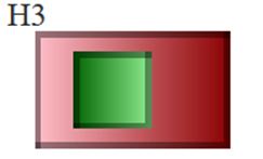
You are correct, I made a mistake on H3. There is just enough space for the
outer box to pass. I've fixed that, and added an example that's similar but
where the box is rounded (N1 - N4)

As for E3 and E4, I think it is okay for those to fail. They are more
difficult to hit than some of the other fails like G4 and H4. I think this
actually strikes a good balance. The only two that I question are A4 and
D1. Those are just so small... even if someone isn't likely to hit the
wrong thing, it'll be hard to hit. If we added an absolute minimum diameter
of 12px for every target those two would fail without changing any of the
other ones.


On Thu, Nov 19, 2020 at 2:04 AM Alastair Campbell <acampbell@nomensa.com>
wrote:

> HI Wilco,
>
>
>
> That’s great! Thanks for putting that together.
>
>
>
> > Unfortunately, none of the proposals actually gets all of them right.
>
>
>
> I think we might need to discuss ‘right’ in this context.
>
>
>
> The previous wording from the FPWD did allow examples like E3/E4 assuming
> there were no other targets to consider:
>
> [image: A large green square with two small red ones on either side.]
>
>
>
> But is that a good thing? The newer wording means that the proximity of
> the small targets to another target causes a fail. I think that aligns with
> the intent.
>
>
>
> When we get down to the overlapping examples I’m not sure that
> interpretation is correct?
>
>
>
> Taking H3 as an example:
>
> [image: A large red rectangle containing a green square slightly to the
> left of center.]
>
> The red square is 60 wide, the green is 24 + 12 left-padding, so there is
> 24px of the parent on the right-hand side.
>
>
>
> With a wording of “*For each target, the distance from each adjacent
> target to the farthest edge of the current target is at least 24 CSS pixels
> except when*”
>
>
>
> The green target fits the exception bullet, but for the red one:
>
>    - We can consider the green target as “adjacent”;
>    - The farthest edge of the red target from the green target is 24px –
>    pass.
>
> I agree that H4 would fail, and I think most of the others. I’m not clear
> about L2, I can’t see how much space is between those circles? For a circle
> I think we have to treat the furthest point as the ‘edge’.
>
>
>
> Kind regards,
>
>
>
> -Alastair
>
>
>
>
>
> *From:* Wilco Fiers <wilco.fiers@deque.com>
> *Sent:* 18 November 2020 16:16
> *To:* Alastair Campbell <acampbell@nomensa.com>
> *Cc:* Michael Gower <michael.gower@ca.ibm.com>; WCAG list (
> w3c-wai-gl@w3.org) <w3c-wai-gl@w3.org>
> *Subject:* Re: Target spacing refinement
>
>
>
> Hey folks,
>
> I did what I always do when rules get too complex. I write test cases.
> Here's what I wrote. I used color gradients to indicate passes and fails.
> Light green to dark green is passed, dark red to pink is fail.
>
> https://codepen.io/wilcofiers/pen/abZxPow
>
>
>
> Unfortunately, none of the proposals actually gets all of them right. So
> this is going to need more work. I'll see if I can come up with a proposal
> that gets all cases right. Probably worth for folks to have a look, see if
> we're all in agreement on these. Maybe most noteworthy are E3 and E4. Those
> corner blocks pass with the currently published SC text, but they fail in
> all of the new .
>
>
>
>
>
>
>
> On Wed, Nov 18, 2020 at 4:41 PM Alastair Campbell <acampbell@nomensa.com>
> wrote:
>
> Hi Michael,
>
>
>
> Tackling the second one:
>
> > *The distance from each target's mid-point to the mid-point of adjacent
> targets is at least 24 CSS pixels, expect when...*
>
>
>
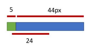
> Measuring from mid-points allows for tiny targets next to larger ones, e.g:
>
>
>
> Although easier to understand (slightly), I don’t think it aligns to the
> goal quite as well.
>
>
>
> For the re-write of option 5, I think it would need to start with the
> thing you are evaluating, e.g:
>
> *For each target, the distance from each adjacent target to the farthest
> edge of the current target is at least 24 CSS pixels except when:*
>
>
>
> If others think that scans ok, I’m happy with that.
>
>
>
> Regarding the ‘objectives’, I think we can easily include that on the new
> understanding docs at the top of the intent, and work back through the
> 2.1/2.0 docs later.
>
> The upcoming re-design looks like this for the understanding doc:
>
>
> https://w3c.github.io/wai-wcag-supporting-documents-redesign/2020-07-15-prototype-understanding.html
>
>
>
> We can add a CSS class to the objective paragraph and work out the styling
> in parallel.
>
>
>
> Cheers,
>
>
>
> -Alastair
>
>
>
>
>
> *From:* Michael Gower
>
>
>
> I agree option 5 *seems *to scan best, but I also think there is a
> missing preposition. There are 2 ideas here:
> 1) we are talking about the edge *farthest from* an adjacent target
> 2) we are talking about the distance* from *that edge *to* the adjacent
> target (or *between *them)
>
> So I think we need 2 prepositions, one to describe which edge and one to
> describe the distance *between* two points. i think a rejig of the
> sentence still allows that to scan okay:
> *The distance from each adjacent target to the farthest edge of the
> current target is at least 24 CSS pixels.*
>
> I think we need to bear in mind that this is a design-centric
> consideration. As such, it is even more important to get the
> language/concept simple. As such, I want to advocate for a variation I
> pasted into the channel yesterday:
>
> *The distance from each target's mid-point to the mid-point of adjacent
> targets is at least 24 CSS pixels, expect when...*
>
> AWK said that this wouldn't work for some edge cases, but I'd like to see
> some examples to understand what gets through the net.
>
> Regardless of wording, this is another SC where a quick blurb summarizing
> the objective would help with rapid comprehension. For instance:
> *Objective: Ensure separation of targets for ease of operation.*
> I wrote such blurbs for all the 2.1 additions, which were supposed to be
> included in the Understanding documents, but were never incorporated.
>
> Michael Gower
> Senior Consultant in Accessibility
> IBM Design
>
>
> 1803 Douglas Street, Victoria, BC  V8T 5C3
> gowerm@ca.ibm.com
> cellular: (250) 661-0098 *  fax: (250) 220-8034
>
>
>
> From:        Alastair Campbell <acampbell@nomensa.com>
> To:        "WCAG list (w3c-wai-gl@w3.org)" <w3c-wai-gl@w3.org>
> Date:        2020/11/17 04:34 PM
> Subject:        [EXTERNAL] Target spacing refinement
> ------------------------------
>
>
>
>
> Hi everyone, After the long discussion on target spacing today,...
>
>
>
>
> *This Message Is From an External Sender*
>
> This message came from outside your organization.
>
> Hi everyone,
>
>
>
> After the long discussion on target spacing today, I tried to collate the
> options into one place and add a couple of diagrams:
>
>
> https://docs.google.com/document/d/1Q9zWT1OjdCrts2xuadVEaJ2wpyLzxnysFQCSTs72L2o/edit?usp=sharing
>
>
>
> Personally, I’m leaning towards option 5 as the simplest which measures
> the size+spacing of the target, which would be:
>
>
>
> For each target, the distance of the target’s edge farthest from each
> adjacent target is at least 24 CSS pixels, except when:
>
>    - [3 bullets unchanged]
>    - *Nested:* The target is enclosed within another target and has a
>    minimum height and width of 24 CSS pixels.
>
>
>
> If you’d like to add something (options, positives/negatives, diagrams
> etc) please let me know and I’ll add you as an editor of the doc. It is
> open for comments.
>
>
>
> Kind regards,
>
>
>
> -Alastair
>
>
>
> --
>
>
>
> @alastc / www.nomensa.com
>
>
>
>
>
>
> --
>
> *Wilco Fiers*
>
> Axe-core product owner - Co-facilitator WCAG-ACT - Chair ACT-R
>
>
>
> Join me at axe-con <http://deque.com/axe-con> 2021: a free digital
> accessibility conference.
>


--
*Wilco Fiers*
Axe-core product owner - Co-facilitator WCAG-ACT - Chair ACT-R


Join me at axe-con <http://deque.com/axe-con> 2021: a free digital
accessibility conference.
Attachments
- image/png attachment: image002.png

- image/png attachment: image004.png

- image/png attachment: image009.png

- image/gif attachment: deque_logo_180p.gif

Received on Thursday, 19 November 2020 10:36:14 UTC