- From: Newton, Brooks (TR Product) <Brooks.Newton@thomsonreuters.com>
- Date: Fri, 3 Jan 2020 22:59:01 +0000
- To: Andrew Kirkpatrick <akirkpat@adobe.com>, "w3c-wai-gl@w3.org" <w3c-wai-gl@w3.org>
- Message-ID: <SN6PR03MB451163FEFE0ED845258D6ADF84230@SN6PR03MB4511.namprd03.prod.outlook.com>
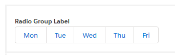
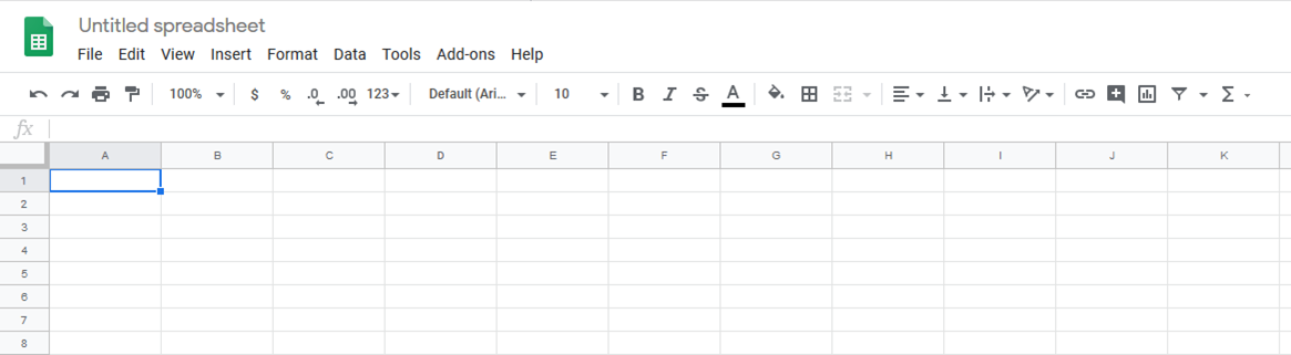
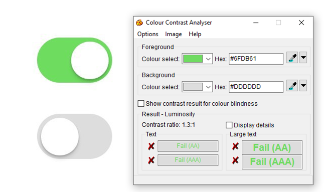
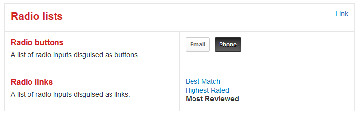
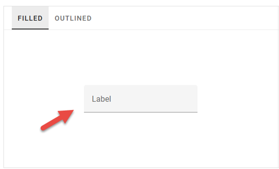
Hi Andrew,

I’d prefer that others contribute to the thread, rather to respond in full to the good points you raise.

On the issues you labeled as numbers 3 and 4:

I will say that my intent was to include the contrast checker app to demonstrate how the green and the gray backgrounds used for the “on/selected” and “off/not selected” toggle switches have very low contrast when the green and gray are compared to one another.  In other words, I’m not using the contrast checker app as an example of an inaccessible interface, but rather as evidence that the toggle switch examples have visual shortcomings related to contrast.  I’ll say more on that in a bit.

If you don’t know that a nub moved to the right is “on” and a nub moved to the left is “off,” the different background colors used for different toggle switch states may help user determine state.  In this example design, the color of the toggle background is a backup mechanism that some sighted users are able to perceive as a clue for the state of the control.  Green means on, and gray means off, right?  Or, maybe that’s not so obvious, especially when you consider that the color contrast between the green and gray is so low it may be indistinguishable to some sighted users.


  *   Which way does the nub go when the toggle switch is on, left or right?
  *   How can some users determine the selected state by the toggle switch background color, when the colors have such a low color contrast ratio?

In my opinion, these are two distinct problems, that when presented in combination in a single interface, cause a large number of folks with disabilities to misunderstand the state, or even the purpose, of the control.

The first rule of ARIA is don’t use it if you don’t have to.  Use long-established, old school conventions, such as semantically meaningful HTML instead of applying roles to div elements, right?  Maybe the same general principal of using long-established means of communicating expectations applies to user interface designs, as well as to programmatic indications?   How long have toggle switches been around on the web? How about checkboxes?  What percentage of user agents automatically display controls that look like toggle switches based on specific markup in the page code?  I don’t know the answers to these questions, but these are some of the questions that matter when it comes to establishing user expectations with interactive control affordances.

Have a Good Weekend,

Brooks

From: Andrew Kirkpatrick <akirkpat@adobe.com>
Sent: Friday, January 3, 2020 3:44 PM
To: Newton, Brooks (TR Product) <Brooks.Newton@thomsonreuters.com>; w3c-wai-gl@w3.org
Subject: Re: Examples of interactive elements with what I consider missing or inadequate affordances

Brooks,
Thanks for the examples. Comments:

  1.  Google Sheet title – completely agree.
  2.  Lightning Design system radio group – This seems to be more about familiarity with this pattern than a lack of affordance. If you hadn’t seen a “regular” radio group before you might be similarly confused. This group actually looks more like its namesake than the regular radio button controls. I do agree that people will find this less familiar, so I would exercise caution in using it, but I don’t think that it lacks affordance.
  3.  Toggle switches – I’m not sure that I agree about this one. The green/grey example would fail non-text contrast, but if the green had sufficient contrast with the white nub I think it would make the on/off states sufficiently unique to provide users with the hints about how this is to be used.
  4.  Contrast checker app – not sure why this image is present?
  5.  Radio list from Yelp – The first is just like the lightning example. The second with just text is on the slippery slope for me - I don’t like it, but am not sure if I agree about the lack of affordance even though the affordance is lousy.
  6.  Material Design input – this would fail Non-text Contrast, so I don’t think it is an example of something that isn’t covered, is it?

Thanks,
AWK

Andrew Kirkpatrick
Head of Accessibility
Adobe

akirkpat@adobe.com<mailto:akirkpat@adobe.com>
http://twitter.com/awkawk


From: "Newton, Brooks (TR Product)" <Brooks.Newton@thomsonreuters.com<mailto:Brooks.Newton@thomsonreuters.com>>
Date: Friday, January 3, 2020 at 12:38 PM
To: WCAG <w3c-wai-gl@w3.org<mailto:w3c-wai-gl@w3.org>>
Subject: Examples of interactive elements with what I consider missing or inadequate affordances
Resent-From: WCAG <w3c-wai-gl@w3.org<mailto:w3c-wai-gl@w3.org>>
Resent-Date: Friday, January 3, 2020 at 12:37 PM

Hi All,

In a previous working group meeting, someone suggested that interactive elements without adequate affordances are “edge case scenarios” that users wouldn’t frequently encounter online.  In advance of our discussion of the proposed Visual Indicators Success Criterion, I wanted to send out some examples of interactive components that could cause confusion to sighted users based on the lack of visual affordances, or use of non-traditional visual affordances that connote interactivity.

This Google Sheets editable document title (“Untitled spreadsheet”) doesn’t look interactive to me upon page load.

[The phrase "Untitled spreadsheet" is presented at the top left of the online document, but is missing traditional affordances, such as a rectangle around the pre-populated text and a proper input label to indicate that the title is in fact an interactive page element.]


This Lightning Design System radio button group doesn’t look like a group of mutually exclusive radio button choices to me.
[Lightning Design System radio group comprised of five adjacent squares with Mon, Tue, Wed, Thu and Fri listed inside of the squares.]


Unidentified set of toggle switches, where the lack of a darkened nub makes it tricky to determine which switch is in the “on” position.
[On and off toggle switch inputs where the switch backgrounds for on and off don't meet the color contrast ratio requirement for non-text content, and where the nubs for both switches are white]


Radio lists from the Yelp Style Guide, including what I consider a misleading affordance for Radio links that makes the group look like linked and unlinked text and not a list of mutually exclusive choices.

[Yelp Style Guide examples of radio lists where radio buttons  that are styled to look like push buttons and where radio links are styled to look like linked and unlinked text.]

Material Design filled text input with placeholder text looks to me like a non-interactive text phrase positioned above a horizontal rule. Low color contrast between the filled input background and page background (1.1:1) make it indistinguishable to some sighted users.

[Material Design filled input with low contrast textbox input background and a single horizontal line at the bottom of the input area.]

These are not edge case scenarios.  All but one of the examples I’ve provided above are from design systems that are marketed to be used over and over by the masses. There are more examples of ambiguous and misleading interactive element affordances out there in the wild.  If anyone from the group has more examples to share, please do.

Thanks!

Brooks

· · · · · · · · · · · · · · · · · · · · · · · · · · · · · · · · · · · · · · ·
Brooks Newton
Sr. Accessibility Specialist

Thomson Reuters
the answer company
This e-mail is for the sole use of the intended recipient and contains information that may be privileged and/or confidential. If you are not an intended recipient, please notify the sender by return e-mail and delete this e-mail and any attachments. Certain required legal entity disclosures can be accessed on our website: https://www.thomsonreuters.com/en/resources/disclosures.html
Attachments
- image/png attachment: image007.png
- image/png attachment: image002.png
- image/png attachment: image003.png
- image/png attachment: image004.png
- image/png attachment: image005.png
Received on Friday, 3 January 2020 22:59:10 UTC