- From: Alastair Campbell <acampbell@nomensa.com>
- Date: Tue, 10 Dec 2019 15:45:05 +0000
- To: "Abma, J.D. (Jake)" <Jake.Abma@ing.com>
- CC: WCAG list <w3c-wai-gl@w3.org>
- Message-ID: <16A39F35-3AD5-4213-9630-00461ABC699D@nomensa.com>
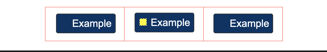
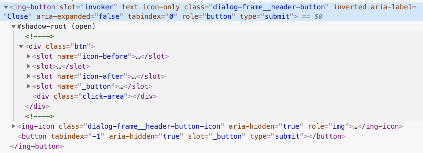
Hi Jake,

Well, I think punished is a bit strong: If the focusable element had a default browser indicator that would probably pass. (I’m assuming the red lines aren’t there in practice, so the default blue 3:1 indicators or the dotted lines in FF/Edge would pass.)

It is a good reason not to use this (made up) method of internal focus indicators, but use the regular outline method.

I’m fairly sure there are a lot more practical cases where a proportional indicator is a better overall effect, and not punishing.

Cheers,

-Alastair


From: "Abma, J.D. (Jake)"

that's a choice which can be overwritten

But in this case the example I send with the red border (touch target and the tabindex="0" in the example) and the blue buttons with yellow square is exactly what I mean.

Making the area bigger and you get punished.

[cid:image001.png@01D5AF70.D17CC270]
________________________________
From: Alastair Campbell <acampbell@nomensa.com>
Sent: Tuesday, December 10, 2019 4:31 PM
To: Abma, J.D. (Jake) <Jake.Abma@ing.com>
Cc: WCAG list <w3c-wai-gl@w3.org>
Subject: Re: Focus Visible (Enhanced)


Hi Jake,


Is there a rendered version of that component?


From the code, I’d point to the element with tabindex=”0” as the thing the user is interacting with, but I’ve no idea how it’s rendered.


-Alastair


From: "Abma, J.D. (Jake)"


Depending on the 'button' as "user-interface component" is also not fine as we do not  USE them visually (for visual purposes), can even make them 1px by 1px and so the focus indicator of 2 CSS px would be fine?

________________________________

From: Abma, J.D. (Jake) <


Hi Alastair,


I just took your example as a starting point to make a statement.

We can think of so many other ways this can take form and where the limitations of the SC right now will prevent adaption because proper indicators will fail and design solutions will not be possible anymore.


Please see code below where we use web component structures where the parent / main container, click-area and button are separated and focus indicators are made to fit OR buttons OR placement (like top right corner in dialog OR on touch target area (depending on need of design)


But before we talk too much code, having a clear focus indicator so people see where the focus is and failing that same indicator because the touch target gets bigger doesn't feel correct.


Depending on the 'button' as "user-interface component" is also not fine as we do not them visually, can even make them 1px by 1px and so the focus indicator of 2 CSS px would be fine?


[cid:image001.png@01D5AF6E.FBEEC410]

________________________________


-----------------------------------------------------------------

ATTENTION:

The information in this e-mail is confidential and only meant for the intended recipient. If you are not the intended recipient, don't use or disclose it in any way. Please let the sender know and delete the message immediately.

-----------------------------------------------------------------
Attachments
- image/png attachment: image001.png
- image/png attachment: image002.png
Received on Tuesday, 10 December 2019 15:45:12 UTC