- From: Abma, J.D. (Jake) <Jake.Abma@ing.com>
- Date: Tue, 10 Dec 2019 15:28:02 +0000
- To: Alastair Campbell <acampbell@nomensa.com>, "Newton, Brooks (TR Product)" <Brooks.Newton@thomsonreuters.com>
- CC: WCAG list <w3c-wai-gl@w3.org>
- Message-ID: <VI1PR03MB446225BDB69819447A155E00F15B0@VI1PR03MB4462.eurprd03.prod.outlook.com>
Hi Alastair,

I just took your example as a starting point to make a statement.
We can think of so many other ways this can take form and where the limitations of the SC right now will prevent adaption because proper indicators will fail and design solutions will not be possible anymore.

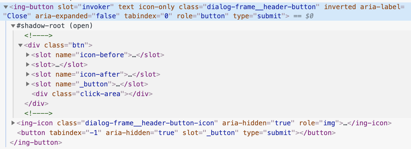
Please see code below where we use web component structures where the parent / main container, click-area and button are separated and focus indicators are made to fit OR buttons OR placement (like top right corner in dialog OR on touch target area (depending on need of design)

But before we talk too much code, having a clear focus indicator so people see where the focus is and failing that same indicator because the touch target gets bigger doesn't feel correct.

Depending on the 'button' as "user-interface component" is also not fine as we do not them visually, can even make them 1px by 1px and so the focus indicator of 2 CSS px would be fine?

[cid:8eb69109-7f7d-4ef8-b854-49f7d9b8e3ec]
________________________________
From: Alastair Campbell <acampbell@nomensa.com>
Sent: Tuesday, December 10, 2019 4:13 PM
To: Newton, Brooks (TR Product) <Brooks.Newton@thomsonreuters.com>
Cc: WCAG list <w3c-wai-gl@w3.org>
Subject: Re: Focus Visible (Enhanced)


Hi Brooks,


> Is a flat button, such as the one you included in Figure 1A in the Understanding document for SC 1.4.11 Non-text contrast<https://www.w3.org/WAI/WCAG21/Understanding/non-text-contrast.html#user-interface-components>, an example of an “artificially expanded hit area” – as you’ve described?


Not really, it doesn’t have a visible hit area (until the focus indicator appears). In that case then defaulting to the actual size of the element would make sense.


By artificial I meant the case of having a visible background that you might assume is the hit-area, and then expanding it invisibly.


Do you think it would help to add a line to the understanding doc to that effect?


I scanned for a suitable point, and noticed that In the section “Size of the indicator”, it already says:

“To determine the minimum size for conformance purposes you would need to measure the size of the element.”


I think defaulting to the size of the element is the best approach in general, I’d rather not complicate it with what (I think) is an unusual example, is the artificially expanded hit-area something you’ve come across?


Assuming you say yes, there are a couple of ways of achieving that effect in HTML/CSS/JS:


  1.  The interactive component (e.g. <a href=””>) is the expanded area, and there is an inner <span> that defines the visible background.

  2.  The interactive component is the inner area with visible background, and the expanded hit area is applied with scripting.


I’d be inclined to use the interactive component (the <a> in HTML) as the basis, that aligns with where the focus indicator will be shown by default.

Therefore (1) needs a bigger indicator than (2). That might seem odd, but it allows people to use larger hit-areas without necessarily needing to expand the focus indicator.


A case that keeps cropping up for me is a large ‘card’ (e.g. box with heading, image, paragraph of text, ‘read more’ text), I’ve been seeing more people wrap the whole thing in a link to make it a large hit area, which is not a good experience for screenreaders (particularly voiceover/iOS).


I’ve been recommend they make the heading the link (which is the best text-link), and using a script to make the whole card clickable (including the now ‘fake’ read-more text at the bottom).


When tabbing through, the heading link needs a good focus indicator, and that aligns nicely the text-link approach. It is a better all-around experience than the whole card being the link, so long as the whole thing is click/tap-able.


Kind regards,


-Alastair

-----------------------------------------------------------------
ATTENTION:
The information in this e-mail is confidential and only meant for the intended recipient. If you are not the intended recipient, don't use or disclose it in any way. Please let the sender know and delete the message immediately.
-----------------------------------------------------------------
Attachments
- image/png attachment: Screen_Shot_2019-12-10_at_4.20.35_PM.png

Received on Tuesday, 10 December 2019 15:28:17 UTC